Standout Features:
- Abstract, meaningful sail design
- Minimalist and geometric aesthetic
- Calming blue and grey color palette
Located in northern Germany, Max-Eyth-Schule BBS Schiffdorf is a professional school with strong local ties. Kreativbüro Zwei designed their new professional service logo to be modern and reflect its coastal surroundings. It aims to give the school a fresh, recognizable look that speaks to both its educational role and its maritime heritage.
What really catches your eye in the logo is the clever use of two stylized sails that hint at the school’s coastal home and even subtly form an "M" for the school's name. This design gives you a sense of movement and progress, perfect for a dynamic school.
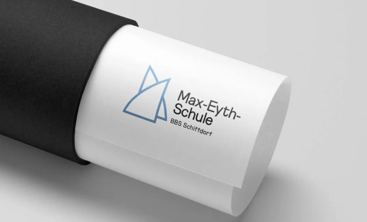
You can see a strong minimalist and geometric style in this logo. The sails are made from simple, angular lines, giving it a contemporary feel. Because there are no frills, the design stays clean and functional. This simplicity helps the logo work well in many different places you might see it. The logo’s colors, blue and grey, are deliberately chosen. Blue is often linked with the maritime environment and a sense of dependability. Grey adds a sophisticated, neutral element. This restrained palette reinforces the school’s educational focus, making it look professional and grounded to you. Essentially, the new logo for Max-Eyth-Schule is a thoughtful blend of symbolism and clean design. Kreativbüro Zwei successfully used abstract maritime imagery, a minimalist style, and a professional color palette. This gives you a clear sense of the school's values, its northern German roots, and its modern educational approach.