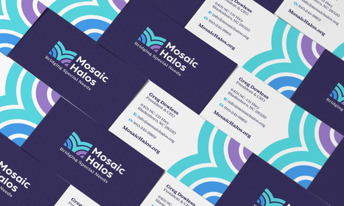
Logo Designed by
Wraps Ink Wraps Ink

Mosaic Halos

Mosaic Halos logo design by Wraps Ink.
Mosaic Halos’ identity blends symbolism and softness to reflect faith, inclusivity, and support. Wraps Ink created a modern mark built from layered arcs forming an abstract “M,” paired with calming blues and purples to visually represent unity, guidance, and the organization’s mission to bridge special needs communities.
Mosaic Halos logo design by Wraps Ink.
Structured emblem subtly reflects halos
Mosaic Halos logo design by Wraps Ink.
A cohesive system built on clarity
This website uses a colour palette of 4 colours
  • #FDFDFD
  • #66D5E3
  • #4FA0E2
  • #A07ED0
Technologies & Tools
Description
Team Behind the Design
  • Agency: Wraps Ink
  • Client: Mosaic Halos
  • Category: Logo Design — Nonprofit
  • Location: Murrells Inlet, South Carolina, United States
  • Project Brief: Develop a complete logo and visual identity for Mosaic Halos, a new faith-based organization focused on special needs advocacy and education, ensuring the brand communicates compassion, unity, and clarity.

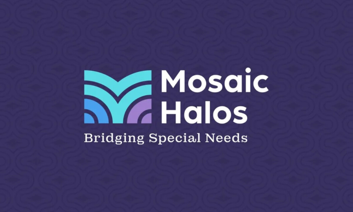
Nonprofit branding calls for emotional resonance paired with visual discipline. Mosaic Halos delivers this through a structured symbol that subtly evokes halos and unity, aligning its faith-centered mission with a composed contemporary aesthetic.

Ready to elevate your designs?