- Agency: Janet Mo Design
- Client: Ms. Marjorie’s Pet Sitting Service
- Category: Logo Design — Professional Services
- Location: Newberry, Michigan, United States
- Project Brief: Design a logo for a pet sitting business that communicates trust, warmth, and reliability while remaining modern, clear, and versatile across print and digital applications.
Many brands in the local market struggle to balance a professional image with a welcoming tone, but professional services logo design provides the structural logic needed to bridge that gap.
Ms. Marjorie’s Pet Sitting Service succeeds by deconstructing the concept of care into a clean, modern mark that emphasizes trust and long-term reliability.
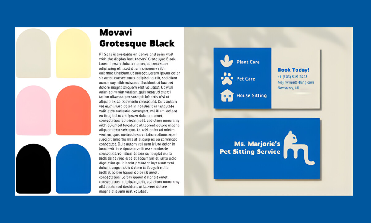
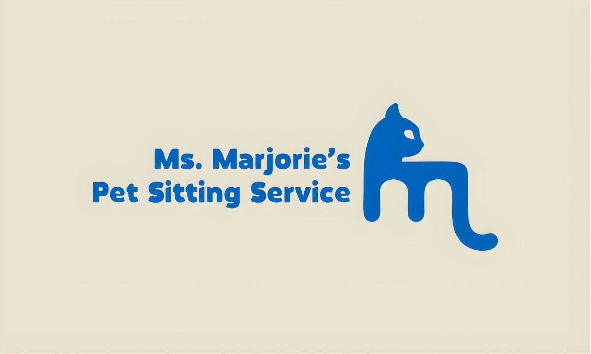
- Friendly Symbolism: I like how the cat-inspired icon uses soft curves and simplified geometry to instantly communicate pet care while remaining calm and welcoming. This symbolic choice reinforces a sense of dependability, ensuring the mark does not appear overly playful or childish.
- Balanced Personality: I believe the logo carefully walks the line between warmth and professionalism to appeal to owners seeking emotional trust. This typographic and structural balance prevents the brand from appearing impersonal, keeping it inviting for the local community.
- Color & Form Simplicity: The restrained color palette and bold, solid shapes improve legibility and recognition across varied backgrounds. I appreciate how these details ensure the core design elements remain effective at small sizes without losing their impact.
- Scalability & Consistency: The mark works seamlessly across business cards, signage, and social media touchpoints. I like how this flexibility ensures the business can grow its reach while maintaining long-term coherence across every client interaction.
What Brands & Designers Can Learn from Ms. Marjorie’s Pet Sitting Service
1. Use Friendly Symbolism Without Losing Credibility
Soft, simplified iconography communicates care and trust without feeling childish. Calm symbols help service brands feel welcoming while remaining reliable.
2. Balance Warmth with Professional Structure
Carefully controlled typography and form create emotional trust without sacrificing seriousness. This balance is essential for local services built on long-term relationships.
3. Design for Everyday Scalability
Clean shapes and restrained color ensure the logo performs across signage, print, and digital platforms. Scalable simplicity supports growth without visual inconsistency.