- Agency: ColorJar
- Client: Navy Pier
- Category: Logo Design — Recreation
- Location: Chicago, Illinois, United States
- Project Brief: Create a logo conveying cultural vibrancy through bold geometric elements for modern recognition.
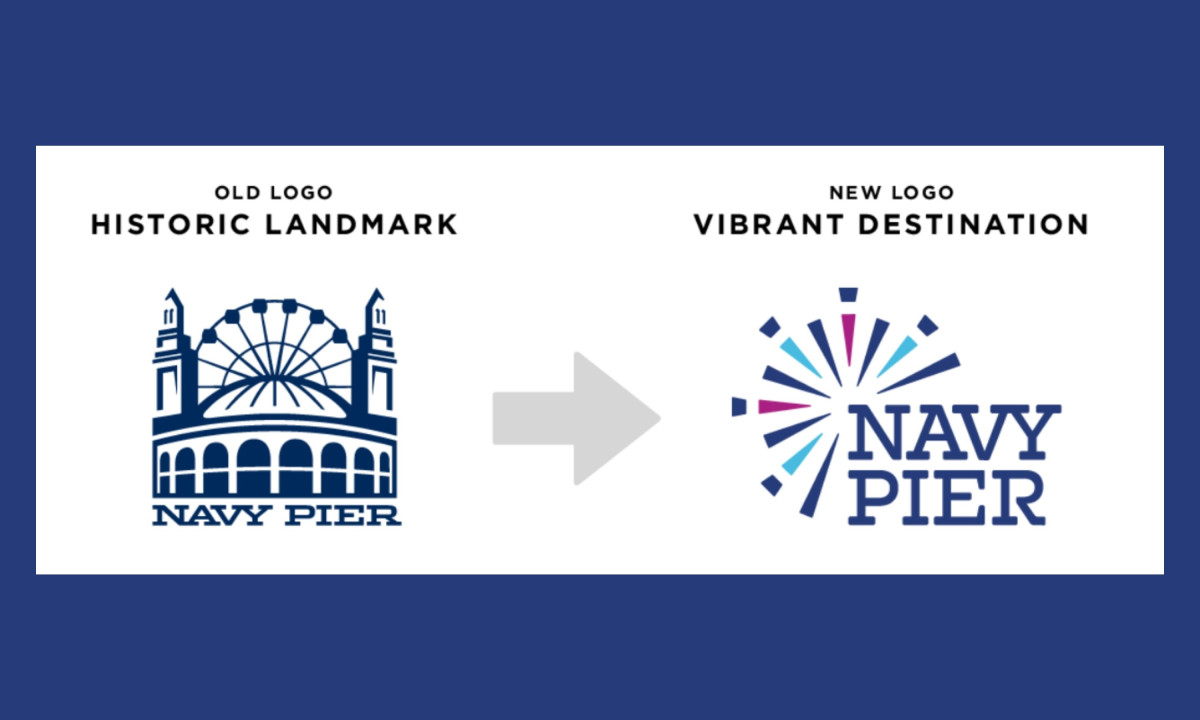
A recreation logo carries a specific kind of pressure: it has to mean something to people who already have a relationship with the place.
ColorJar's redesign for Navy Pier trades the old identity's literal architectural weight for something closer to the experience of actually being there.
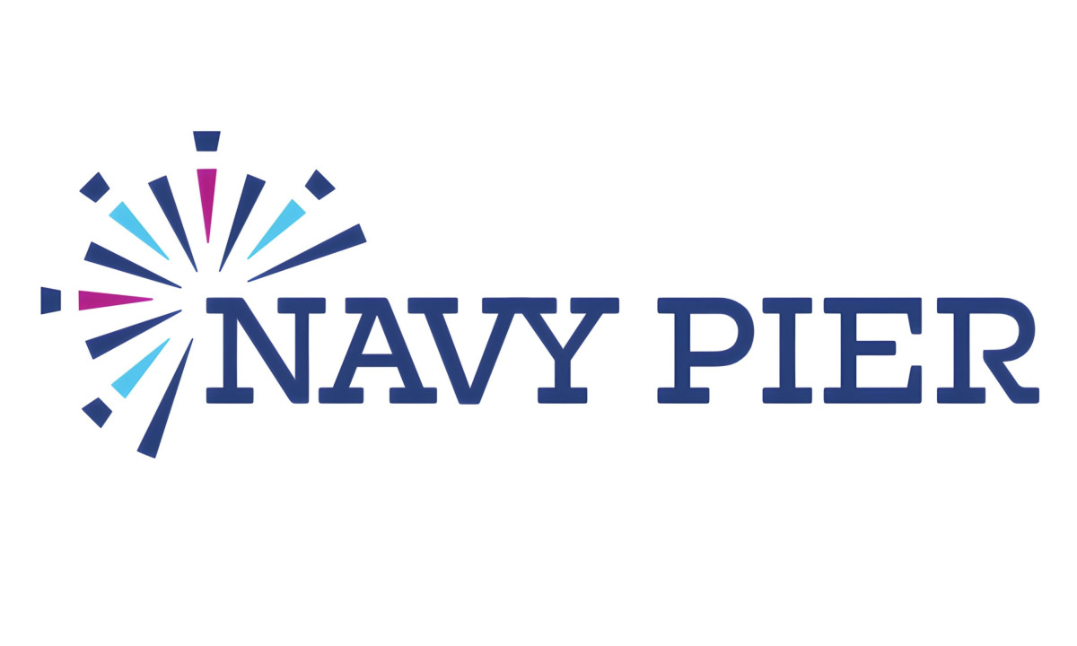
The central mark reads as both a fireworks burst and a Ferris wheel in motion, a clean solution to a problem that could have gone in a dozen worse directions.
A clean, medium-weight slab serif keeps the brand grounded in Chicago without feeling like a history lesson. Deep navy, bright cyan, and a punch of magenta give the palette enough energy to match the mark, and enough familiarity to hold for the millions of people who already know the lakefront by heart.
Navy Pier has been drawing people to the lakefront for a century, and the identity finally reflects what keeps them coming back. The redesign doesn't document the place so much as capture the mood of being in it.