Standout Features:
- Innovative use of negative space
- Contemporary sans-serif typography
- Versatile and thoughtful tri-color palette
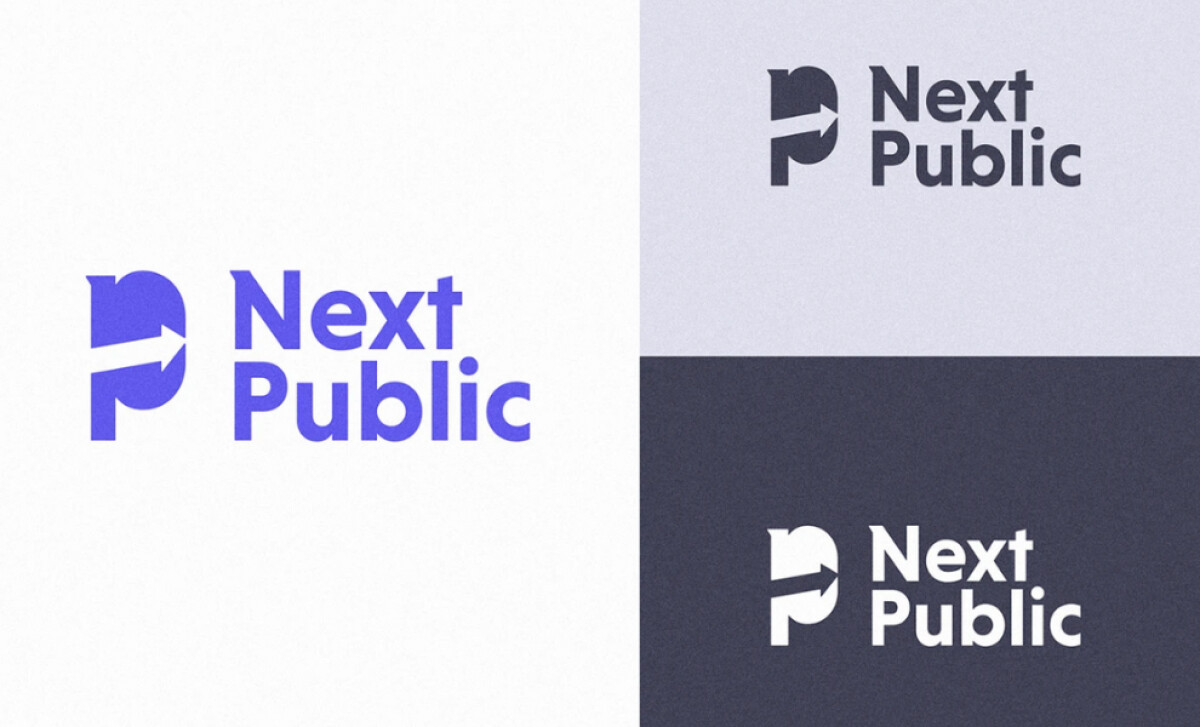
Next Public is dedicated to fostering transformative change via technology, particularly in workforce development and empowering the public future. DDS Studio designed their logo to visually embody this forward-thinking mission. The result is a clear, modern, and symbolically rich identity.
The logo's most distinctive feature is the negative space arrow embedded within a bold, geometric “P.” This arrow, pointing right, visually represents the brand’s focus on future advancement and transformative change.
The clever construction makes the icon both meaningful and highly engaging, a quality that a 2024 International Design Journal study attributes to how positive use of negative space can foster viewer interaction and contribute to a logo's distinctive nature.
"Next Public" is set in a bold sans-serif font characterized by its soft rounded edges. This imparts a friendly yet strong feel. The clean, evenly weighted letterforms ensure excellent legibility. Plus, the stacked layout of the two words creates a visually cohesive and compact brand signature alongside the icon.
The logo’s color palette is designed for versatility, featuring three main versions: electric blue on white, deep navy on light gray, and white on dark navy. This approach ensures the brand can maintain a consistent yet adaptable professional appearance, whether on digital interfaces, print, or other merchandise.
This logo design illustrates that for brands aiming to communicate a forward-thinking mission, a simple yet symbolic mark can be incredibly effective. Next Public’s logo, with its negative space arrow and clean typography, successfully projects clarity and innovation.

