

- Agency: Brand Brothers
- Client: Node
- Category: Logo Design — Banking and Finance
- Location: Paris, France
- Project Brief: Create a modular typographic logo for Node that reflects digital sovereignty and decentralized technology through a calm, adaptable visual identity.
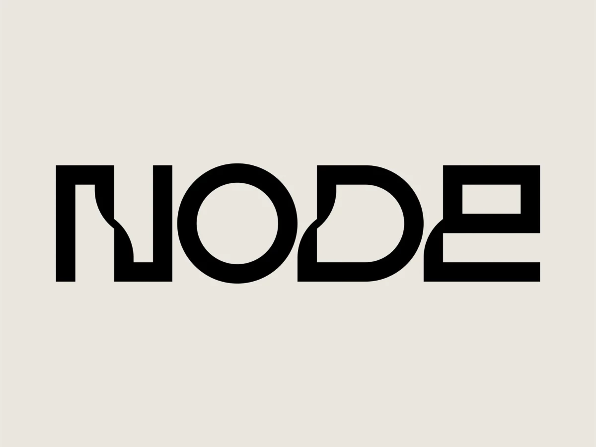
A banking and finance logo tends to reach for a shield or a coin to signal trust. Brand Brothers went the other way for Node, building a modular wordmark that turns four letters into a small piece of engineering.
The letterforms carry the whole idea. A stretched N, a perfect circle O, and a squared-off E read like circuitry or a hardware panel, which suits a personal server for Bitcoin, data, and private AI agents.
Juror Andrea Owsinek-Brucker credited the type with doing the strategic work, calling it an "innovative and fresh use of font choice to depict the corporate positioning, philosophy and brand identity."
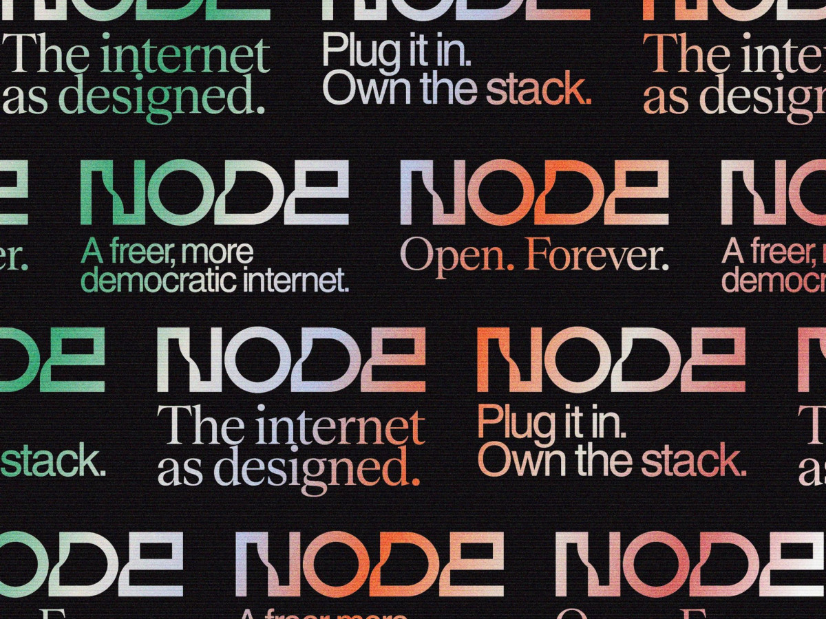
The system is built to flex, not just sit still. The same wordmark runs in gradient color across a tiled poster of slogans like "Own the stack" and "Open. Forever.," giving a political message room to shift tone without losing the mark. Juror Orçun Iybar found the concept legible across the whole build: "The node/network concept comes through clearly."
The identity stays calm enough to age and quiet enough to let the product lead. The mark reads confident and grounded rather than loud, which fits a company selling digital sovereignty as a long-term idea rather than a quick trend.