- Designer: Rhianna Francis
- Category: Logo Design — Entertainment
- Location: Tempe, Arizona, United States
- Project Brief: Create a logo for a progressive podcast that empowers grassroots communities.
Designing for a podcast rooted in community organizing and progressive narratives requires more than visual consistency; it demands emotional resonance.
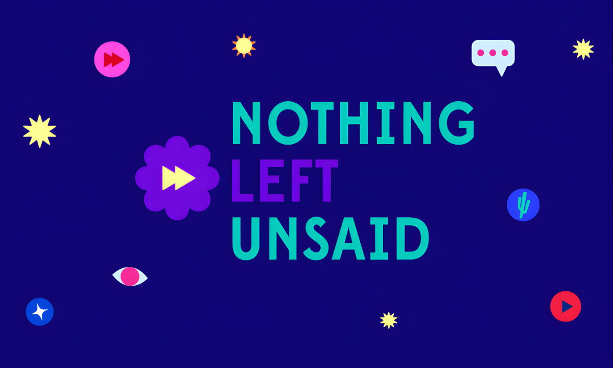
Nothing Left Unsaid succeeds by embracing color, playfulness, and clarity as tools for empowerment rather than decoration.
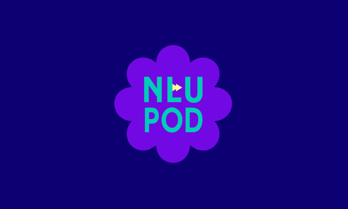
- Logo Symbolism: The design balances wordmarks and icons built around a flower form paired with a “play” symbol. I believe this combination is particularly effective because the flower suggests growth while the play icon anchors the visuals firmly in audio storytelling.
- Typography as Attitude: The pairing of Gelica with Edmondsans creates a balance between quirky expressiveness and functional legibility. I think Gelica injects warmth and personality while Edmondsans provides the structural clarity needed for informational content.
- Color & Emotional Impact: The palette is intentionally vibrant, combining Electric Grapes, Turquoise, and Lemon to create an energetic and optimistic tone. I appreciate how these high-contrast colors create a clear hierarchy across applications, from immersive podcast screens to social media assets.
- Graphic Language & Illustration: Sticker-inspired illustrations referencing conversation and activism introduce a sense of play that keeps the brand approachable. I believe these elements feel human and informal, which aligns the visuals closely with grassroots organizing culture.
What Brands & Designers Can Learn from Nothing Left Unsaid
1. Use Symbolism to Reinforce the Medium and Message
Blending a flower form with a play icon connects growth and dialogue directly to audio storytelling. Thoughtful symbols can communicate purpose instantly without over-explaining.
2. Let Typography Carry Emotional Tone
Expressive type paired with a clear, functional counterpart balances warmth and usability. Typography can signal values and attitude while still supporting everyday content needs.
3. Embrace Color and Play as Tools for Empowerment
Vibrant, high-contrast colors and sticker-like illustrations create optimism and accessibility. When playfulness feels intentional, it strengthens connection and lowers barriers to engagement.