Standout Features:
- Abstract green mountain-like mark
- Proven adaptability across diverse applications
- Bold geometric sans-serif type
When you're making that big leap from running a side business to launching it as a full-fledged brand, like Outbound Supplies and Rentals did around 2024, getting a professional, credible, and super versatile logo becomes essential for supporting that growth. Thus, Emily Anfinson Design LLC stepped in to create its distinctive identity system.
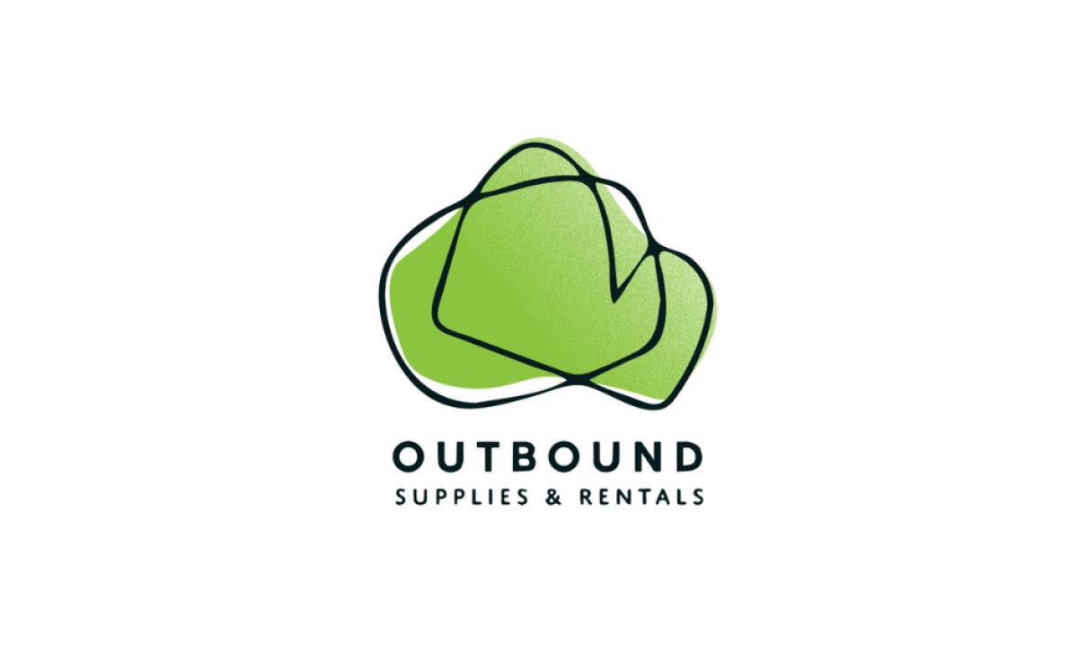
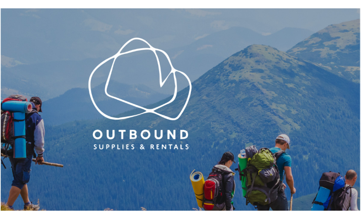
The logo's main anchor is this unique abstract mark made of a vibrant green organic shape with a continuous black (or white, in inverse versions) line overlaid on top. This line suggests a simplified mountain range or cleverly, abstract 'O' and 'B' letterforms of the brand name, hinting at the outdoors and adventure without being too literal or obvious.
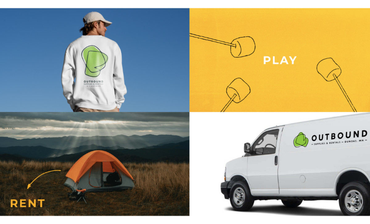
A big win for this logo system is its demonstrated flexibility in real-world use. You can tell it was designed with practical application considered: it looks good in full color, converts easily to simple line art for varied backgrounds, and scales nicely for everything from t-shirts to vehicle wraps.
Finally, the design uses clean, easy-to-read typography to look professional throughout. "Outbound" is set in a bold, geometric, all-caps sans-serif, making it a strong main identifier visually. The "Supplies & Rentals" descriptor below simply uses a lighter weight for clear hierarchy. This modern font choice feels reliable and clear.
For transitioning businesses, creating a strong professional services logo that adapts easily to different color needs, formats, and changing scales ensures consistent branding across all your new touchpoints. That kind of built-in flexibility makes for high impact brand presence everywhere the brand needs to appear — especially for an outdoors brand.