- Agency: Rivetry Design Studio
- Client: Pacific Northwest Defense Coalition
- Category: Logo – Professional Services
- Location: Portland, Oregon, United States
- Project Brief: Redesign PNDC’s logo to replace an informal, inconsistent identity with a unified, credible mark that reflects professionalism, coordination, and innovation within the defense sector.
Professional services logos need to project authority quickly and clearly.
The Pacific Northwest Defense Coalition logo does this by building symbolism into its structure and using disciplined geometry to represent unity and direction.
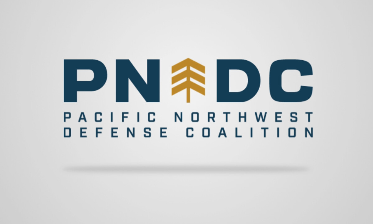
- Concept & Symbolism: I like how the identity replaces the “N” in PNDC with a vertical emblem that reads as both a chevron and a conifer form. That abstraction communicates growth, direction, and regional identity in a subtle way, without leaning on literal or illustrative cues.
- Form & Structure: Consistent stroke weights, tight spacing, and symmetrical construction give the mark a strong sense of order. I find that level of structural discipline appropriate for defense, security, and engineering-focused organizations, where precision and reliability matter.
- Color Strategy: A deep navy base establishes institutional trust and seriousness. I appreciate how the restrained gold accent is used sparingly to draw focus to the emblem, creating a clear hierarchy without adding visual excess.
- System Flexibility: The emblem functions well on its own across different layouts. I like that this system-driven approach allows the identity to scale across digital, print, and formal communications while staying cohesive and easy to read.
What Brands and Agencies Can Learn from Pacific Northwest Defense Coalition
1. Embed Core Identity Into the Wordmark
PNDC shows how integrating symbols into letterforms can strengthen cohesion and memorability while eliminating the need for detached icons.
2. Use Geometry to Signal Professional Rigor
Clear grids, consistent angles, and controlled spacing can visually reinforce reliability and coordination — especially important in high-stakes industries.
3. Design Logos as Systems, Not Just Marks
Creating emblems that function independently allows brands to build flexible, long-term identity systems rather than relying on decorative elements.