
- Agency: Underline Studio
- Client: Pape Salter Teillet
- Category: Logo Design — Legal
- Location: Toronto, Canada
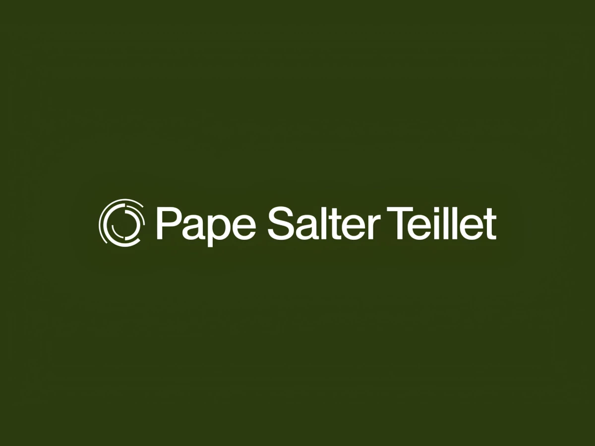
- Project Brief: Create a logo design that reflects Pape Salter Teillet’s long-standing work with Indigenous Nations through a symbolic system of arcs representing progress, partnership, and justice.
A legal logo trades on quiet authority, and the best ones say it without a gavel or a column. Pape Salter Teillet, an Indigenous-rights law firm branded by Underline Studio, reaches for that through a set of nested semi-circles that stand for a journey still underway.
The mark stacks incomplete arcs around an implied full circle, so the eye finishes the shape the design leaves open. That gap carries the meaning, marking progress made while pointing at the justice still ahead for the firm's Indigenous clients.
The restraint is deliberate, letting simple geometry and a clean wordmark do the talking instead of heritage clichés. It reads as serious and modern, giving a 45-year practice a current face without shedding its weight.
The concept is the strength and the exposure at once, since the arcs lean hard on the backstory to mean anything. A viewer who does not know the semi-circle rationale sees a tasteful abstract mark, and the justice symbolism stays invisible until someone explains it.