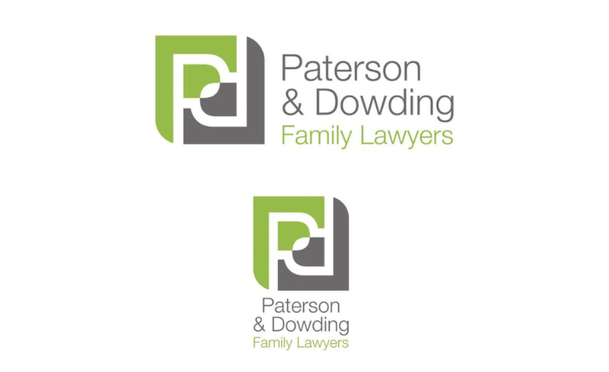
Standout Features:
- Interconnected "P" letters
- Contrasting color palette
- Straightforward sans-serif font
The logo design for Paterson & Dowding Family Lawyers by Pineapple Planet creates a powerful visual identity that reflects the firm's partnership and professionalism.
The design utilizes two interconnected "P" letters, mirroring each other to form a cohesive composition. Aside from representing Paterson and Dowding, this abstract symbol embodies partnership through the negative space between the letters, resembling a unified mark.
Additionally, the agency used a combination of green and gray for the logo's color palette to enhance its representation of the firm's core values. Green symbolizes growth and trust, while muted gray evokes stability and reliability.
Completing the design, the straightforward sans-serif font ensures the logo exudes professionalism while providing excellent legibility. The clean typography aligns with the firm's high level of expertise while reinforcing clarity and approachability.