Standout Features:
- Geometric emblem
- Sophisticated dual-tone color system
- Minimalist and professional typeface pairing
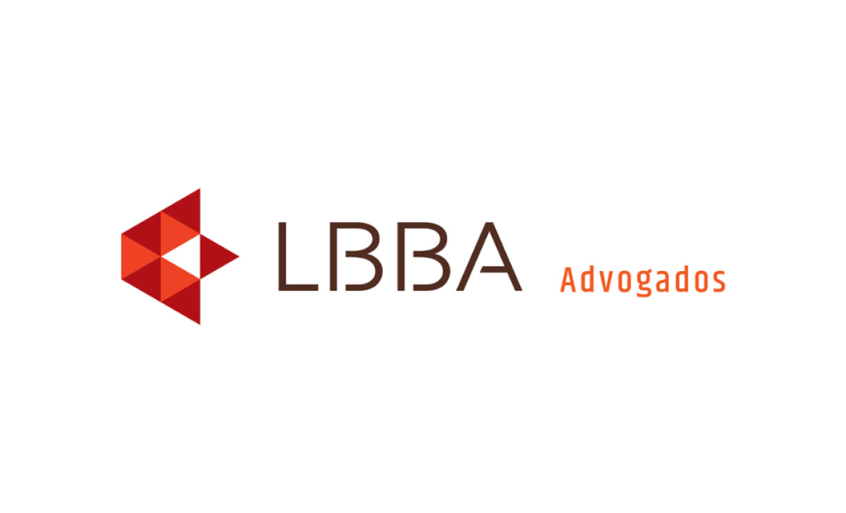
Visuh Design created this brand identity for LBBA Advogados, a law firm with a modern and strategic vision. Since 75% of consumers believe the 'look and feel' of a logo can make or break a company's success, the design is a standout in a traditionally conservative industry.
We like that this symbol rejects common legal logo design tropes like gavels or columns. It favors an abstract structure of triangular geometry that speaks to stability, logic, and balance — principles that are foundational to the law.
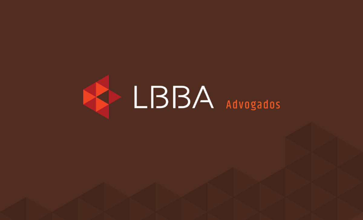
The identity uses a high-contrast palette of deep crimson and a saturated orange. On the light version of the logo, the logotype appears in a dark neutral brown for a classic, grounded feel.
At the same time, the pop of bright orange brings a sense of energy that is perfect for a forward-thinking firm.
The contrast between “LBBA” and “Advogados,” which differ in both color and weight, is a key detail. This typographic treatment helps to establish the firm as both approachable and rigorous.
Additionally, the combination of the clean type with the geometric mark results in a visually cohesive identity. It works well at all sizes and across all mediums.
LBBA Advogados is a bold and successful exercise in legal modernism. It proves that even the most tradition-bound industries can benefit from a fresh, modern, and strategic approach to branding.
It's a real challenge to create a brand in a traditional industry that feels new and exciting without losing any sense of trust.
That's why brands turn to expert partners, and our team has ranked the best agencies worldwide to make finding them simple.
Visit our Agency Directory for the Top Logo Design Companies, as well as:
Our design experts also recognize the most innovative design projects across the globe. Visit our Awards section to see the best & latest in logo design.