Standout Features:
- Artistic paintbrush motif
- Eye-catching red accents
- Professional and creative typefaces
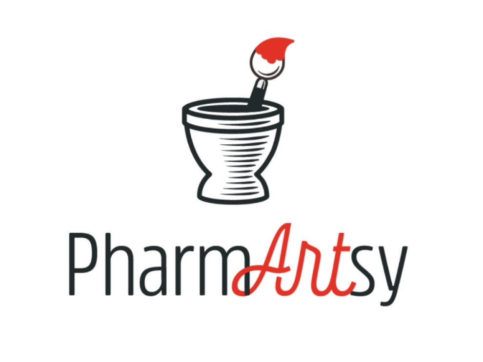
In PharmARTsy's imaginative logo, designed by Ryan Kerbs, traditional pharmaceutical imagery is given a creative twist. It features a sketched container, not for holding medicine but for cradling a paintbrush with its bristles dipped in vibrant red paint.
The contrast between the sleek and playful typefaces highlights the dual nature of PharmARTsy's brand identity. "Pharm" is depicted using a straightforward font that conveys reliability and expertise. Meanwhile, "ART" is rendered in a more whimsical, cursive style highlighted in red.
Such unique design marries the concepts of pharmaceutical care and artistic creativity, setting PharmARTsy apart as a brand that champions a holistic and enriched approach to wellness.
Get a chance to become the next Design Award winner.
SUBMIT YOUR DESIGN