Standout Features:
- Vintage-inspired typography
- Nautical imagery
- Earthy and organic color palette
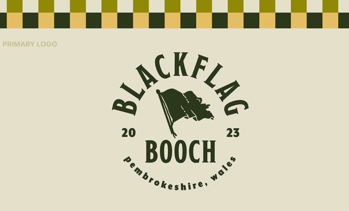
Blackflag Booch crafts innovative kombucha with an adventurous, pirate-inspired spirit, deeply committed to sustainability and ocean protection. Its logo by Dude Babe Design, with its clear nautical themes and earthy colors, perfectly introduces a brand that’s both rebellious and eco-conscious in the beverage industry.
The logo features vintage-inspired typography in a robust, all-caps serif font. This typographic choice evokes a sense of nostalgia and the rebellious spirit of pirates. The bold lettering powerfully asserts the brand’s confident presence and it's definitely a commitment to the brand’s theme.

You'll immediately notice the nautical imagery, most prominently an illustration of a pirate flag. This thematic imagery also cleverly ties back to Blackflag Booch's commitment to protecting the oceans, reinforcing its eco-friendly and adventurous core.
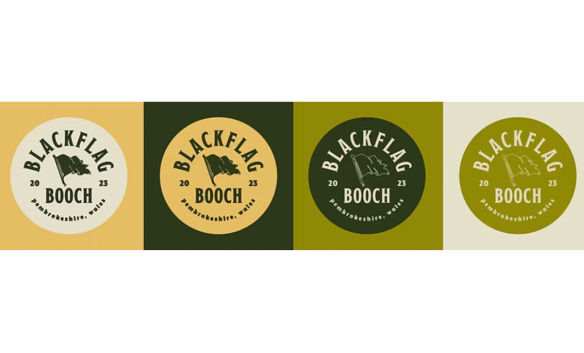
The design uses shades of green and yellow that reflect the brand’s focus on natural ingredients. These dark green and yellow tones are reminiscent of both nature and the sea: Green symbolizes health and eco-consciousness, while yellow adds a complementary touch of energy and adventure, making the logo feel fresh and authentic.
Dude Babe Design masterfully integrated Blackflag Booch's brand story — adventure, rebellion, ocean love — directly into the logo’s imagery and typography. This is a powerful takeaway for any brand: a logo that tells a story is far more engaging and memorable than one that simply displays a name.


