- Agency: Joy Stain
- Client: Poʻokela Communications
- Category: Logo Design — Technology
- Location: San Clemente, California, United States
- Project Brief: Create a culturally respectful and modern logo for a Mobi PCS wireless program exclusively serving residents of Hawaiian Home Lands (DHHL).
Technology logo design should translate complex values into a singular, balanced form that remains functional across all scales.
Poʻokela Communications succeeds by utilizing a series of visual experiments that prioritize structural integrity and community accessibility over digital ornamentation.
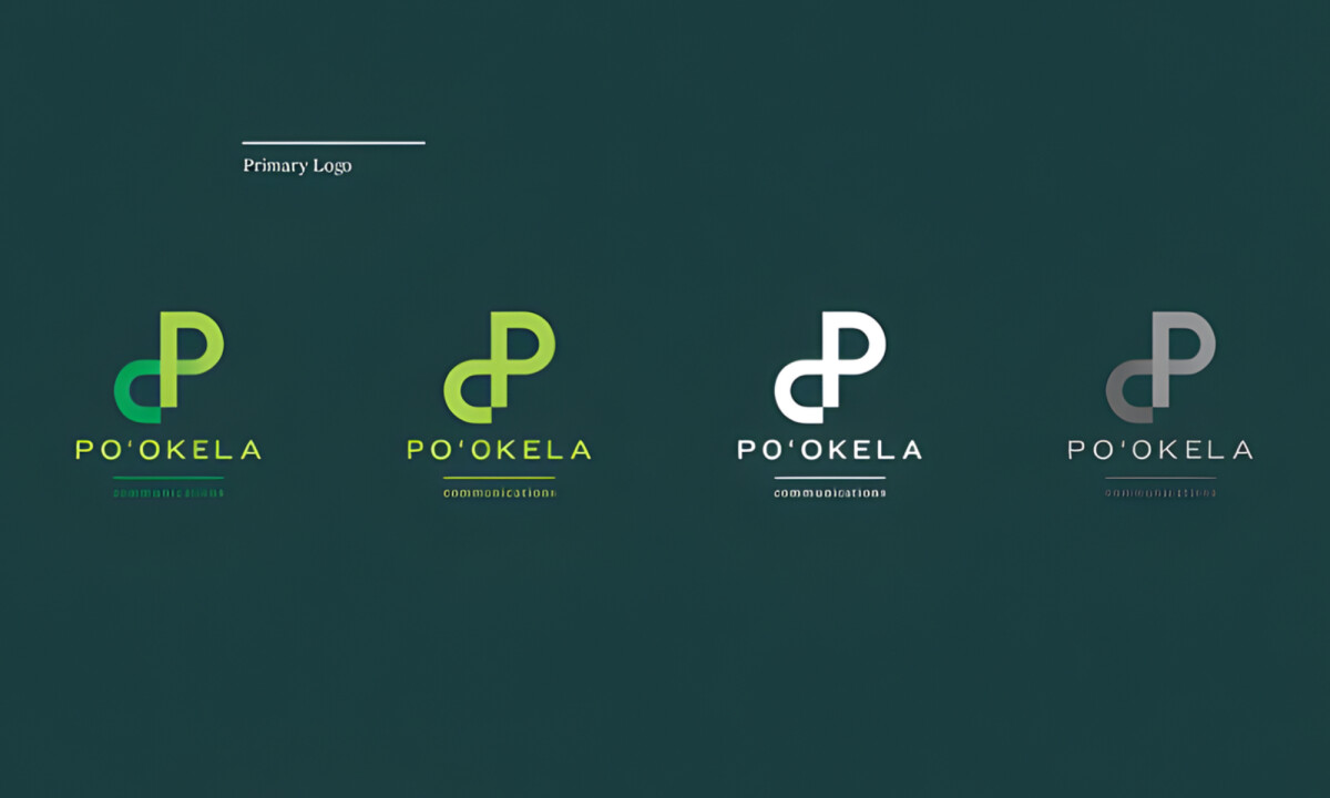
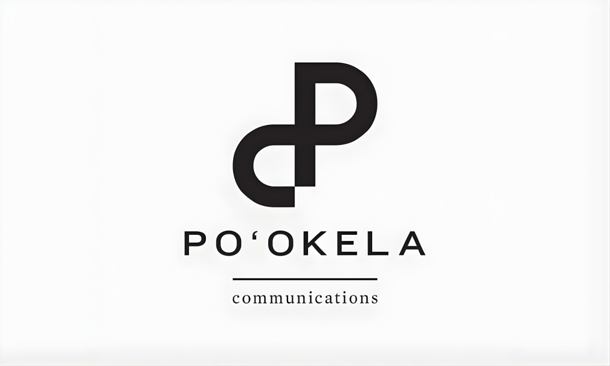
- Concept & Symbolism: I like how the interlocking “P” form communicates continuity and service through balanced geometry. These softened curves introduce an approachability that is essential for a community-focused professional services brand.
- Typography System: I appreciate the use of Knockout to establish strength and legibility across all digital touchpoints. Pairing it with Mercury adds a refined, human tone that balances functional communication with necessary brand warmth.
- Color Strategy: The green-forward palette successfully anchors the brand in themes of growth, vitality, and trust. I find that the secondary accent colors provide the flexibility needed for sub-programs while maintaining overall coherence.
- Construction & Scalability: I like that the mark is built on a precise grid system to ensure consistent proportions. This disciplined construction allows the logo to scale seamlessly across devices and signage without losing its visual integrity.
What Brands & Designers Can Learn from Poʻokela Communications
1. Use Geometry to Communicate Connection and Reliability
Interlocking forms visually reinforce continuity, service, and structure. Balanced geometry can express trust without feeling rigid or impersonal.
2. Pair Functional Type with Human Tone
Strong, legible typography ensures clarity across digital use, while refined secondary type adds warmth. Thoughtful type systems help technology brands feel both capable and approachable.
3. Design with Scalability Built In
Grid-based construction keeps proportions consistent across screens and signage. Precision in form ensures long-term flexibility without visual degradation.