- Agency: Prznt Perfect
- Client: Quantum Security Company
- Category: Logo Design — Technology
- Location: Dover, Delaware, United States
- Project Brief: Create a technology logo and visual identity for Quantum Security Company that communicates scientific rigor, cybersecurity expertise, and probabilistic computing through abstract graphics, a distinctive cyan palette, and a flexible brand system.
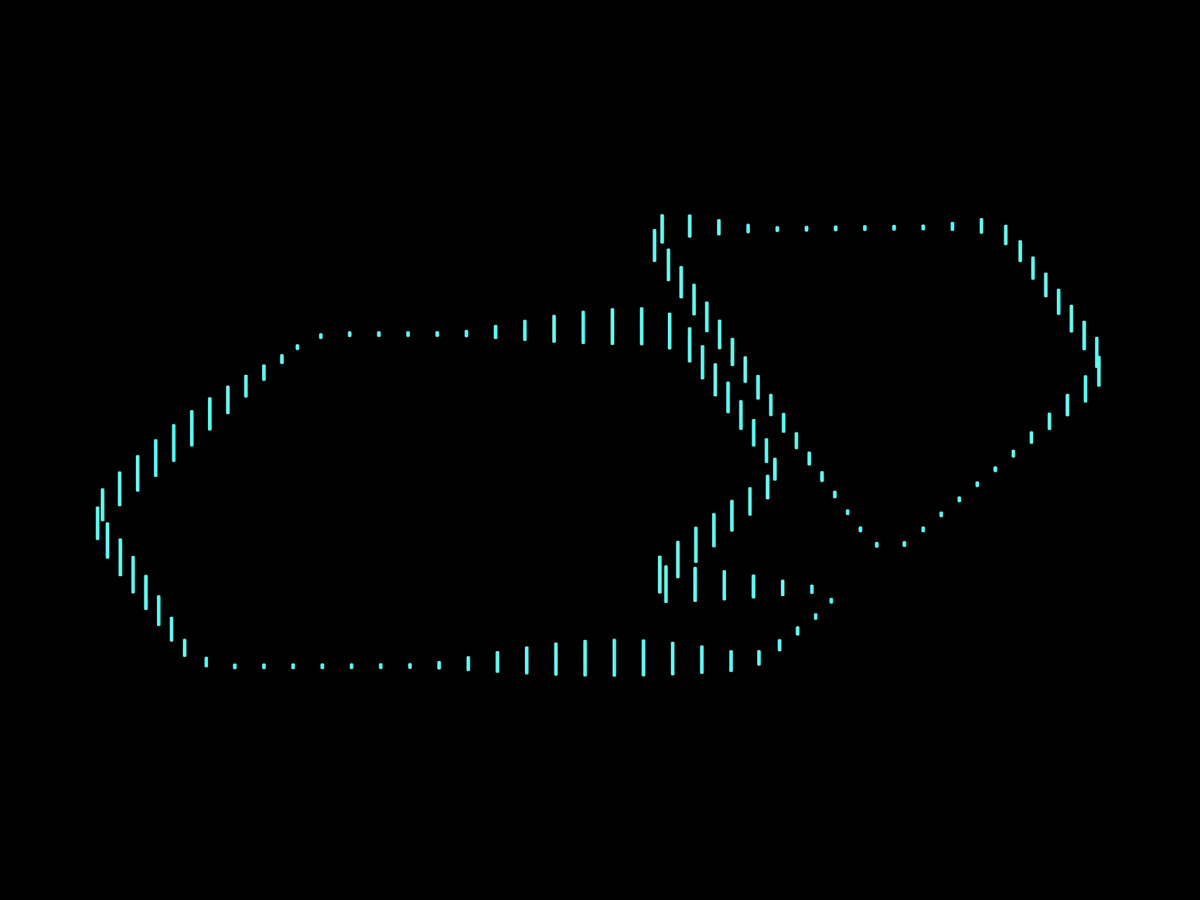
Deep tech companies heading into a funding round want a technology logo that looks as mature as their science. Prznt Perfect gave Quantum Security Company a mark built from two rounded hexagons that spell out its initials.
The Q gets a short notched tail, and the company name sits right inside its open space. Leaving out the usual atoms and orbits keeps the mark quietly confident, one of the core attributes set during strategy workshops.
In motion, the outline breaks into cyan dashes that stretch and shrink as they trace the shape. That shifting rhythm points to probability and photonics, so the mark reads as precise and a little unpredictable at once.
On a lapel pin, the shape gets a teal enamel fill and a polished metal edge. Business cards blind-emboss it into white stock, so the investors you hand one to can feel the brand before they read a word.