- Agency: Oliver Grace
- Client: Redheads
- Category: Logo Design — E-Commerce & Retail
- Location: Melbourne, Australia
- Project Brief: Create a modern logo and identity system that preserves Redheads’ heritage while refreshing the brand for contemporary audiences.
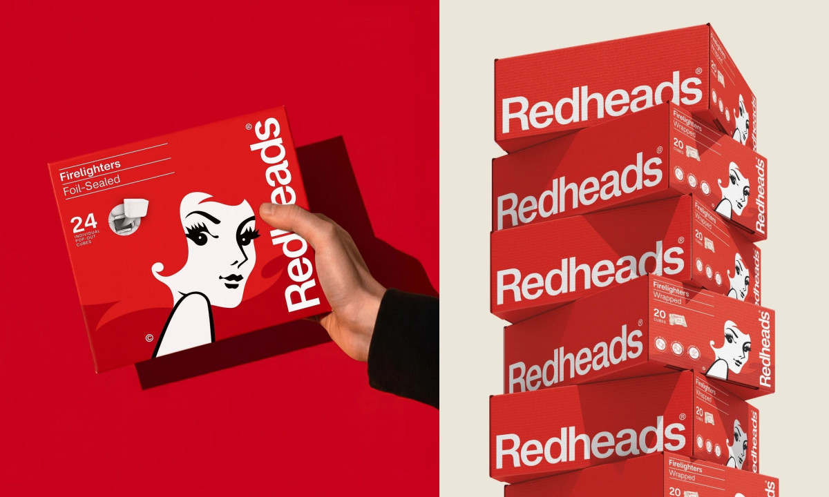
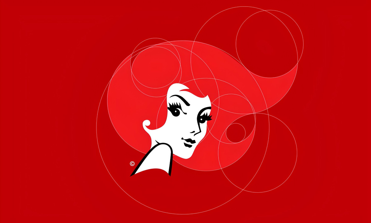
A logo redesign for a heritage brand walks a narrow path: change too little and it stagnates, change too much and it loses the thing people actually connected with. Oliver Grace finds that line for Redheads by giving Ms. Redheads enough of a modern edge to feel current without touching what made her recognizable in the first place.
Australians have been picking up this box since 1946, and that history informs every design decision. Archival reds and whites keep the palette honest, and contemporary typography moves just far enough forward that the brand reads as considered rather than preserved.
A flexible Swiss grid system and archival wordmarks give the identity the structural discipline to hold together across matchboxes and digital storefronts without flattening into something generic. Oliver Grace built the system with range in mind, and it shows.
Redheads steps into e-commerce looking like a brand that has always known what it is. Applying 1970s design principles with precision, the agency delivers an identity that doesn't feel like it's catching up to anything.