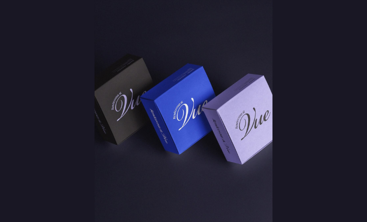
Standout Features:
- Elegant, multifaceted typography
- Layout that focuses on the "At Vue" placement
- Clean design
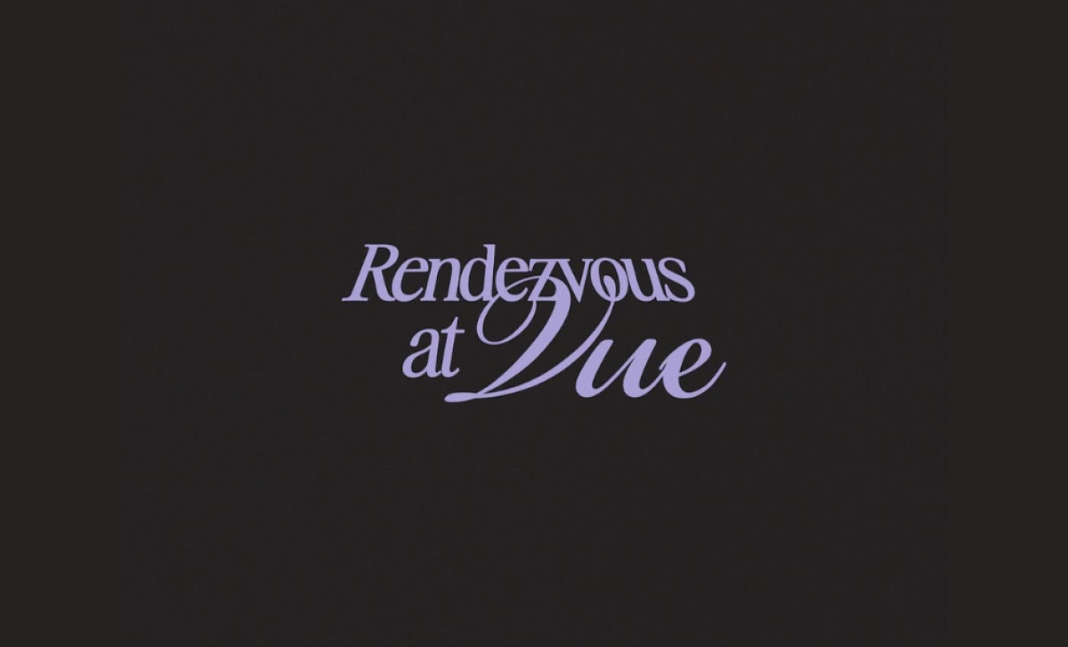
Perched atop Hotel Washington with breathtaking views of D.C., the premium Vue Rooftop venue sought Ayanni.psd’s help in creating its Rendesvous at Vue series. But how could one distill the energy of D.C.'s skyline, as well as the brand’s stylish ambiance, seasonal cocktails, and elegant dishes into a single logo?
Ayanni.psd started with leveraging an elegant typography. This cursive, script-like typeface conveys a sophistication that perfectly mirrors the upscale atmosphere at Vue. More interesting however, is how the typographic differentiation of all the words, especially the text, "At Vue," make the viewer remember the name of the location.
On the other hand, to highlight the venue's unique selling point — its prime location — Ayanni.psd strategically positioned "at Vue" in the logo. By placing "Vue" as a separate, emphasized line below "Rendezvous," the logo immediately establishes "Vue" as a specific location — specifically, the only place to be.
Aside from aesthetics, the logo's efficient design, characterized by its clean and simple form, allows for practical applicability too. Regardless of whether the logo appears on digital platforms, promotional items, or physical displays, it’s readable while still managing to maintain the elegance its type and form strived to achieve.
More than a hospitality logo, The Rendezvous at Vue logo functions as an invitation too. To “renezvous at Vue” establishes a sense of place, but also a moment in time (not to mention the rhyme that just rolls off the tongue). It marks a destination, a gathering, creating a sense of place without relying on literal imagery.