Standout Features:
- Illustrative architectural mark
- Elegant typographic hierarchy
- Sophisticated color palette
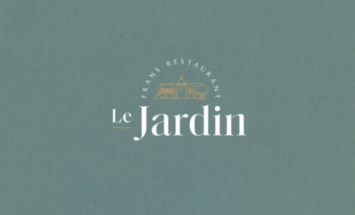
Restaurant Le Jardin offers an intimate, homey fine dining experience within a former residence. Knapper Design crafted the logo to embody this unique fusion. The branding visually translates the restaurant’s distinct setting and philosophy, inviting guests with refined yet welcoming hospitality from their first encounter.
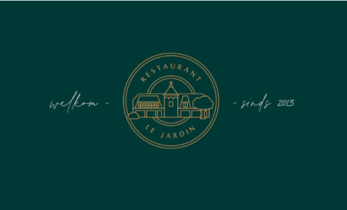
The logo's heart is an illustrative architectural mark: a delicate line drawing of a classical house with garden elements in warm golden ochre. This custom illustration recalling the actual building has a fine monoline style that reinforces the "house" concept and establishes instant location recognition.
The primary logotype uses a modern high-contrast serif for "Jardin." This stately presence, paired with a similar but smaller "Le," evokes French luxury, while a handwritten script for supporting phrases adds a personal touch. This careful pairing adds emotional layers, suggesting Le Jardin is equally about heritage and heart.
The design employs a sophisticated color palette, featuring muted, botanical-inspired hues like dusty blue-gray and deep pine green. The calm blue-gray is ideal for fine dining, while the green resonates with the "garden" name. Accented with warm ochre and white, the palette sets expectations for a curated, refined dining experience.
Most notably, the custom architectural illustration in Le Jardin’s logo is a powerful differentiator. This is a key takeaway for restaurant logo design: bespoke artwork rooted in your brand’s unique attributes — like its physical building — can create a deeply personal and memorable connection.