Standout Features:
- Minimalist and sophisticated logo design
- Modular, adaptable brand identity
- Creative use of transparency and layering
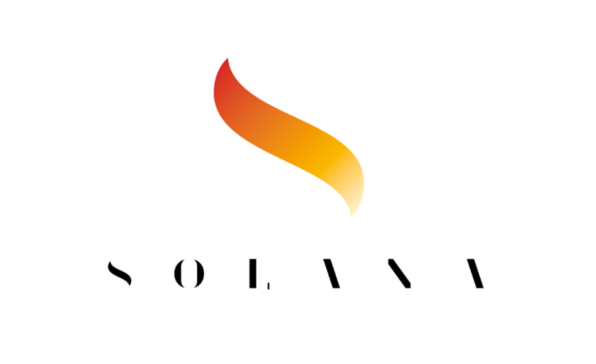
Restaurante Solana, a distinguished dining destination in Cantabria, Spain, is known for its Michelin-starred cuisine and its unique fusion of traditional and contemporary flavors. The logo, designed by Lamecha, captures this blend of history and modernity, creating a corporate identity that evolves with the restaurant’s heritage.
The logo itself is a masterclass in minimalist design. It features a smooth, flowing icon that represents the establishment's elegance while remaining highly legible. Additionally, the clean shape evokes both elegance and warmth, setting the tone for a refined yet welcoming brand identity.
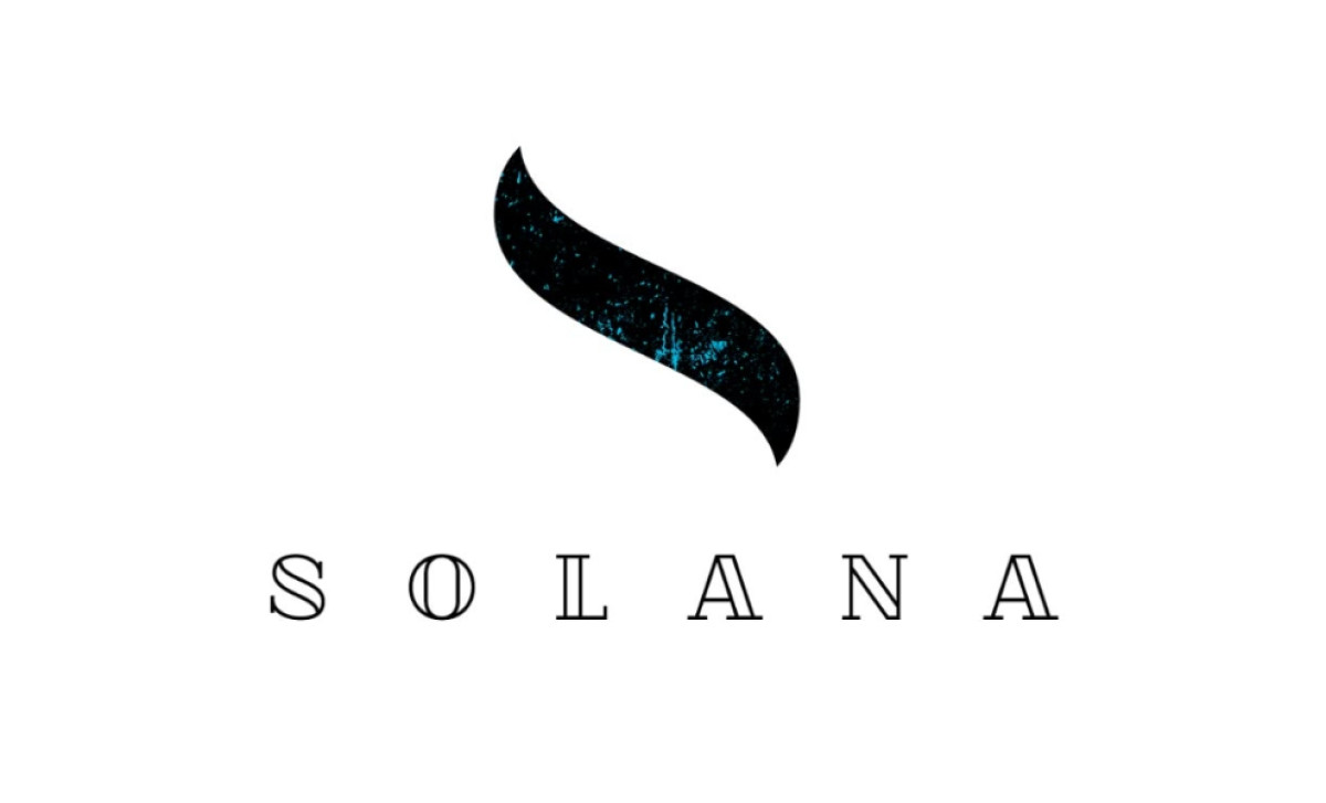
The modular approach taken to the brand identity allows for seamless integration across various platforms. The logo adapts to different settings — whether it’s the more sophisticated version for the fine dining restaurant or the traditional version for the casual bar.
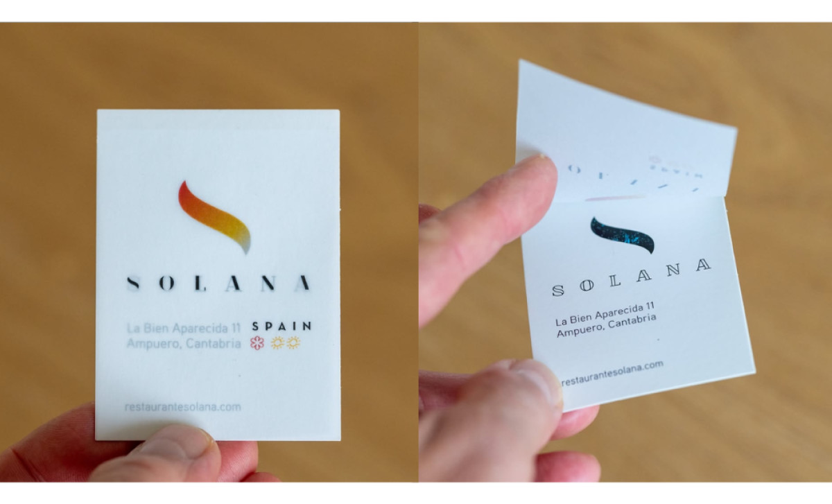
Another striking element of the design is the clever use of transparency. In its print form, the logo can be seen through a thin sheet of translucent paper, where the outline logo beneath subtly comes through. This use of layering emphasizes the logo’s minimalist aesthetic while giving it an extra dimension that feels modern and sophisticated.
Lamecha’s work for Restaurante Solana not only meets the needs of the brand’s varied offerings but also sets the establishment apart with its elegant, innovative design solutions. Through minimalist sophistication and creative material choices, the hospitality logo perfectly embodies the restaurant’s blend of tradition and innovation.


-preview.jpg)