- Agency: Moonshot Ventures
- Client: Rune Technologies
- Category: Logo Design — Startup
- Location: San Francisco, California, United States
- Project Brief: Create a logo design for Rune Technologies that communicates strength, speed, and innovation through a versatile identity suited to digital and physical applications.
A defense startup faces an odd branding problem. It needs to look cutting-edge without spooking a military buyer who distrusts flash, and Moonshot solved that for Rune Technologies with a single Norse rune that signals heritage and precision at once.
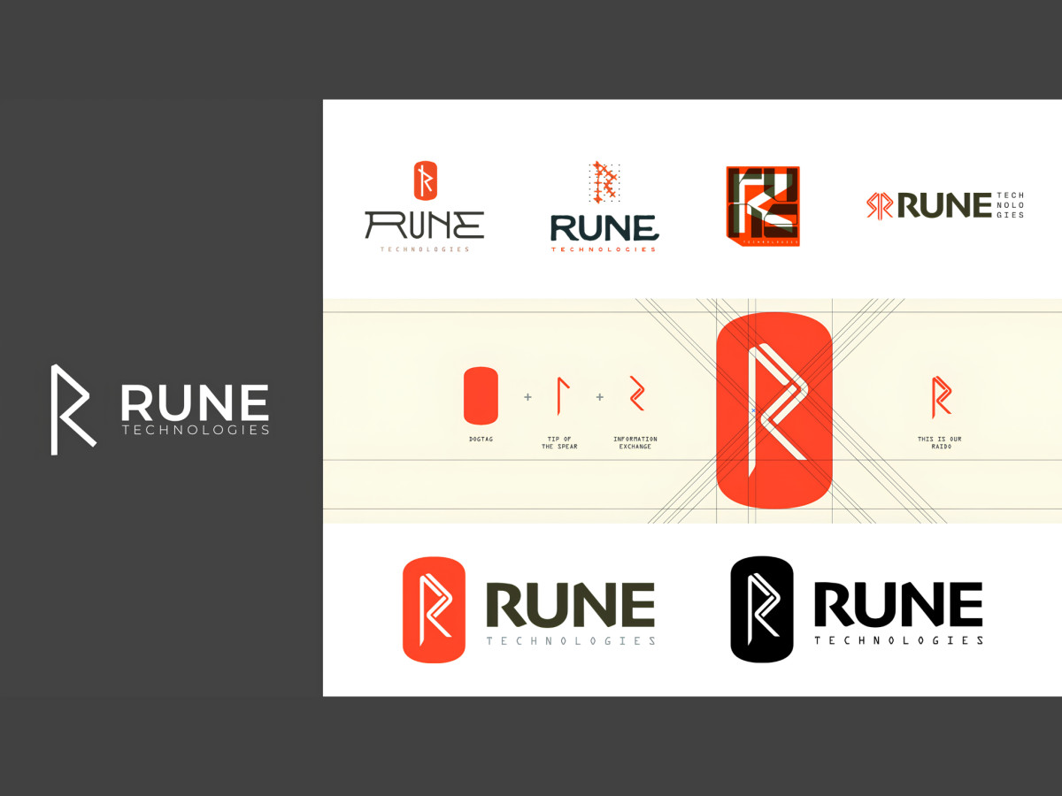
The symbol borrows its shape from the Raido rune, redrawn as a modern monogram. Angular strokes fold into an R inside a rounded tag, so ancient meaning and a clean tech glyph land in the same form.
That rounded container does double duty as a military dogtag. The pill frames the letter the way a soldier's tag frames a name, a service cue that needs no eagle or weapon.
Look closer and the R carries more than one idea at once. Moonshot drew it from a dogtag crossed with a tip-of-the-spear stroke and an information-exchange rune, so logistics and force sit inside the geometry.
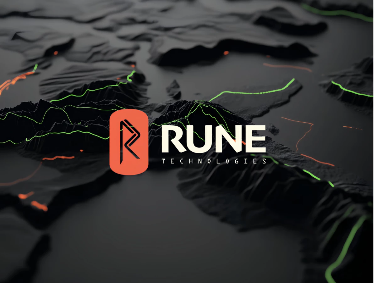
Color leans on a hot orange against deep black, with a signal green accent. Set over the terrain-map backdrops, the orange reads alert and field-ready, a long way from the corporate gray the category settles for.
The lockup sets the rune beside a condensed, squared-off wordmark. RUNE sits in a technical sans with TECHNOLOGIES spaced beneath it, and the engineered tone matches the mark instead of fighting it.
It also holds up in solid, reversed, and single-color forms, which matters more than it sounds. The same mark has to carry a pitch deck one day and a uniform patch the next, and this one manages both.
Most defense brands reach for a shield or an arrow. Rune reached for a rune, something with real meaning behind it, and that choice lets a young company read as where the category is headed rather than the newest name on the vendor list.