Standout Features:
- Sustainable and modern symbolism
- Clean and professional typography
- Versatile branding across platforms
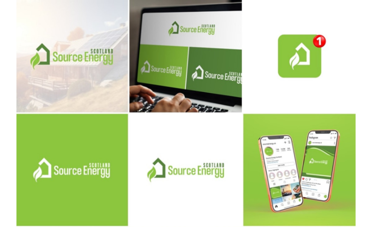
Scotland Source Energy is a renewable energy provider focused on sustainable power solutions for homes and businesses. Their logo, designed by Creative Thinkers, perfectly captures the essence of their brand with a clean, professional look that appeals to a wide range of clients seeking energy-efficient solutions.
The logo features a combination of a leaf and a house, which effectively communicates the company’s focus on green energy for residential and commercial spaces. The leaf element symbolizes sustainability and eco-consciousness, while the house represents the target market of homeowners and businesses.
Typography plays a key role in the design's professionalism. The bold, sans-serif font conveys strength and trust, aligning with the company's commitment to reliable and innovative energy solutions. The clean typeface ensures easy readability across various applications, from business cards to digital platforms.
The logo adapts well to multiple branding materials, including business cards, social media icons, and website headers. The use of green reinforces the eco-friendly message, making it stand out against different backgrounds. This flexibility allows Scotland Source Energy to maintain a consistent brand presence across all media.
The Scotland Source Energy logo effectively communicates the company's values of sustainability, trust, and professionalism. It is a prime example of the best professional services logo design for the energy sector, offering a sleek and modern identity that appeals to the target audience and strengthens the brand's message.