The Property Cayman Symbol Showcases The Brand’s Real Estate Offerings
Property Cayman is a real estate company based in the Cayman Islands. It was founded in 2003 and is a part of the RE/MAX real estate group. The team at Property Cayman have always been passionate about helping people buy and sell property in a fast, efficient and stress-free way.
But with changing times, the real estate group found themselves in need of a facelift and underwent a rebrand to connect more fluidly with its clients.
The rebrand of Property Cayman elevated this real estate company from the Cayman Islands to the high-level clientele it was looking to meet. And one of the most notable parts of the rebrand can be seen in its logo design. It's sophisticated, modern, and classy without looking unapproachable.
And it’s full of depth that keeps you invested.
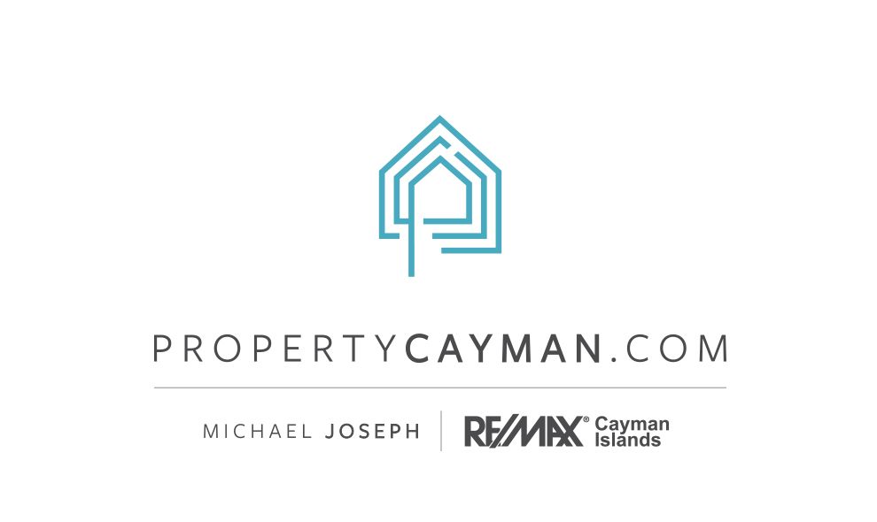
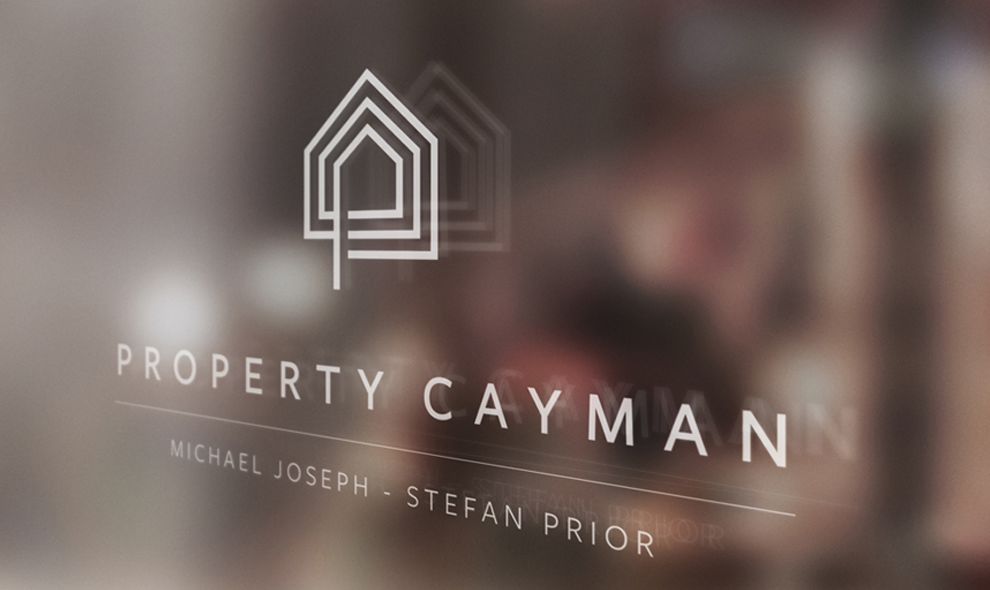
The Property Cayman logo is made up of two parts — a wordmark and a symbol. This is a very traditional route to go when it comes to logos, and Property Cayman isn’t afraid to show off its traditional persona and powerful roots.
The symbol that stands proudly above the wordmark takes on the shape of a house, but it is created in an almost optical illusion-like way with the house shaping repeating around the original image.
The image is made up in a light, crystalized blue that almost reminds you of the clear blue waters surrounding this island destination.
It’s peaceful and serene yet striking and poignant. And it definitely calls back to the brand’s own services — helping people buy and sell homes.
This is very different from the RE/MAX logo we all know and recognize — the red, white and blue hot air balloon. But that’s a good thing because it shows that this branch of the real estate company is geared towards a more high-end clientele without sacrificing the authority of the RE/MAX name.
The wordmark is a very basic wordmark that uses a sans-serif font, a black coloring and thin lines to showcase the brand’s name. In some instances, you’ll see the website included in the wordmark. And sometimes, you’ll see the word Cayman bolded in a way that is very pronounced and eye-catching.
There is an elegance and a refinement to this simplicity and this delicate nature. But that doesn’t mean this logo, nor this brand, shouldn’t be taken seriously. In fact, quite the opposite. This wordmark helps to solidify the real estate brand’s own prominence and prestige. It’s an organization of real estate agents committed to making sure you can find the home of your dreams.
This logo was created in order to broaden the audience pool of the company. It was created because Property Cayman wanted to reach out to more high-end clientele. This is an island, after all, and these properties aren’t cheap. So they wanted to make residents and visitors feel comfortable. They wanted a symbol that was trustworthy, modern and chic — one that would show people that they understood the expensive market and could still get the job done.
And this symbol does just that.
This logo design screams real estate, and it is very easy to see why the brand wanted to give their own identity a facelift to connect with a wider audience pool.
A Hidden Monogram Lies Inside The Property Cayman Logo, Making It A Welcoming Symbol
We talked briefly about the Property Cayman symbol that exists on all of its promotional material. It is the main image of the brand and really radiates a luxuriousness and a sophistication.
But this delicate house symbol is more than just a house.
At first glance, the symbol gives the impression of a house. But upon further inspection, users might discover a monogram hidden within the lines of the structure that circle around geometrically. The letter "P" is the easiest to spot, but a "C" can also be spotted with more investigation.
The “P” is hidden right at the core of the design. And it’s the most noticeable letter to pick out because the straight line of the “P” extends down past the rest of the image.
The “C” circles this “P”, though it is a bit harder to pinpoint. And this creative monogram adds a classy, regal vibe to the entire symbol and the entire brand that also emphasizes the real estate company’s ingenuity.
But that’s not all. This symbol also resembles a maze — much like the property hunt that Property Cayman will guide you through.
Also, notice the open space created by the leg of the letter "P," which appears like a blueprint-style open door, welcoming the user into their new home. The symbol is paired with a modern san serif font in all caps, which represents the force and structure of the company — always moving forward. However, the welcoming hues of pastel gray and teal balance the strength and make the logo welcoming.
Overall, this symbol — full of hidden meaning — is meant to be inviting. And it really does invite you in, pulling you closer and demanding you to stand at attention. The more you unpack this image, the better you feel about the company. And the better you feel about making the decision to sell your home for something new.

What Is Property Cayman?
Property Cayman is a real estate organization. It’s a subsidiary of the RE/MAX real estate group and was founded in 2003. It’s one of the largest real estate groups in the Cayman Islands and brings with them not only the authority of a real estate brand that’s been in business for 15 years but the legacy of the RE/MAX real estate empire as a whole.
But Property Cayman stands out. It still has its own identity and stands out from its parent company in an exciting and invigorating way.
According to the brand:
TEAM Property Cayman at RE/MAX was founded in 2003 with the desire to make a positive impact in the experience people have when buying and selling real estate in the Cayman Islands. We believe that real estate is more than a simple transaction between buyer and seller. It is about how the investment will affect your family, your lifestyle and your future. Our customer’s happiness and desires are always at the forefront of our minds. Ensuring all their needs are considered is a key element to how we go about finding the best locations for our clients. Our company has been built on a set of values that we believe separate us from other agents in our industry. We believe in celebrating the choices available. Our attention to detail, our effort to develop strong connections in the community and by providing the little “extras” for our customers, are all efforts to deliver the highest service standards. Work throughout all of our interactions is how we demonstrate our choice to strive to be the best real estate professionals in the Cayman Islands.This real estate brand has built a strong community around them and they want to keep building that community, strengthening those bonds and growing their reach. And this logo is a great way to get them there.
It fits right in with the feel of the island itself and fluidly brings all marketing materials and designs together. The website is one that is compelling and engaging — and this logo helps to give it that modern edge.
For such a professional brand, logo and brand identity matters. And this one steals the show.
The Property Cayman Logo Design Was Created With Its Clients In Mind
The Property Cayman logo is a sophisticated symbol that shows off the brand’s authority and excellence in the real estate industry.
The logo is made up of two parts — a wordmark and a symbol. The wordmark is simple, straightforward and clean. It’s a minimal design that shows off the brand's strength, structure and process.
The symbol is a bit more intricate and creative. At first glance, it looks like a chic-looking house made up of geometric shapes. But the closer you look, the more you see. As you keep searching, you find a monogram of the brand name embedded in this house shape. And the shape starts to take on the look of a maze that is taking you on a journey through your house hunting.
It’s a clever symbol that emphasizes the brand’s services in a stunning and captivating way. It uses the brand’s own legacy and parent company to give it that initial credibility but goes a step further with its design to really promote its own, unique identity to its separate audience. Make sure to check out our article on best real estate logo designs.
Build your own stunning logo design with the help of these logo design and branding studios!