- Agency: SlabPixel
- Client: Sendit
- Category: Logo Design — Distribution
- Location: Sleman, Indonesia
- Project Brief: Create a logo design for Sendit that communicates connection, speed, and simplicity through a flexible visual identity for logistics and e-commerce.
Logo design for a logistics platform has to make a fragmented process feel like one connected thing. SlabPixel gives Sendit a modular mark that pulls the whole distribution world, couriers, routes, and businesses, into a single interlocking symbol.
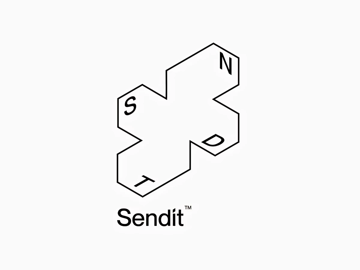
The logomark reads as a map and a crossroads at once. An isometric plus shape places N, S, T, and D at its arms like compass bearings, so the idea of routing packages in every direction lives right in the form.
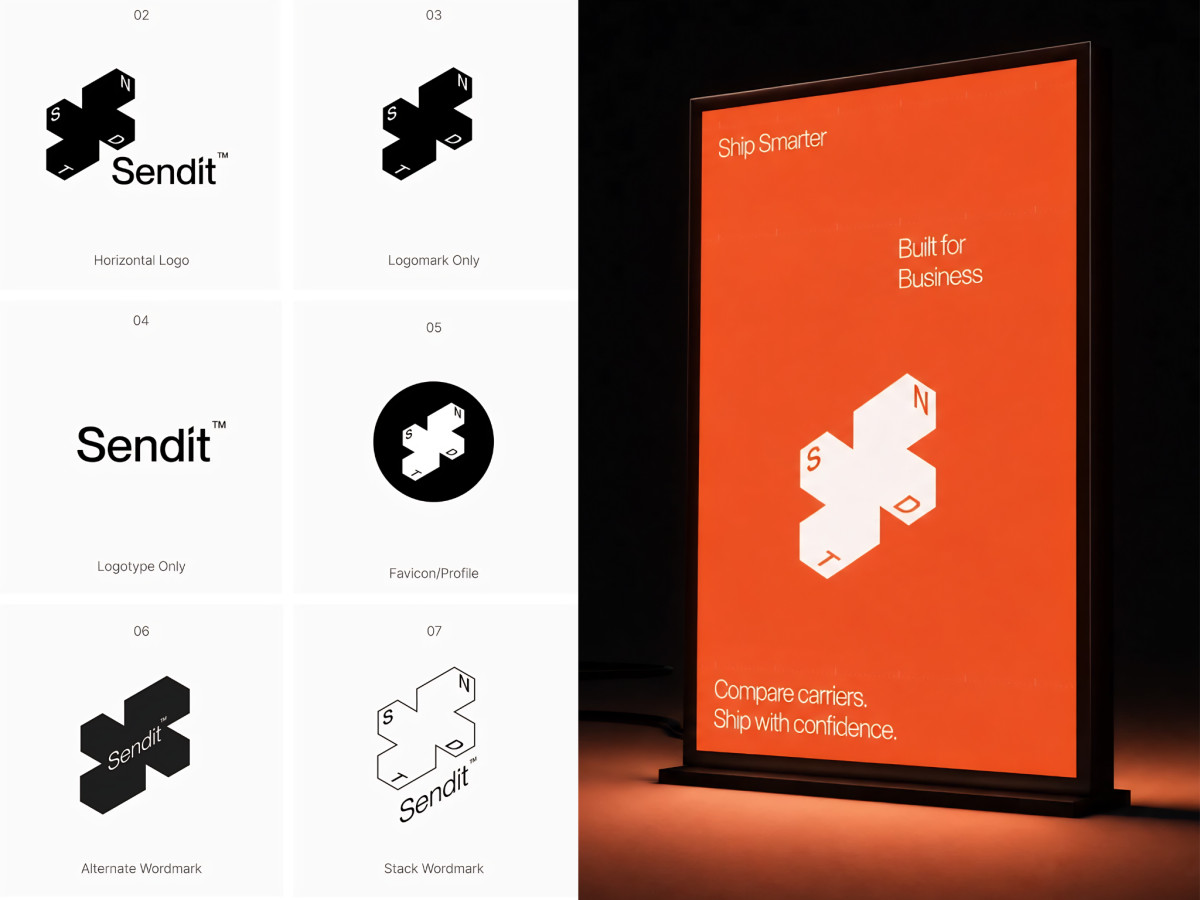
The system flexes across every use. Horizontal lockup, logomark, favicon, and stacked wordmark all draw from the same shape, giving the brand a consistent presence from a profile avatar to a full sign.
The palette stays mostly monochrome with one loud accent. Black-and-white lockups keep things clean, then signal orange takes over on the “Ship Smarter, Built for Business” poster, so the identity reads calm up close and punchy at a distance.