Standout Features:
- Witty references
- Simple yet dripping with personality
- Professional design
The next design on our list of the best SEO agencies' logos proves that SEO can be fun!
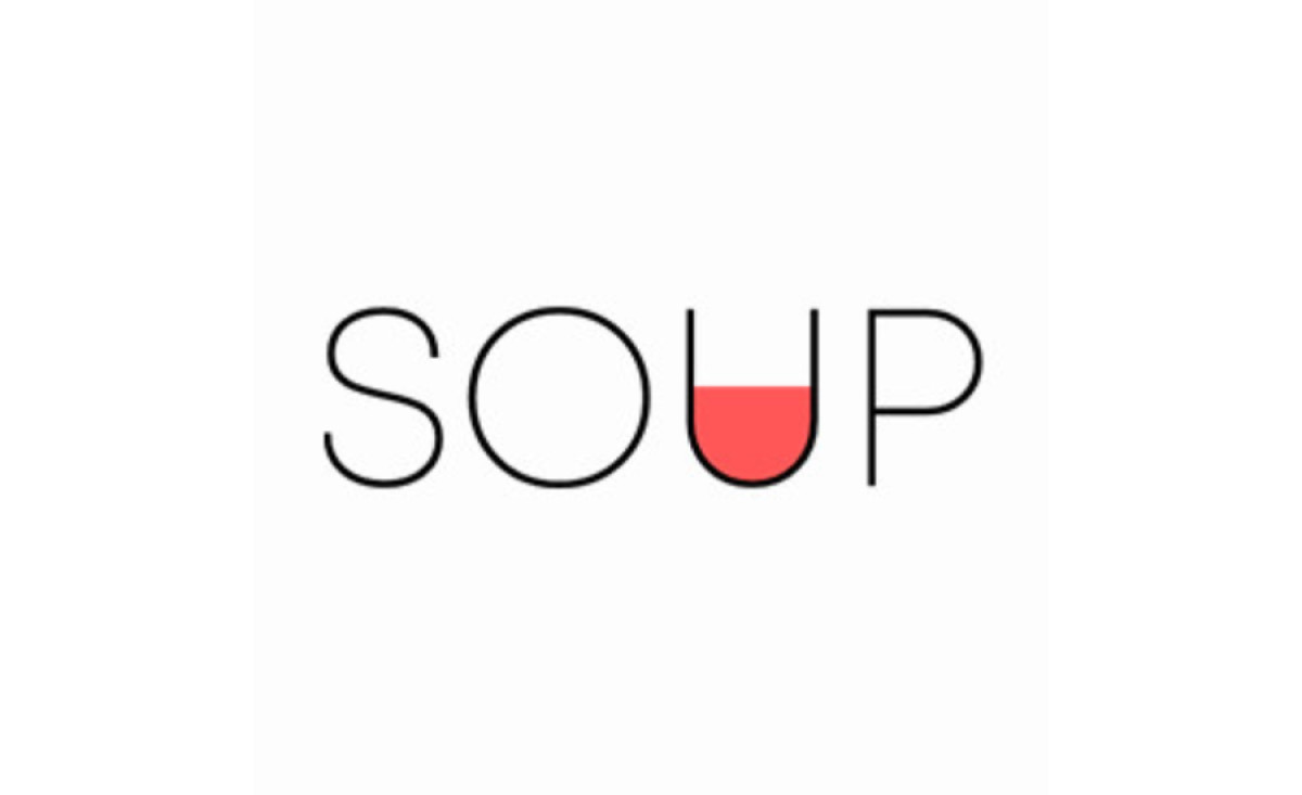
For SOUP Agency, their logo design is a perfect balance between professionalism and wit. The name itself is already clever, but the subtle references in the design take it to the next level.
The bowl-shaped lettering, especially in the U part, and the bright colors make for an eye-catching logo that stands out from other symbols in its niche.
The logo's attention-grabbing orange color resembles tomato soup, a brilliant nod to the agency's name. We also know how soups set the user's appetite, so this design will attract potential customers.
Overall, it's a simple yet creative logo that speaks volumes about the agency's personality.
Get a chance to become the next Design Award winner.
SUBMIT YOUR DESIGN


