Sparkgeo logo design by 44 Below.
Sparkgeo’s logo system pairs minimal structure with subtle motion cues to reflect the precision and intelligence behind geospatial analytics. Designed by 44 Below, the identity balances stability and energy to represent both geographic structure and dynamic data flow.
Sparkgeo logo design by 44 Below.
A refined wordmark and geometric starburst signal geospatial precision
Sparkgeo logo design by 44 Below
The scalable mark balances authority and innovation across applications
This website uses a colour palette of 4 colours
  • #FFFFFF
  • #FBFA4F
  • #DE2541
  • #000000
Technologies & Tools
Description
Team Behind the Design
  • Agency: 44 Below
  • Client: Sparkgeo
  • Category: Logo Design — Professional Services
  • Location: Dover, Delaware, United States
  • Project Brief: Develop a refined, scalable brand identity for Sparkgeo that reflects technical sophistication, geospatial precision, and innovative data-driven solutions.

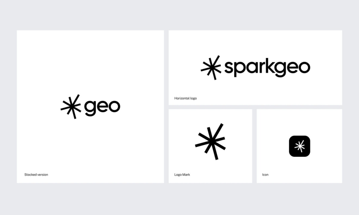
Effective professional services logo design must communicate authority while signaling innovation. Sparkgeo achieves this through a restrained wordmark paired with a geometric starburst mark that suggests mapping coordinates, data nodes, and directional expansion. 

Ready to elevate your designs?