Standout Features:
- Bold and modern typography
- Compact vertical text stacking
- Legibility across print and digital platforms
The State of the Industry logo, designed by Good Grit Agency, is a bold visual statement that reflects both the power and energy of the film industry.
The type-driven design leans on custom geometric sans-serif typography, giving the logo a commanding presence.
This choice aligns with digital-first branding strategies where clean and modern sans-serif fonts are preferred, making up 61% of fonts used on websites today. Their clarity and legibility make them effective in digital and event environments where instant recognition is key.
What stands out immediately is the compact and stylized placement of “OF THE” nestled vertically beside “STATE.” While minimal, this detail adds visual tension and steers the composition away from standard layouts, giving it an editorial edge.
The color palette remains largely monochromatic but is energized by a vivid red-orange-to-yellow gradient in the lower left corner.
Even when placed under different backgrounds, the stark white typography delivers high contrast, ensuring strong legibility across print and digital mediums.
This burst of color suggests motion and creativity – a clever nod to the dynamic nature of the film and entertainment industries that the event serves.
The subtle warmth of the gradient also balances the cooler precision of the type. It adds an emotional touchpoint to the otherwise assertive identity.
The logo not only anchors the brand visually but also supports the larger ecosystem built by Good Grit Agency.
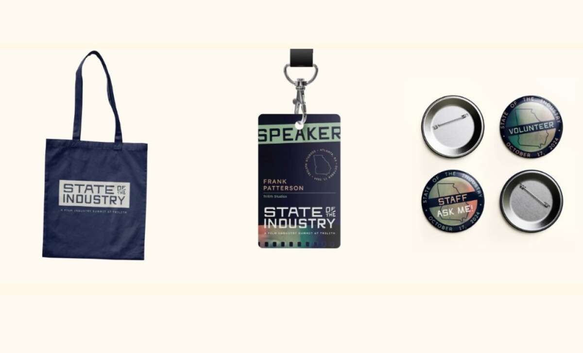
The typographic identity proved versatile across platforms, effectively translating to digital ads, social media campaigns, and even event-day collateral and promotional items like tote bags and button pins.
By embedding the logo into a broader visual system, Good Grit Agency ensured the event felt cohesive, credible, and forward-looking. The success of the 2024 event, which reached full capacity and generated future demand, is a direct reflection of this holistic branding approach.
In summary, the State of the Industry logo design embodies the boldness and ambition of its namesake event. Through sharp typography, smart layout decisions, and strategic use of color, the logo becomes a symbol of industry momentum and creative excellence.
Bold typography and layout precision can turn a logo into a movement — especially when paired with strategy, storytelling, and scalability across platforms.
That’s why brands turn to expert partners, and our team has ranked the best agencies worldwide to make finding them simple.
Visit our Agency Directory for the Top Logo Design Companies, as well as:
We also recognize design work that balances simplicity with precision. Visit our Awards section to explore the best and latest in logo designs.