M11 Studio’s Wordmark Puts A Playful Twist On A Traditional Logo
M11 Studio is a boutique hair salon in Newmarket, New Zealand. Founded in 2016, this salon is dedicated to sustainability in the beauty industry and works to give its clients the best services that are not only good for them but good for the world around them.
The salon was created to shake up the salon industry and give people a modern twist on the traditional hairdresser experience. And with a luxe studio, pristine working environment and an edgy set of professionals, this salon seems to exceed everyone’s expectations.
And one element of this eye-catching brand that grabs attention is the studio’s logo design which is made up of a chic and modern wordmark that is anything but traditional — much like the institution itself.
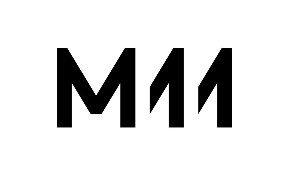
The logo is a creative and innovative wordmark that also takes on the form of a symbol. Standing strong is the M of the brand name in a stoic, black sans-serif font. Next to it are the two ones of the name — only these are created in a fascinating way.
Instead of sitting like a traditional one in the same font as the M, these ones are actually created by cutting the capitalized M in half, adding a symmetrical, almost mirror-like image that repeats seemingly into infinity.
Wordmarks are a very traditional form of the logo. But here, there is a subtle element that elevates it and changes what we think about wordmarks for the better. Because this wordmark can also be used to stand as a symbol, and it’s a powerful image that you can’t look away from.
It’s bold and intriguing. And it certainly grabs your attention. This logo is youthful and exciting. It’s not what you’d expect and neither is this salon. And that’s the point. It was created to shake things up and make you think. And it ticks all the boxes in our book.
Repetitive Elements Keep This Brand Modern And Fresh
A fashion-forward hair salon should have a logo that fits in with the current trends. What your logo says about your business can be the difference between earning new clients and being just another hair studio. Luckily, M11 Studio understands this well and created a logo design that combines a unique mix of letters and number in a way that aligns the brand as a young, hip and modern hair salon.
At first glance, the logo looks like a simple M and two ones. The simplicity is a nice aspect and comes from a practical point of view. This symbol is an obvious indicator of the business and clients can easily spot it from a mile away. The typeface is clean and doesn’t have a lot of distracting flair. It’s bold, straight to the point and chic.
Upon closer inspection, you can see the “11” in M11 is basically two M’s cut in half to look like ones. This gives the logo a layered, almost 3D feeling. It’s a clever use of design and font to create a simple image that is so much more than what you see at first glance.
The final result is a clean logo with a unique appearance. M11 has found a logo that, initially, seems incredibly simple. But the longer you look, the more you notice.
And the repetitive elements — with the almost invisible Ms — grabs attention immediately. It demands to be seen and causes consumers to take a closer look.
We can admit to that, and we know that if we did it, so do others.
This logo is minimal in nature. It’s clean and straightforward and bold. It aligns the salon as one that is fashion and future-focused. And these images are powerful enough to stay with you long after you’ve put the business card down or looked away from the website.
This wordmark is ingenious and fun. It flirts with modernity and edginess but still holds a refinement and an elegance in its clever repetition. And it definitely shows that it’s here to stay.
How M11 Studio Uses Its Logo To Keep Branding Consistent
The M11 Studio logo is innovative and exciting. It’s a sophisticated symbol that gives the brand a tangible personality. And it’s an image that is easily transferable across mediums to ensure that this brand gets noticed as much as possible.
And they certainly know how to grab attention.
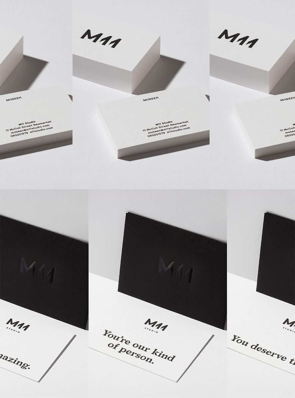
This logo is used throughout the salon — online, on print materials and even in the interior design of the salon itself. And that’s because it’s such a fluid and memorable image that anywhere it’s placed is bound to turn heads and make an impact.
There are so many elements to this design that can get reused and repurposed. In many instances, the logo in its entirety is splashed across its web design and on its printed materials like business cards and brochures.
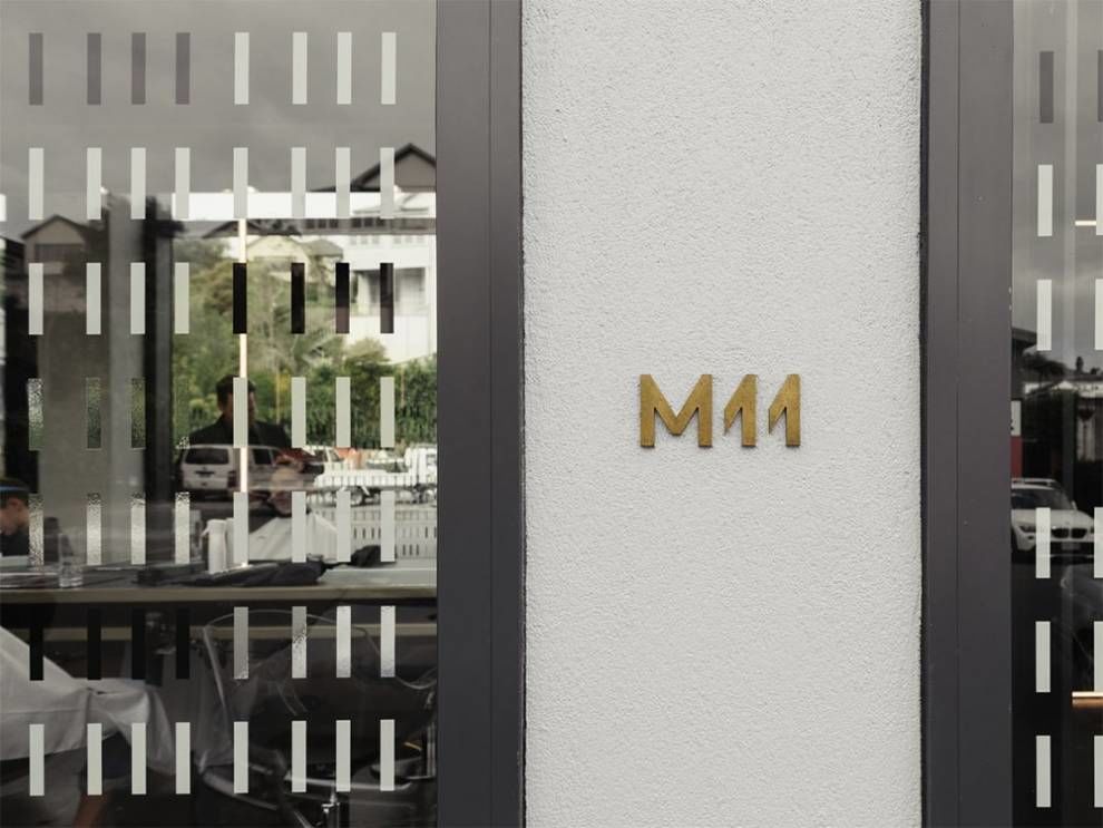
But what really caught our attention was the way this studio infused the logo design into its window display to not only add a cool vibe but further promote its luxurious, mysterious and edgy persona.
The windows are made up of symmetrical, organized straight blocks that mirror the lines of the M and the ones in the logo design. They are layered onto the window in blacks and whites and they add depth and mystery.
They allow the salon patrons inside seemingly innate privacy as they block out much of the view of the outside world. But they also spark a curiosity in viewers passing by as the reflections and light bounce off the glass, highlighting these shapes and urging them to try and look through the textured panes.
This is a surprising and compelling use of logo design in subtle variations to create urgency. And it also keeps branding consistent because these elements are apparent everywhere you look creating a cohesive identity for consumers to interact with.
What Is M11 Studio?
M11 Studio is a luxury hair salon in New Zealand. It was founded in 2016 and has grown in popularity since its conception only a few years ago. And just recently. It joined a community of sustainable salons to further promote its altruistic and forward-thinking ideas.
And right from the start, this modern brand knew that it needed an edge that could only come from design. So they enlisted the help of design studio Inhouse Design to create a complete identity — from print materials to logos and interior design.
The results were certainly noteworthy.
According to the agency behind the branding and logo design:
Housed within a light filled space in the heart of Newmarket, M11 is a luxe salon that references the refinery of a Tom Ford fashion boutique. The salon required a simple timeless identity to sit comfortably with the sophisticated interior spaces. The logo is drawn from a common shape and recycles facets of one figure to draw the others, forming a repeating pattern with a spacial quality. A pattern for the large salon windows was developed from the geometry of the of the logo to form a screen in both reflective and opaque vinyl, providing privacy for clients and intrigue for passers by. The salon collateral employed a restrained palette of black, white and copper and was executed with premium print finishes creating luxurious, tactile touch-points.The designers created this identity with an intention — it focused on a monochromatic, luxurious and enchanting color scheme and played freely with geometric shaping to create a look and feel that’s timeless and elegant.
The whole vibe of this salon, specifically, comes from the captivating logo these creatives brought to life. And it is used in so many ways throughout the salon — in the window design, in its overall orientation, and in its print collateral — that it ensures anyone who sees it knows what it’s all about.
The M11 Studio Logo Stands The Test Of Time
The M11 Studio logo design is robust, clean and edgy. It captures a modern effervescence and a cool persona that aligns the salon as one that is professional, youthful and experienced. And its subtle twist on a traditional wordmark matches the twist this salon adds to the traditional hair-cutting experience.
Not only that, but the repetitive elements are immediately engaging and grab attention. They make an impact and further promote the brand’s modernity and forward-thinking nature. This matches with their dedication to sustainability that they’ve recently been promoting.
And these design elements are embedded throughout the M11 Studio experience — this logo is on the web page, the print materials and even the windows in a clever and creative way that keeps branding cohesive and consistent.
All of this ensures that the design appears much simpler than it actually is. And the more you investigate, the more invested you become. And you don’t mind it at all.
Create your ideascaptivating symbol with the help of these logo design and branding agencies!