Team Behind the Design
Logo Design Analysis
A good logo, in my view, should feel instantly recognizable while revealing layers of thought the longer you look at it.
It needs to hold its ground on a screen, on a sign, or printed on something as small as a business card.
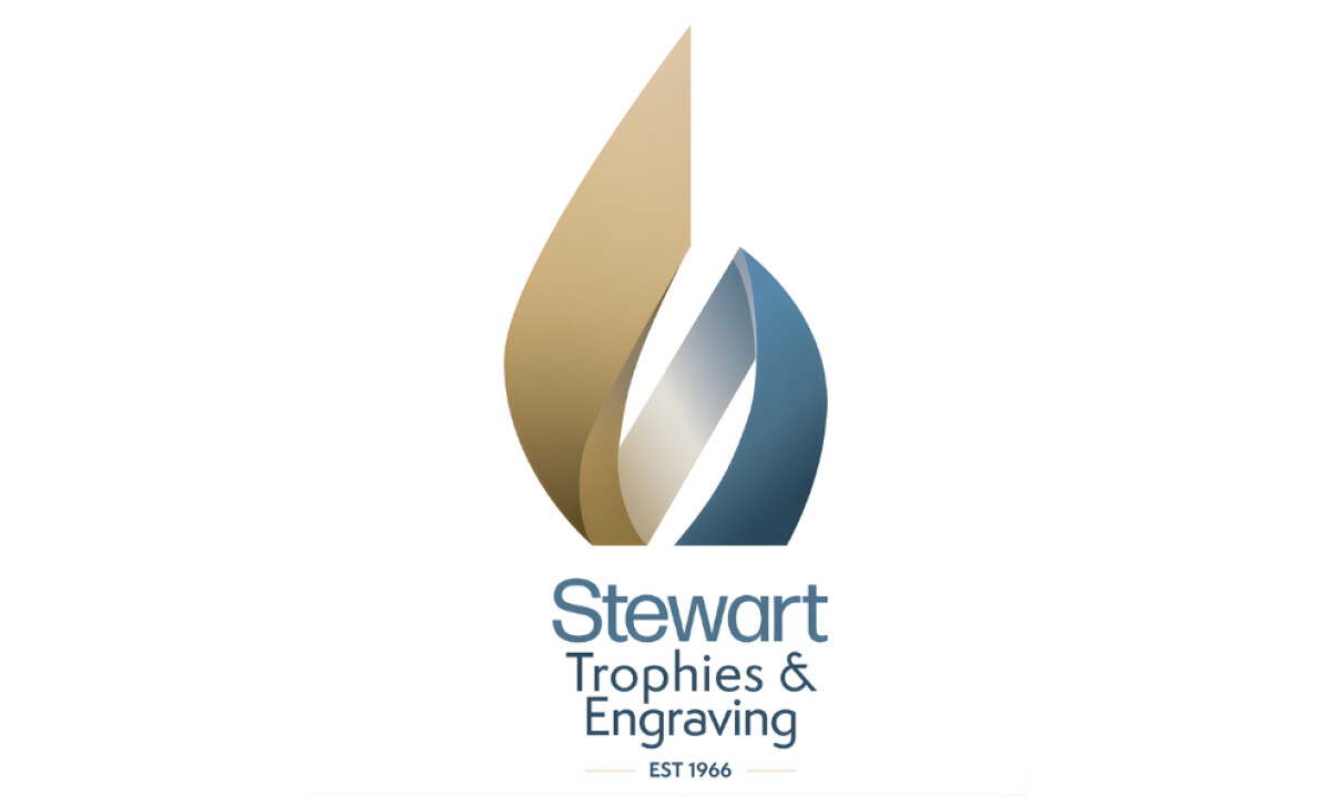
The logo for Stewart Trophies & Engraving does this beautifully, capturing both prestige and warmth through color, form, and flow.
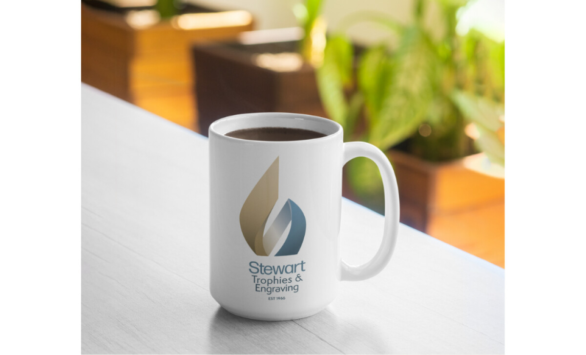
- Concept: I can see how the shape draws inspiration from both a flame and a trophy. The subtle “S” woven into the form feels intentional and elegant, giving the brand a signature mark that reflects craftsmanship and celebration.
- Typography: I like the pairing of Forma DJR Display and Semplicita Pro. The combination feels professional but friendly, with the right amount of precision for a company focused on engraving and detail.
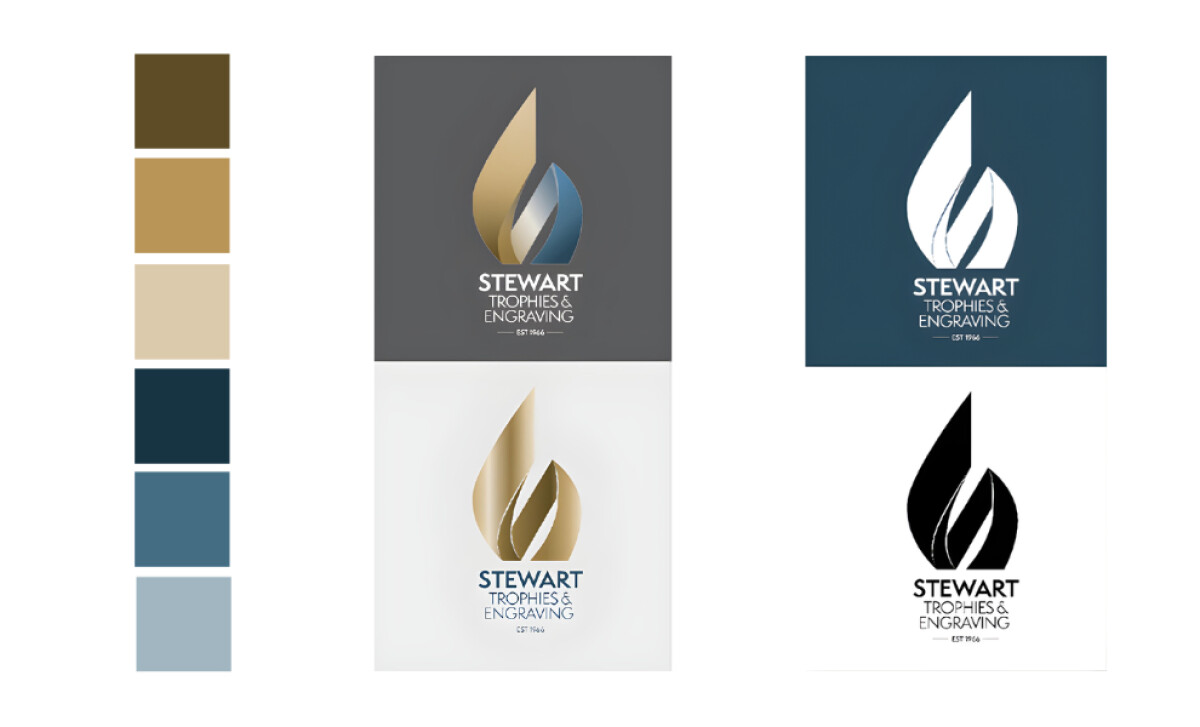
- Color: The mix of gold and steel blue immediately stood out to me. Gold naturally communicates excellence and prestige, while blue grounds the identity in trust and sincerity. It’s a palette that feels confident without shouting.
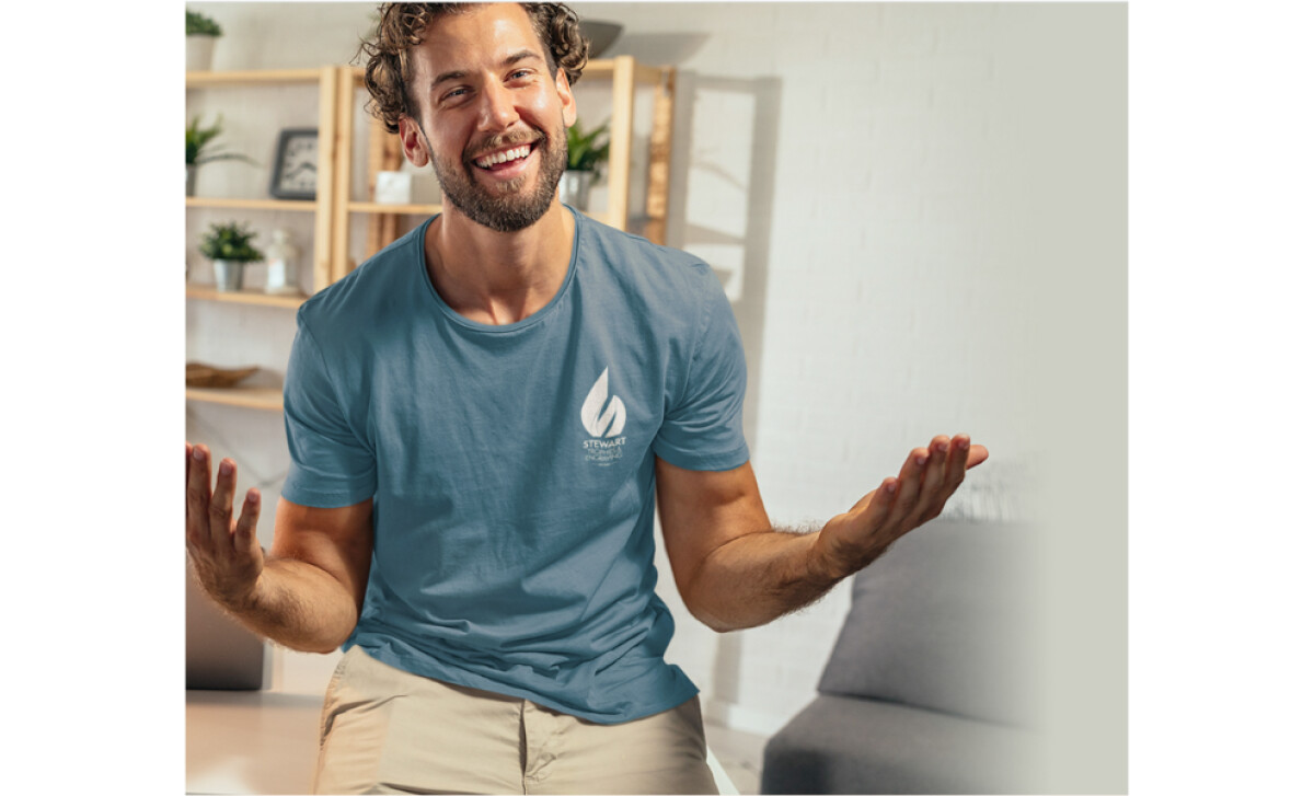
- Application: What I appreciate most is how adaptable the logo is. Whether embossed on a trophy, printed on a mug, or embroidered on a shirt, it retains clarity and balance. That versatility tells me the design was carefully planned from the start.
What Brands & Agencies Can Learn from Stewart Trophies & Engraving
Sandra Barnes’ design for Stewart Trophies & Engraving shows how a logo can communicate craftsmanship and pride through restraint. Every decision, from form to color, speaks with quiet confidence rather than excess.
1. Design with Purpose and Patience
The flame-like “S” feels natural and considered, showing that memorable marks often come from careful refinement instead of decoration. A single, well-drawn form can hold meaning that lasts.
2. Use Color to Reflect Character
The balance between gold and steel blue captures both celebration and professionalism. It proves that the right palette can express identity just as clearly as typography or shape.
3. Build for Real-World Application
The logo performs equally well on a polished trophy, a digital banner, or embroidered fabric. That consistency reminds designers that practicality is as important as beauty.
About DesignRush Featured Designs
At DesignRush, we review hundreds of agency projects each month to uncover standout work in branding, digital, and visual design. The featured designs represent some of the most compelling executions, standing out for clarity, creativity, and technical precision.
Top-performing projects often advance to our Monthly Design Awards, gaining wider industry recognition.
See more creative projects across categories:
- Best Logo Designs
- Best Website Designs
- Best App Designs
- Best Print Designs
- Best Packaging Designs
- Best Video Designs
For a full list of design agencies and related services, visit our Agency Directory.