- Article by
- Branko Dimitrijević

This website uses a colour palette of 4 colours
#100C0D #110D0E #FFFFFF #FEFEFE
Technologies & Tools
Description
Team Behind the Design
- Agency: Fabrizio Ceppi
- Client: Styled by Merce
- Category: Logo - Fashion & Beauty
- Location: Miami, Florida, United States
- Project Brief: Create a fashion and beauty logo system that balances elegance and accessibility while remaining versatile across editorial, digital, and retail-inspired applications.
In fashion and beauty logo design, I pay close attention to how restraint and proportion communicate confidence.
The Styled by Merce identity shows how minimal form and thoughtful structure can feel both elevated and approachable.
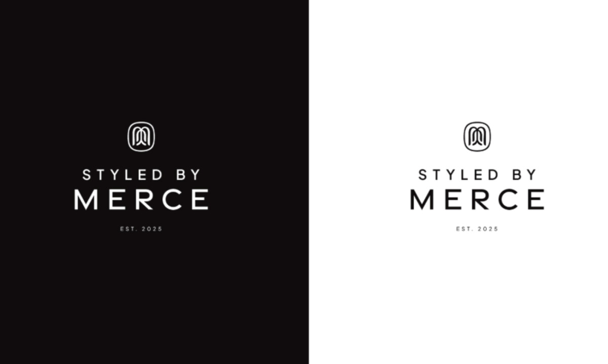
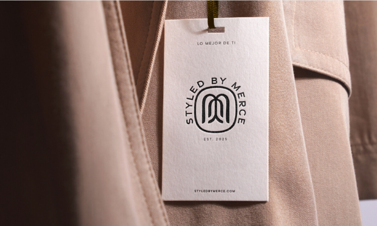
- Symbol & Form: The monoline “M” icon feels calm and well-balanced overall. I like how the rounded geometry introduces warmth without drifting into ornamentation, which fits a lifestyle brand rooted in everyday elegance.
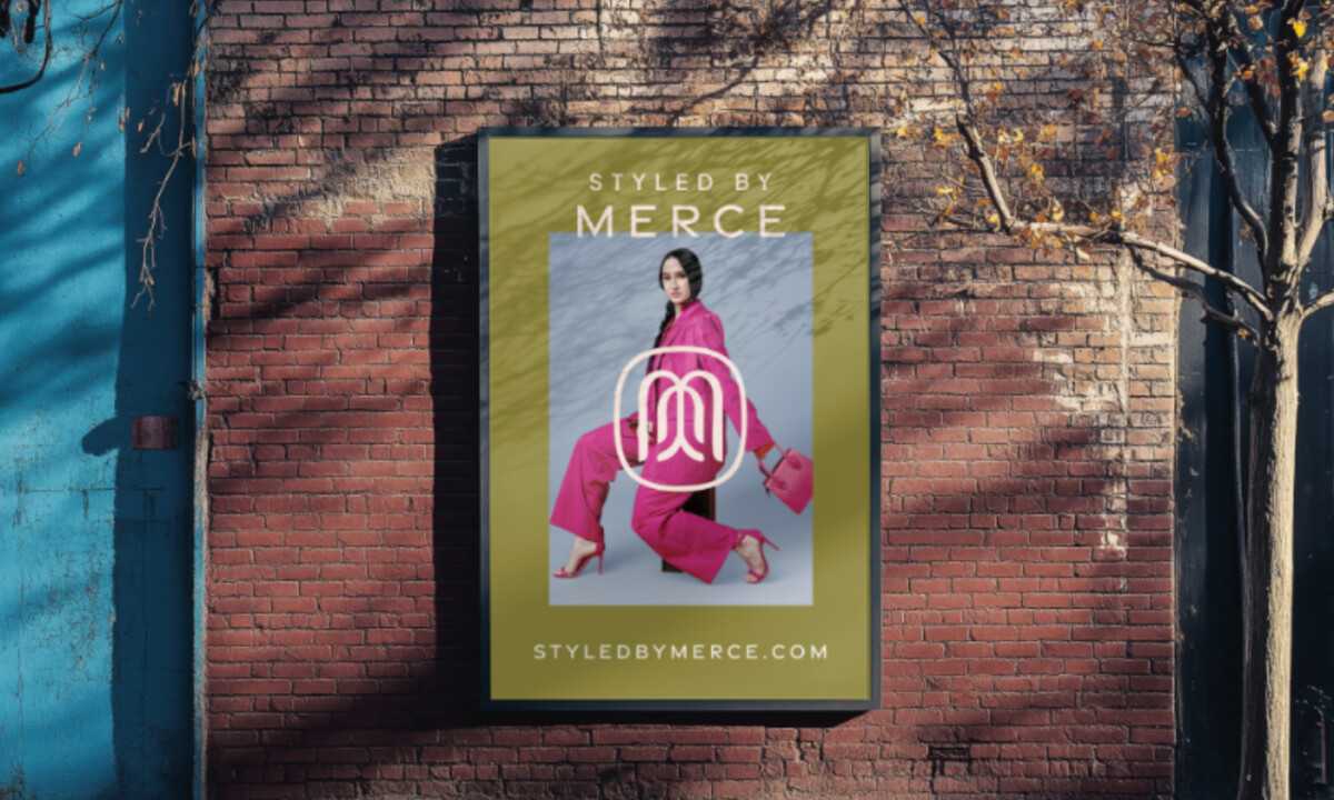
- Color Strategy: A restrained black-and-white logo forms the foundation of the identity. I like how this neutrality allows the mark to sit comfortably across varied materials and environments, from muted retail interiors to bold fashion photography.
- Typography: A subtle but confident hierarchy guides the system. I find the contrast between the all-caps “MERCE” and the lighter supporting text effective, as it establishes authority while maintaining an approachable, editorial tone.
- System Flexibility: Circular lockups introduce variation without adding noise. I like how these badge-style applications translate naturally into retail and lifestyle settings, extending usability while reinforcing brand credibility.
What Brands & Agencies Can Learn from Styled by Merce
1. Restraint Can Be a Strong Differentiator
Minimal forms and limited color palettes often create more lasting recognition than decorative complexity, especially in fashion and beauty branding.
2. Design Logos as Living Systems
Building flexible lockups from the start allows brands to move confidently across editorial, retail, and digital spaces without constant redesign.
3. Soft Geometry Builds Approachability
Rounded forms and balanced proportions can communicate warmth and accessibility while still supporting a premium brand position.
Wildflower Condominiums
GmercyU
TC by the Sea
Dom Le Barbier
Hórus Síndicos
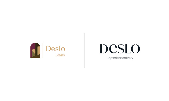
Deslo Design Corporation
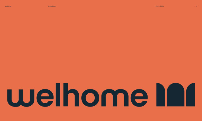
Welhome
Atelier Lapsa
Kensing
View All BestLogo Designs
Ready to elevate your designs?