Welhome Logo Design
Welhome’s logo transforms the concept of home into a clean, geometric symbol. Through balanced typography and simple forms, the identity communicates trust, structure, and warmth, creating a flexible visual system that adapts seamlessly across digital and physical brand touchpoints.
Welhome Logo Design
A modern, adaptable mark built on balanced forms
Welhome Logo Design
A simple geometric logo expressing comfort and reliability
This website uses a colour palette of 4 colours
  • #E27554
  • #E9704D
  • #9A5A49
  • #1B2733
Technologies & Tools
Description
Team Behind the Design
  • Agency: Renan Benvenuti
  • Client: Welhome
  • Category: Logo Design
  • Location: São Paulo, Brazil
  • Project Brief: Create a scalable logo that reflects the concept of home through clean geometry, clear typography, and a versatile identity system.

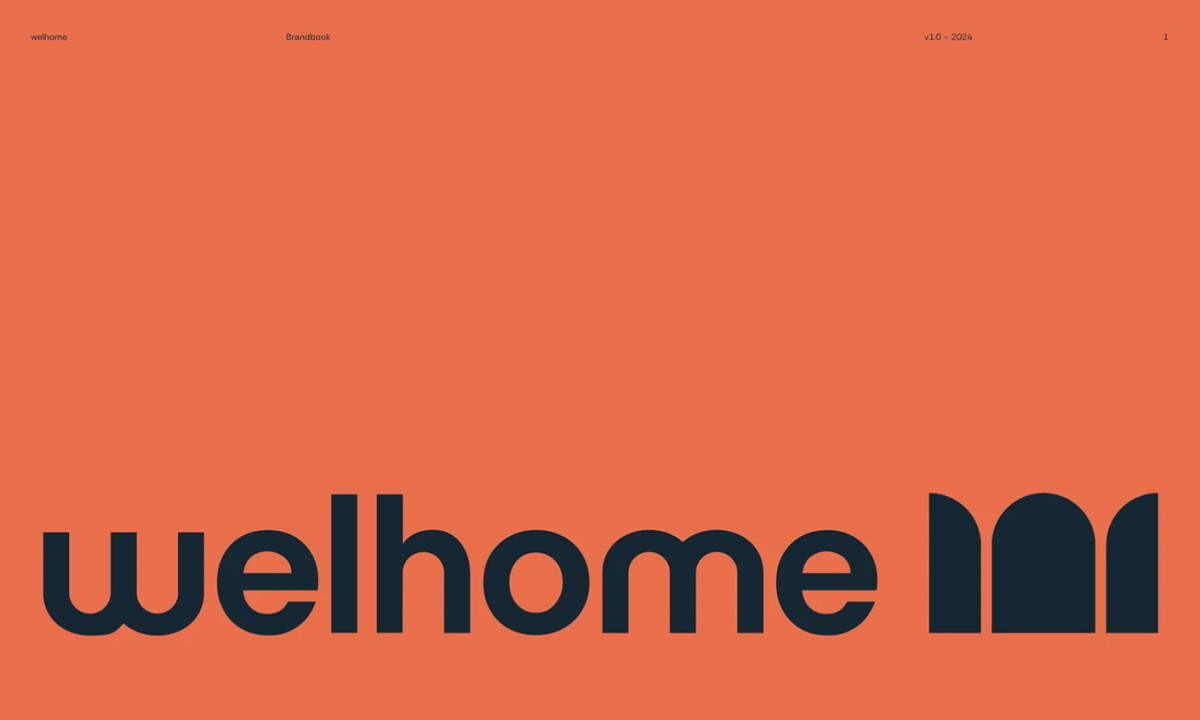
Home luxury logo designs are often judged by how effectively they translate abstract ideas into simple, recognizable forms. In Welhome’s case, geometric structure and balanced typography work together to express reliability and comfort, creating a mark that feels both modern and adaptable across different brand applications. 

Vote for the best design in this year's Design Awards and help decide which projects deserve top recognition. Every vote contributes to celebrating creativity and craftsmanship across categories like web, branding, product, and digital design.
Balance Logo Design by Studio AIO

Balance

Designed byStudio AIO
La Famiglia - Gucci Logo Design by Affaire

La Famiglia - Gucci

Designed byAFFAIRE
Hoopla Logo Design by Self-titled

Hoopla

Designed bySelf-titled
Belle&George Logo Design by Abmo

Belle&George

Designed byAbmo
Redheads Logo Design by Oliver Grace

Redheads

Designed byOliver Grace
Casa Macui Logo Design by Fugitiva

Casa Macui

Designed byFugitiva
Pizza Feasto Logo Design by Berat KAYA

Pizza Feasto

Designed byBerat KAYA
View All BestLogo Designs

Ready to elevate your designs?