Standout Features:
- Greek-inspired
- Relevant symbolisms
- Powerful messaging
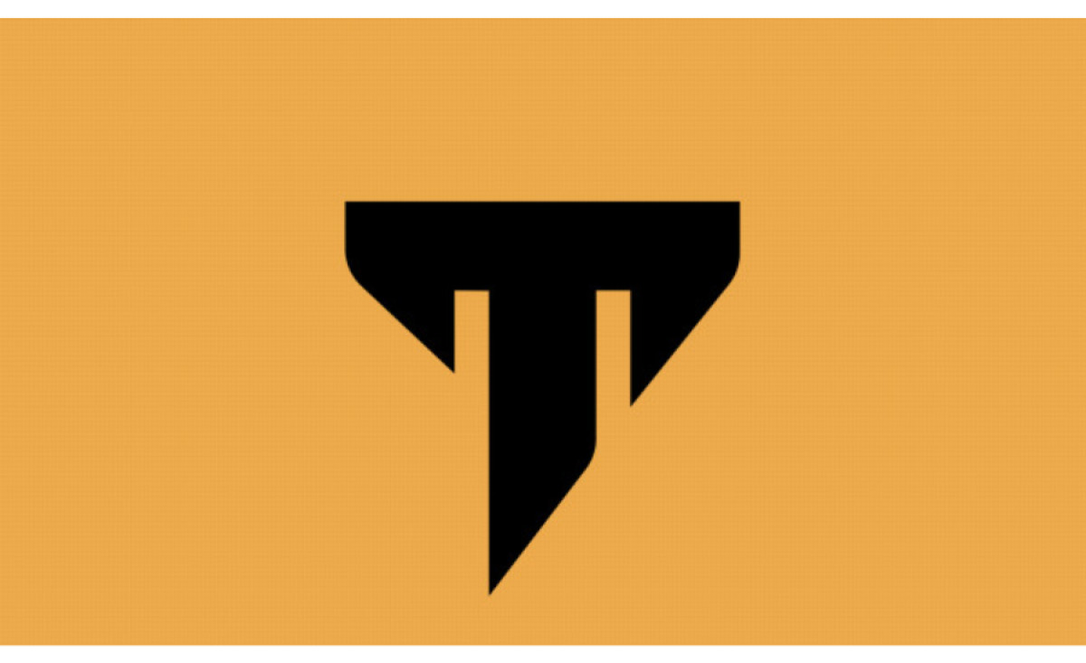
Osmosis Design gathered inspiration from Greek culture and aesthetics when developing a logo redesign for Tanck Suplementos, a Brazilian fitness supplements brand. It resulted in a sleek logo design that speaks of strength and vitality.
The brand believes in attaining a balance between the human body and mind. With this philosophy, combined with the brand's Greek inspirations, the agency designed the letter T like that of Grecian columns.
On some logo versions, the brand name sits beside the stylized T. The typography remains consistent, paying homage to the beautiful, resistant, classic Greek architecture.
Get a chance to become the next Design Award winner.
SUBMIT YOUR DESIGN