Standout Features:
- Pink and sweet
- Customized “K”
- Logo-focused branding
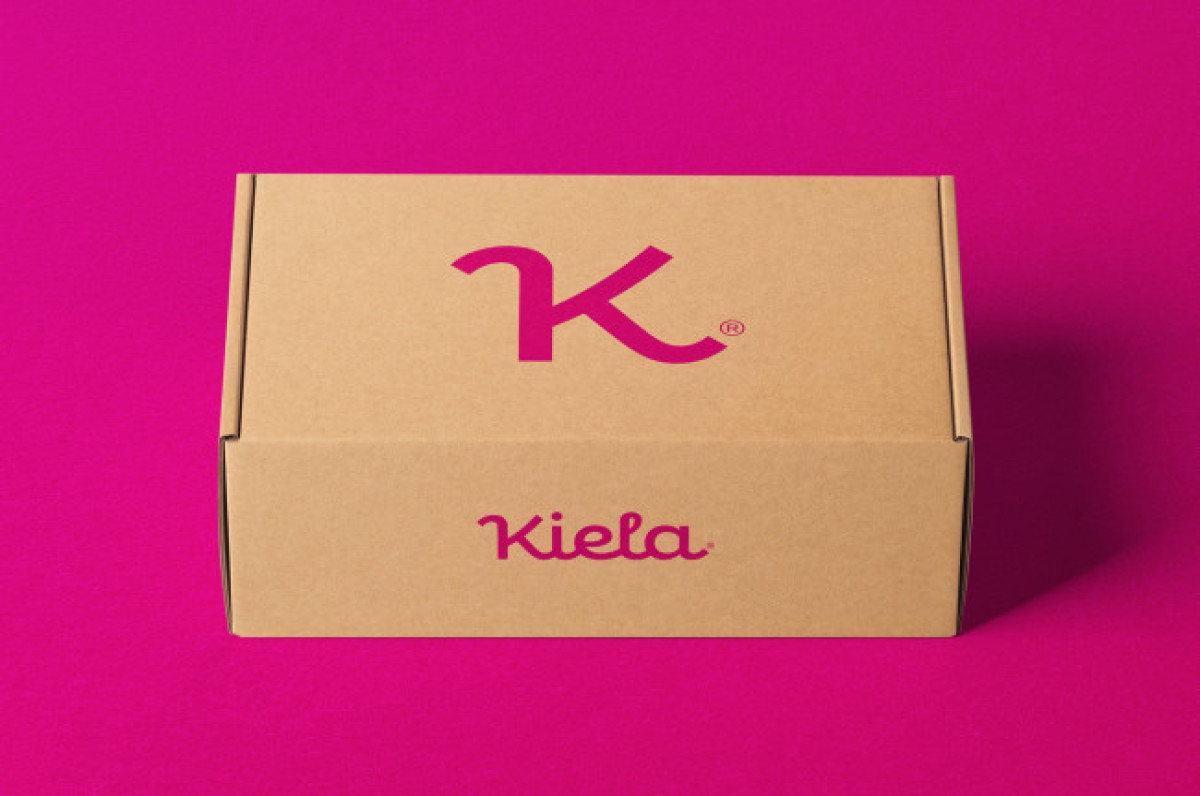
Patricio Roman’s brand identity for Kiela is another remarkable visual story that deserves to be on our best shoe brand designs list.
The concept revolves around the incredibly adaptive logo design and its shortened version. This combination is ubiquitous across this branding package, including the packaging design, product prints, and various merchandise.
Pink and sweet, the longer form of the logo represents the brand’s wordmark spelled out with joint letters in a cute cursive style that portrays the brand as gentle and kind. The shortened version features a customized “K” glyph. The letter features new curves that make it look like a fashionable summer heel.
Get a chance to become the next Design Award winner.
SUBMIT YOUR DESIGN


-preview.jpg)
-preview.jpg)
