Standout Features:
- Vintage icons and elements
- Minimalist design
- Muted color story
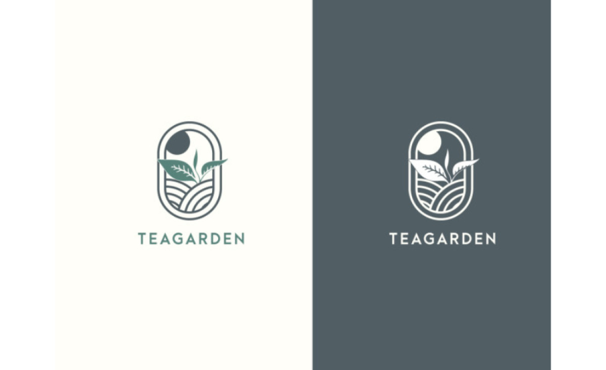
It's The SA's execution of Teagarden’s vintage logo design is impressive. The design's vintage icons and elements lend the logo an organic and authentic feel. Meanwhile, the muted color story augments the vintage appeal and creates a sense of nostalgia.
One noteworthy feature of this logo is its oval window, encapsulating the brand's nature-inspired identity. This simple yet effective design choice resonates with Teagarden's ethos, further reinforcing the brand's connection to nature and tranquility.
Get a chance to become the next Design Award winner.
SUBMIT YOUR DESIGN
