Standout features:
- Well-executed visual logo
- Earthy color palette
- Neat placement of visual elements
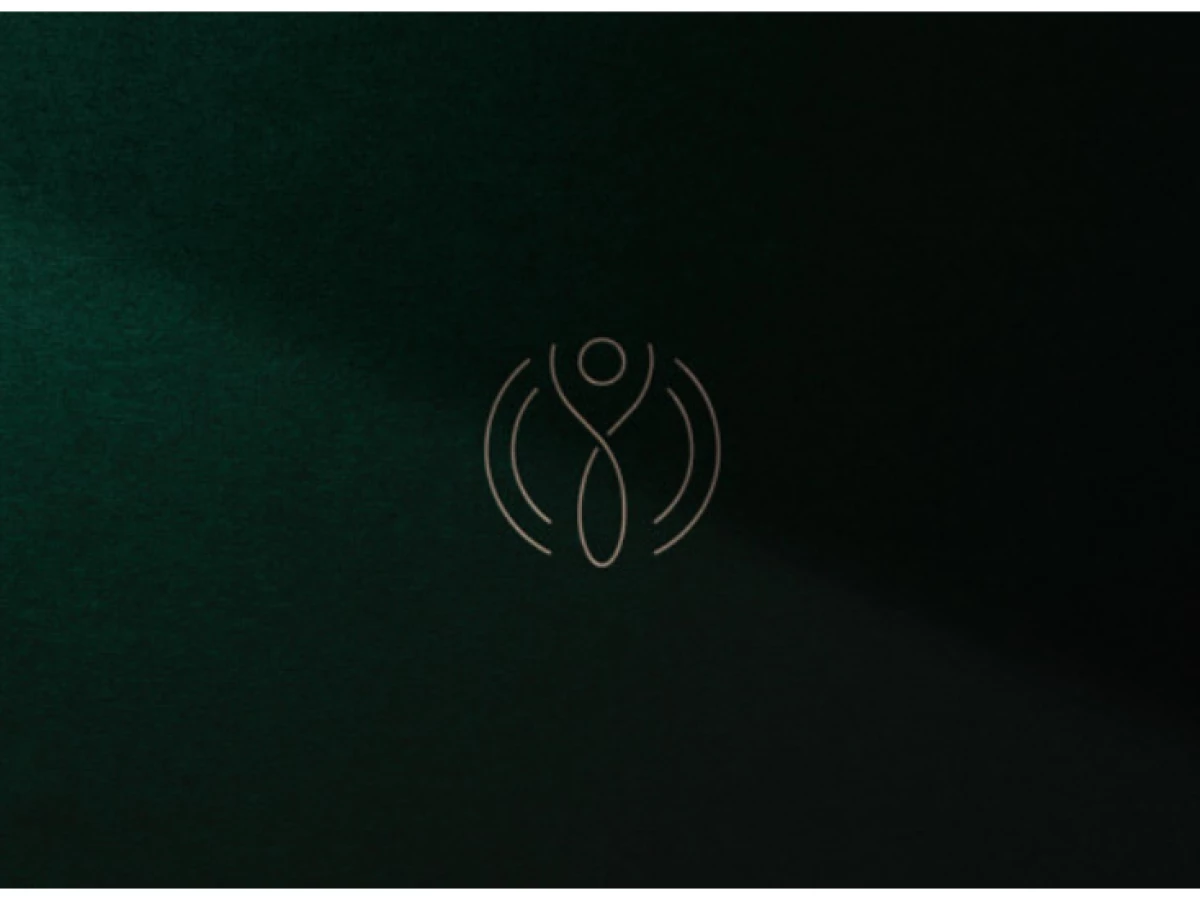
If you're looking for a logo inspiration that shows creativity and simplicity without compromising each other, then this logo design for Thalia Macedo Nutricionista is the perfect example.
They aim to provide generic nutrition and humanized care to their customers in line with their values and sophistication.
This logo designed by CERBO has done a great job of blending all of those qualities while adding a creative twist to the logo design for the company.
The main element of the abstract logo design is a series of curved and twisted lines, forming the image of a human stretching their arms upwards, surrounded by a halo-like light around them.
This shows their commitment to holistic health by providing nutritional guidance in a sophisticated manner. No rush, no hush. Each process is calculated and meant to nurture you in every way possible.
Bronze is used as the color for the logo, while the whole branding pack consists of earthy colors such as muddy browns and deep greens. This all goes back to their commitment to leading healthy lives for their clientele through a balanced diet of fruits and vegetables.
The placement of visual elements is arranged to reflect the client's values without sending the wrong message. In other words, this is a job well done.