Standout Features:
- High-end appeal with a minimalist design
- Versatile logo with multiple finishes
- Clean, modern typography
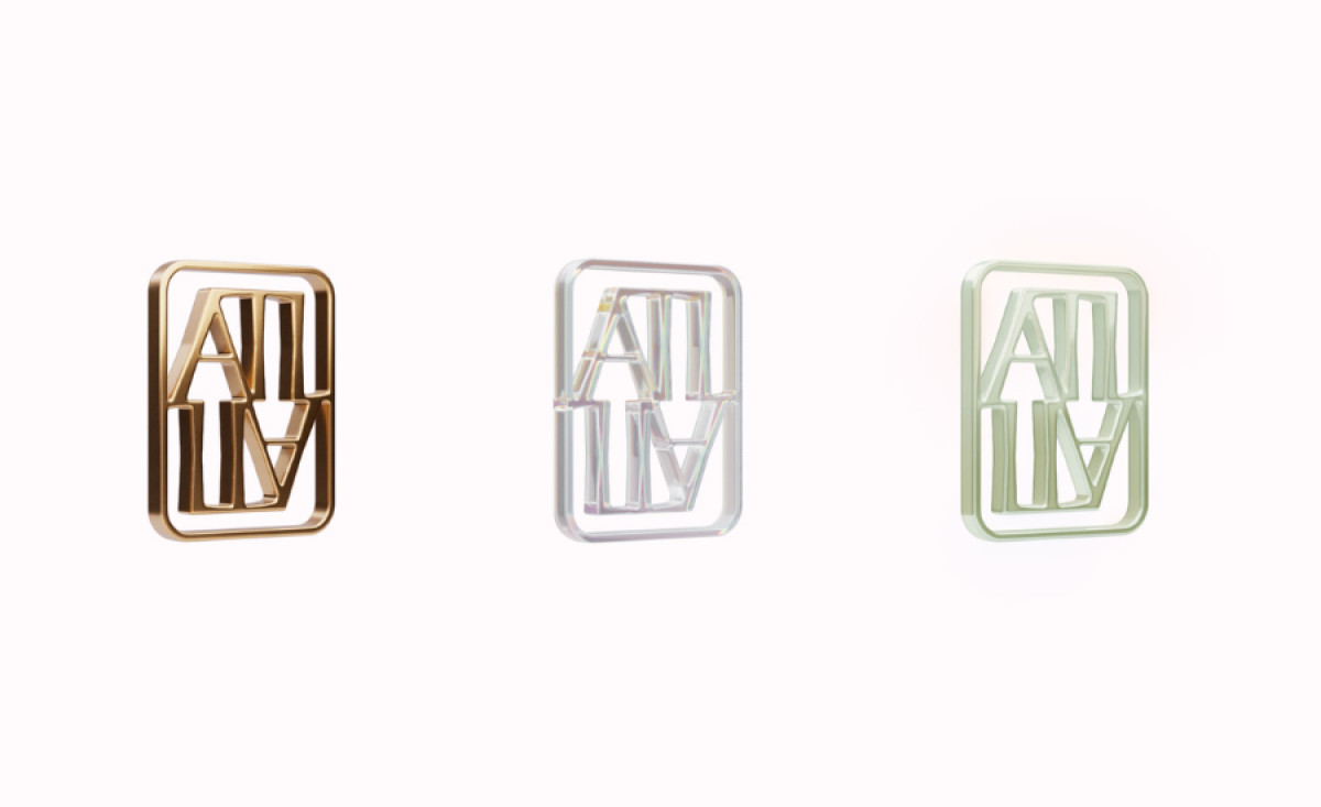
With a vision to offer refined elegance, Apricity The Label’s logo, crafted by The X/OVER Agency, delivers an aesthetic that balances exclusivity with accessibility. The goal was clear: create a design that resonates with the brand’s target audience while remaining true to the minimalistic, sophisticated style the brand is built on.
The clean lines and geometric shapes give the logo structure and precision, evoking modern luxury. This simplicity is key in creating a memorable mark that is adaptable across multiple applications. The logo’s straightforward form allows it to stand out in an otherwise crowded luxury market, proving that elegance doesn’t require complexity.

The use of muted tones and sleek metallic finishes further elevates the brand’s appeal. Whether presented in gold, silver, or black, the logo takes on a different yet cohesive feel . This ensures that the brand can consistently project an aura of exclusivity, whether it’s embossed on a product, displayed on the website, or used in marketing materials.
Typography also plays a crucial role in communicating the brand’s high-end nature. The typeface is simple yet bold, with precise letterforms that convey sophistication. The balance between the minimalistic style and the subtle strength in the typeface captures the essence of the brand: understated luxury with a focus on refined quality.
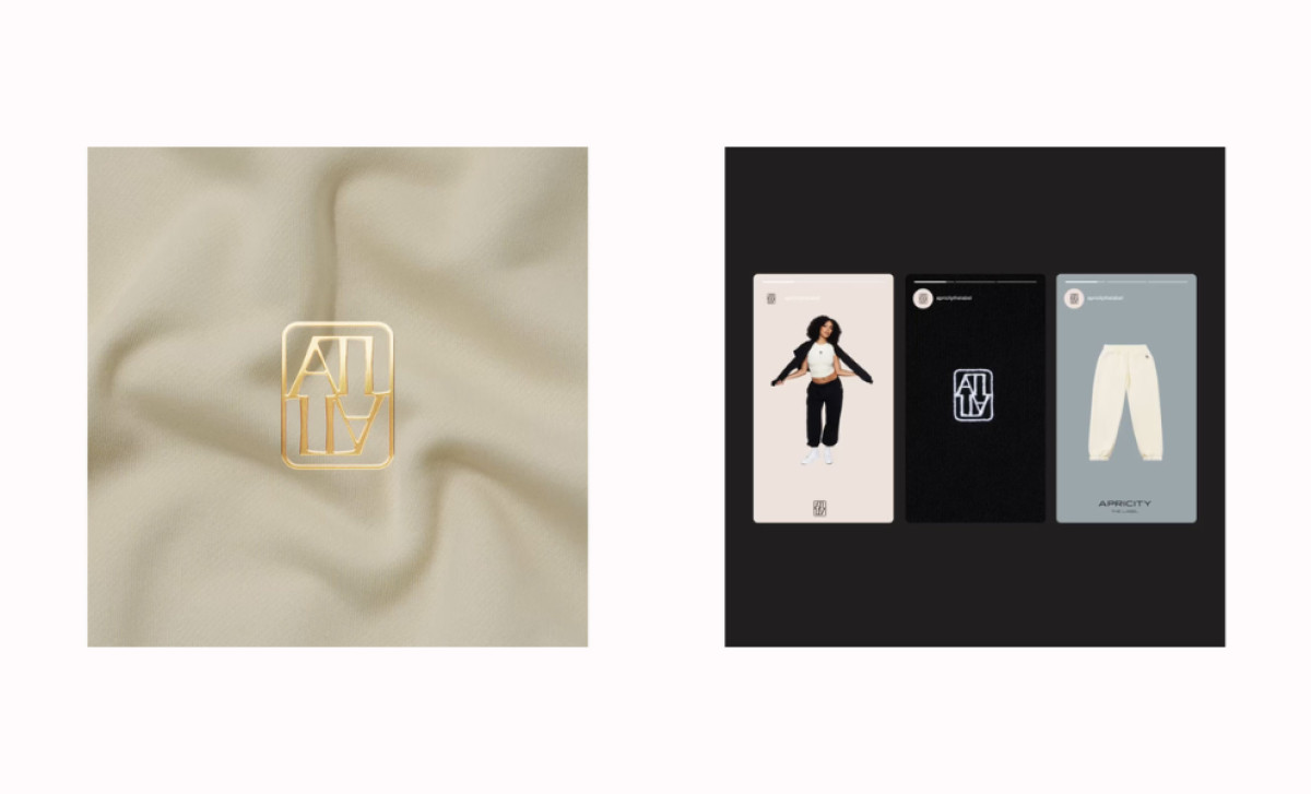
The clean, adaptable design, paired with high-end typography and versatile finishes, makes it an ideal representation for a brand aiming to make a strong, lasting impression in the luxury market. This logo serves as a prime example of the best luxury logo design that exudes exclusivity and visual impact.