- Agency: Andrew Patitucci Design
- Client: The Sweaty Trio Podcast
- Category: Logo - Entertainment
- Location: Vaughan, Canada
- Project Brief: Design a logo that captures the intensity and authenticity of sports fandom while remaining adaptable across podcast platforms, merchandise, and promotional media.
When I review entertainment logo designs, I often focus on how symbolism and flexibility support long-term brand use.
The Sweaty Trio Podcast logo shows how a compact mark can communicate personality, platform, and content focus without visual overload.
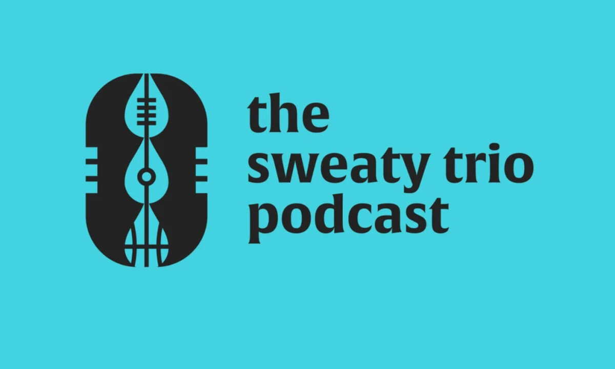
- Concept & Symbolism: At the center, the microphone – droplet hybrid works as a clear anchor. I like how the icon merges podcasting and fandom into a single abstract form, with subtle interior references to football, hockey, and basketball that reward closer inspection without becoming literal.
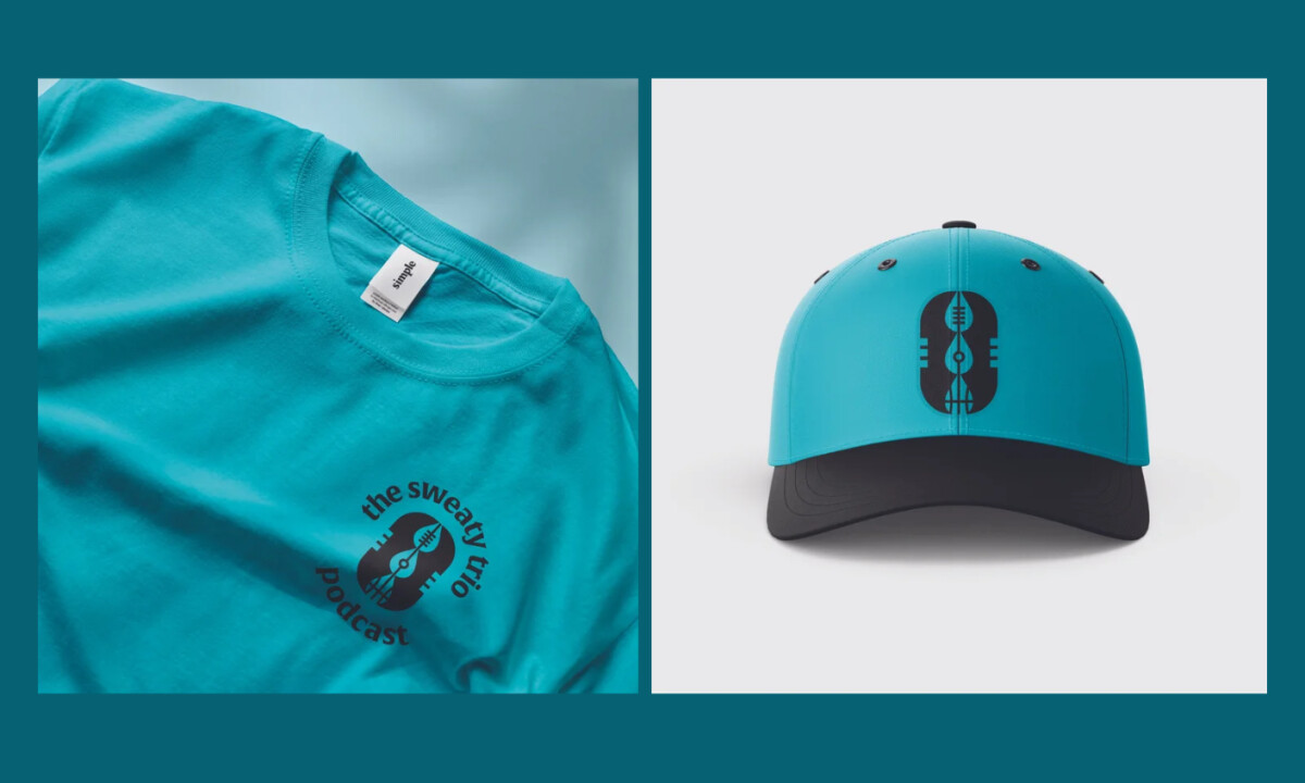
- Color System: The turquoise and charcoal palette feels energetic but controlled. I appreciate the choice to avoid predictable sports colors, as it helps the podcast stand out in crowded directories while still feeling confident and bold.
- Typography: The rounded sans-serif wordmark balances weight and approachability in a way that feels versatile. I like how the soft terminals keep the logo friendly, while consistent stroke widths ensure it reproduces cleanly across digital platforms and physical applications.
- System & Scalability: The circular, horizontal, and icon-only lockups are clearly designed as a system. I like how the deconstructed sub-icons allow the brand to expand into sport-specific content without diluting recognition.
What Brands & Agencies Can Learn from The Sweaty Trio Podcast
1. Abstract Multiple Ideas into One Clear Symbol
Combining multiple ideas into a single, well-crafted mark often creates stronger memorability than illustrating every concept directly.
2. Differentiate Through Confident Color Choices
Choosing an unexpected but confident palette helps entertainment brands stand out without sacrificing clarity or legibility.
3. Build Logos as Systems, Not Single Marks
Designing modular lockups and extensions from the start makes it easier for brands to scale across platforms, formats, and future content.