Standout Features:
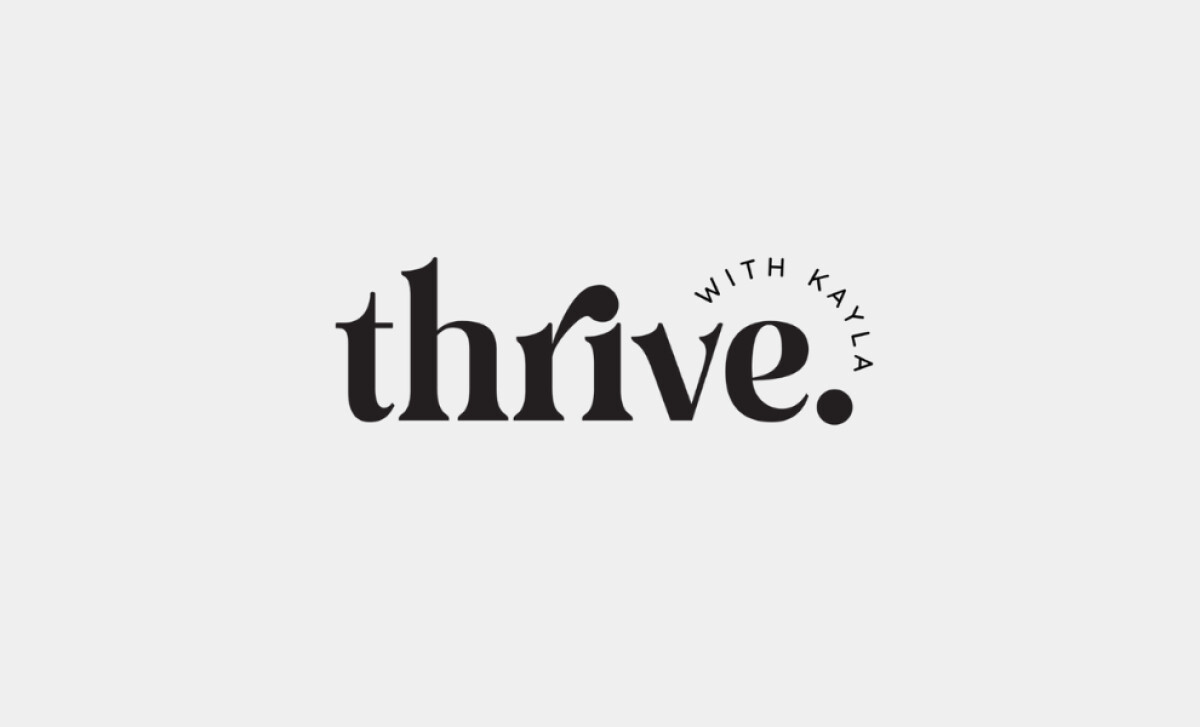
- Distinctive serif typography with a playful, stylized “r” and “i”
- Minimalist monochrome color palette
- Dynamic typographic composition with a curved tagline element
Designed by Live in Five, the logo for Thrive with Kayla aims to embody the brand's mission: helping individuals with ADHD. The visual identity uses a unique typographic approach to communicate this empowerment. It balances classic elegance with playful energy, to create a strong and approachable feel.
A bold serif typeface with high contrast between thick and thin strokes gives it that elegant presence. The uniquely stylized letter "r" in "thrive" features an exaggerated, swooping terminal, combining with the letter “i”. The lowercase "thrive." softens the look, while the small, all-caps sans-serif "WITH KAYLA" contrasts against it.
The color strategy is minimalist, with the logo presented in pure black against a light field. This high-contrast, monochrome approach underscores the typographic structure and ensures versatility.
For a brand like Thrive with Kayla, this visual simplicity is key, as a systematic review on visual complexity in health spaces (Lazard et al., 2014) notes that users generally prefer designs with low visual complexity, which can foster a sense of calm and clarity.
The typographic arrangement creates a pleasing balance. The main wordmark "thrive." is anchored by its period. Above it, the smaller "WITH KAYLA" tagline arcs gently, introducing a friendly, organic counterpoint to the structured serif.
For brands aiming to support mental clarity or engage neurodiverse audiences, Thrive with Kayla’s restrained approach can foster trust and ensure the core message is communicated without distraction — proving that even with bold logos, less is often more.


