Standout Features:
- Alluding to the unique rhythm
- A treat to life
- A “shaky” look
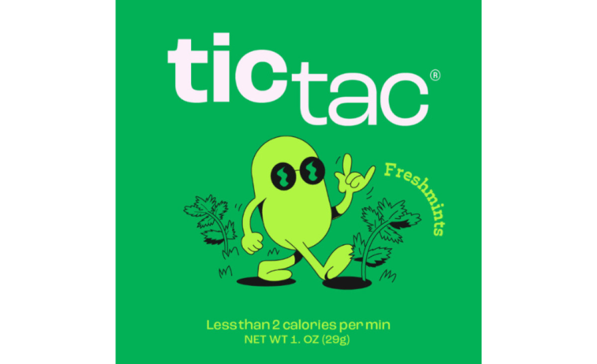
Generations worldwide enjoy these tiny mints’ taste and their minimal, polished look. While the mints prompt you to play around with them and their iconic package, there’s another perspective that Luiza Amorim noticed could be a basis for the intriguing rebranding experience – the distinctive rhythm, sound, and vibration.
Rather than “fixing” what works fine, this rebranding concept aims to add and emphasize another (overlooked) layer to the mint’s success. Luiza realized that the logo could directly reference the sound the packaging design makes when you open and close the lid and shake it around.
The varying vibrations are represented through a slick bolded “TIC” positioned slightly above the regular “TAC.” This displacement simulates a visual experience that equates to the funky sound the packaging makes, with the contrast emphasizing the rhythm.
This rebranding provides a relatable persona for the upscaled mint, portraying it as a green blob with arms and legs. The character is always depicted with cool black glasses on, in motion, playing around with a yo-yo or handing you a flower.