Standout Features:
- Purple shades
- Playful symbols
- Sleek alignment
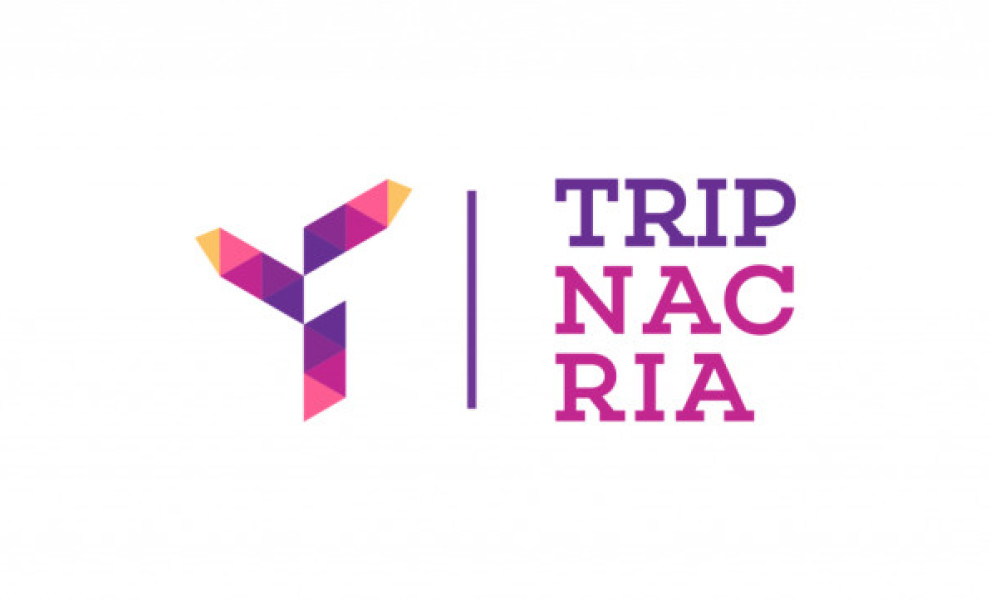
This next-best travel logo design exemplifies the happiness people get from traveling. Designed by Michelangelo Caruso, the logo design combines visual elements that support the brand image: playful and free.
You'll see a gradual change in colors from the logo's center. The designer used vivid and bright shades of purple that turned into subdued pinks. Then, this T-shaped logo design is capped by a yellow-orange tip.
The designer also stacked the letters in rows of three to spell out the company name, which is a smart move on his part as it looks more compact and sleeker when viewed on various platforms, from the website to the stickers.
Get a chance to become the next Design Award winner.
SUBMIT YOUR DESIGN