Standout Features:
- Bold red branding and contrast
- Highly contextual iconography and symbolism
- Brand consistency in the logo’s application
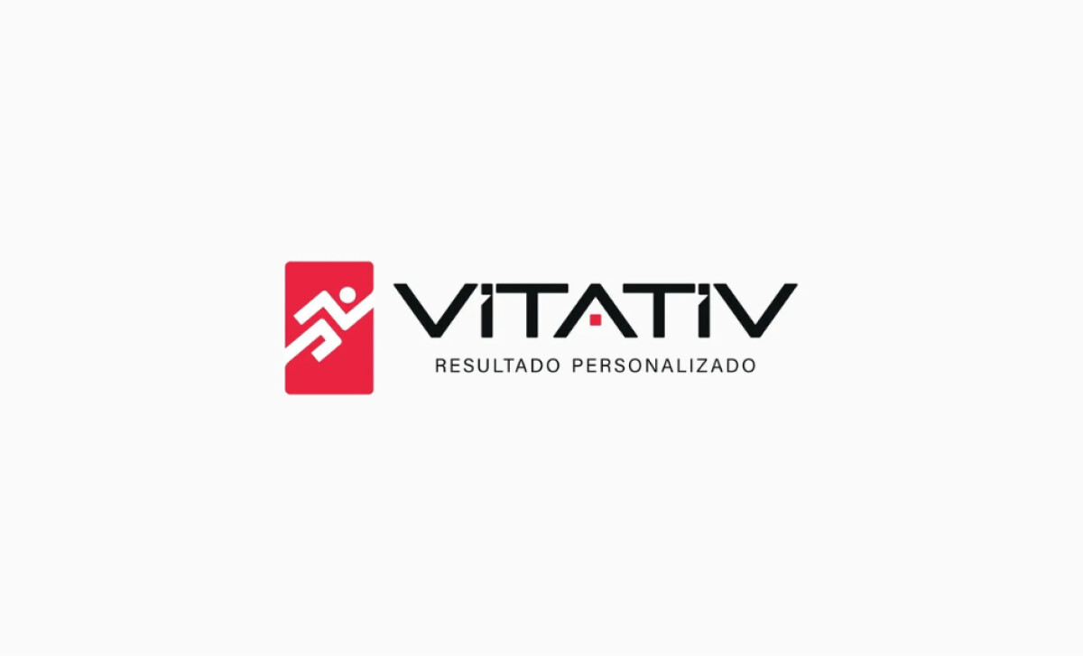
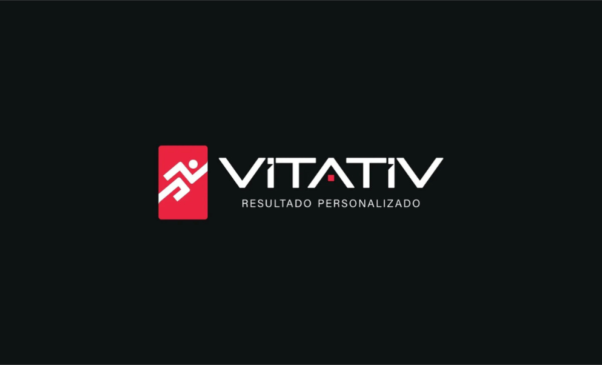
Vitativ, an online fitness consultancy, leverages technology through an app to help users embrace active lifestyles. Agência Digital Arte designed its visual identity to embody these attributes. The result is an exclusive yet relaxed brand with symbolism that's both easy to grasp and quick to energize. The brand identity for Vitativ is built around bold red branding and contrast, with the logo featuring a dynamic figure in a red square alongside sleek black "VITATIV" typography. Red, a powerful color, evokes vitality and motivates action, perfectly suiting a fitness brand. The simplicity and vibrancy ensure versatility and impact across media, too.
The dynamic human figure depicted in motion directly communicates the active lifestyle Vitativ promotes. This ensures the brand’s core message of movement and progress is immediately understood, aligning perfectly with its fitness focus.
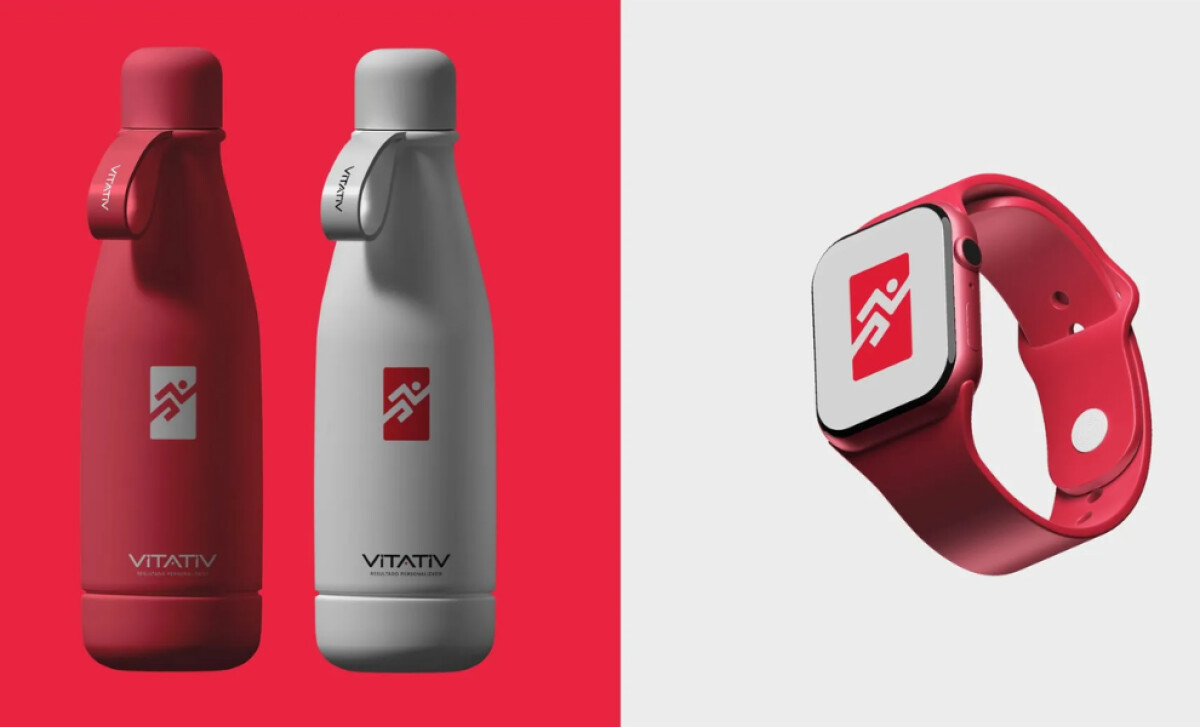
The visual identity is consistently carried over into other materials, with cohesive use of red on items like water bottles and smartwatches. Applying the same sleek, modern design principles to these tangible products ensures a unified and instantly recognizable brand experience.
The Vitativ logo’s bold red and active icon achieves everything the brand wants to convey with impact. The key insight for health and wellness logos is that strong, symbolic design can instantly communicate your core benefits and connect with users.

