


-account-photo_listing.jpg)
-account-photo_listing.jpg)


Our Jury has worked with Prada, Nike, Chanel, Google, and Apple.
Best Health & Wellness Logo Designs of 2026
View the Top Health & Wellness Logo Designs Below
Best Health & Wellness Logo Designs of 2026
4,200+ Submitted Designs- Advertising
- Agriculture
- AI
- Airline
- Alcohol
- App Company Logo
- Architecture
- Arts & Recreation
- Automotive
- Banking & Finance
- Beer
- Church
- Clothing Brand
- Coffee
- Content & News
- Distribution
- E-Commerce & Retail
- Education
- Engineering
- Entertainment
- eSports
- Farm
- Fashion & Beauty
- Food & Beverage
- Government
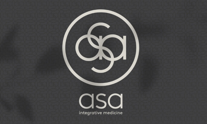
- Health & Wellness
- Hospitality
- Legal & Insurance
- Luxury
- Manufacturing
- Non-Profit
- Photography
- Professional Services
- Real Estate
- Restaurant
- Restuarants
- SEO Agencies
- Shoe Brand
- Small Business
- Software
- Sports & Leisure
- Startup
- Technology
- Travel
- Video Companies
- Weed/Cannabis
- Abstract
- Animated
- Artistic
- Bakery
- Black
- Black & Yellow
- Blue
- Bold Logo
- Brand
- British
- Business
- Circle
- Creative Name
- Dental Office
- Done by Freelancers
- Emblem
- Floral
- Geometric
- Glow
- Gradient
- Gym
- Icon
- Illustration
- Lettermark
- Logo symbols
- Makeup Brand
- Marathon
- Minimal
- Modern
- Monogram
- Multicolored
- Nature
- Negative Space
- Rebranding
- Red
- Redesign
- Simple
- Starting With the Letter S
- Successful
- Sunshine
- Trendy
- TV Channel
- Typography
- Unisex Salon
- Vintage
- Water
- Watercolor
- Wordmark
View Design
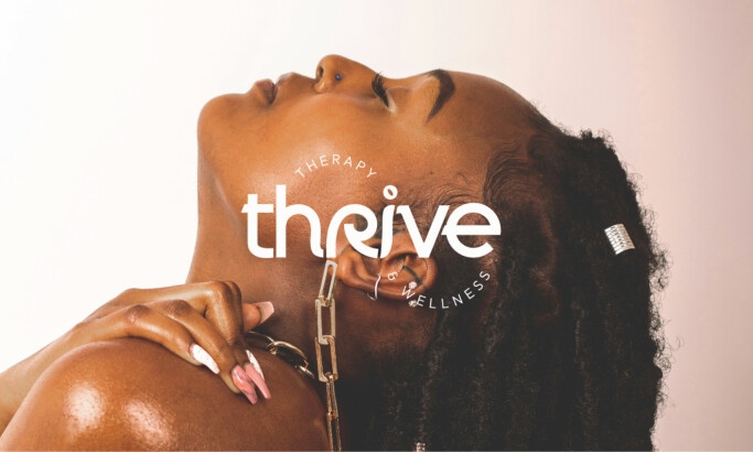
Thrive Therapy & Wellness

View Design
Lewis & Clark River Expeditions
View Design
Lotus Medical
View Design
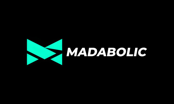
Madabolic
View Design
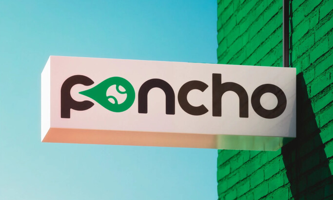
Poncho
View Design
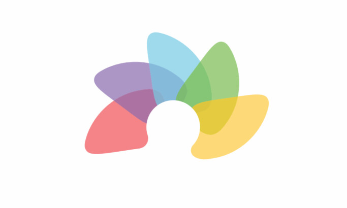
Pinwheel Clinic
View Design
Animula
View Design
Bonosh Health
View Design
Julie Leam Hypnotherapy
Get Connected
With The Right Agency Partner
& Receive Proposals For FREE
View Design
GAIAM
View Design
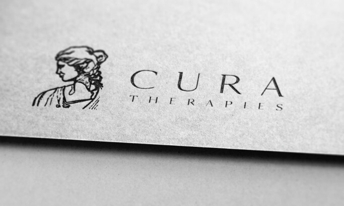
Cura Therapies
View Design
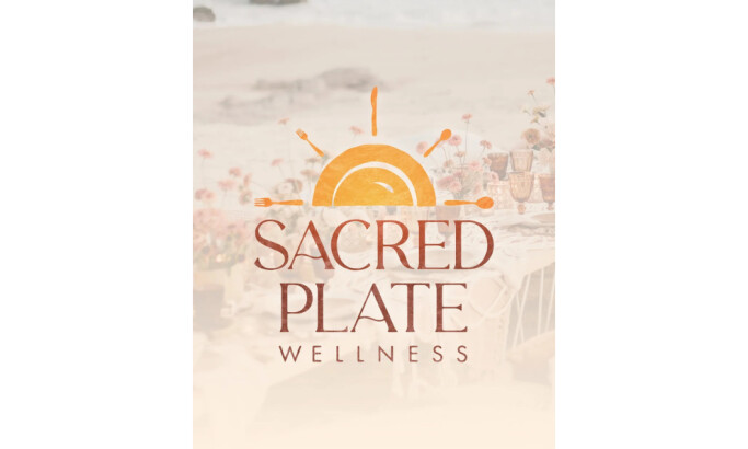
Sacred Plate Wellness
View Design
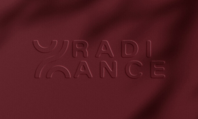
Radiance
View Design
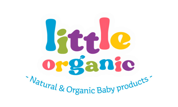
Loova Studio Brings Playful Identity to Little Organic
View Design
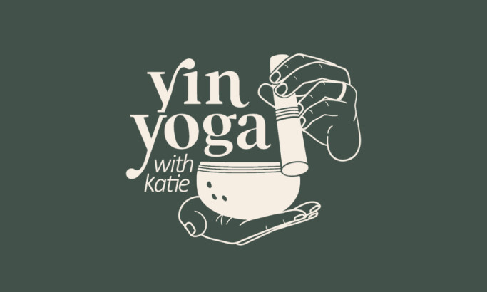
Inside House on Fire’s Logo Design for Yin Yoga with Katie
View Design
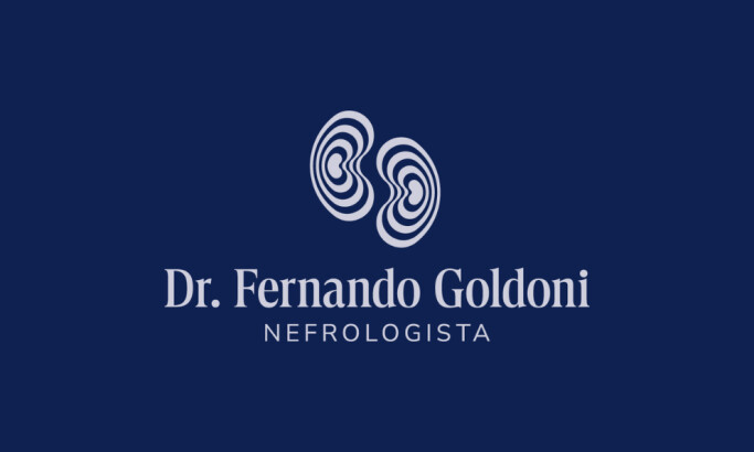
Robson Massaru Creates Medical Logo for Dr. Fernando Goldoni
View Design
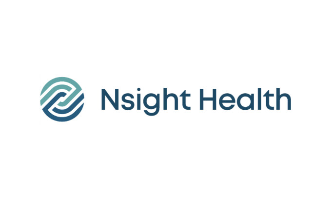
Nsight
Ready to elevate your designs?