Team Behind the Design
Logo Design Analysis
Related Articles:
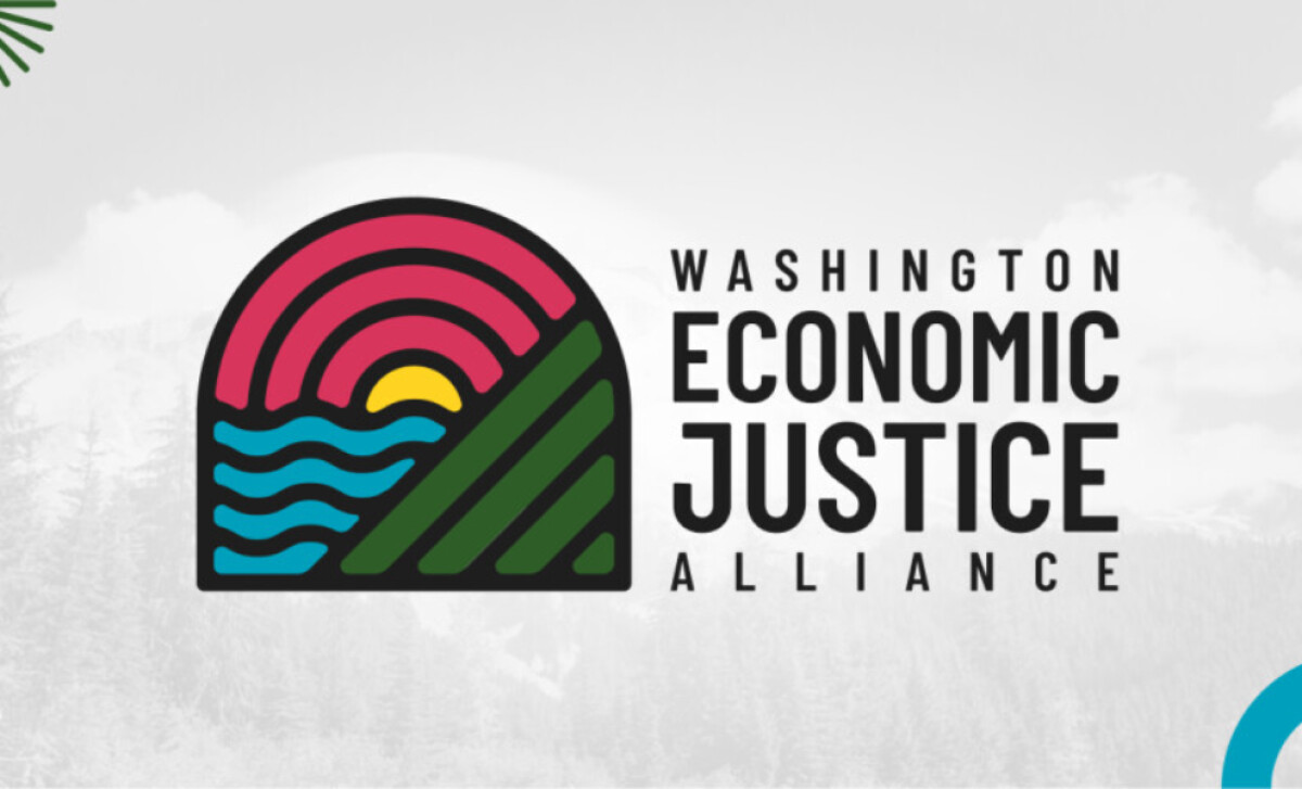
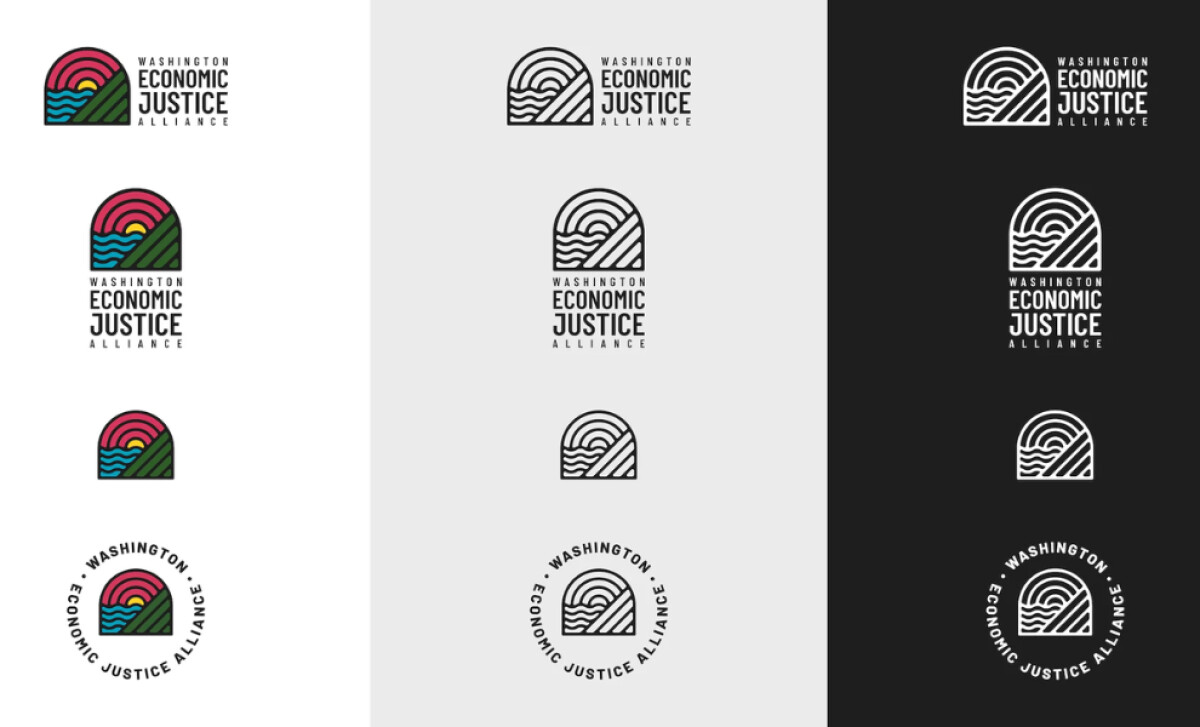
Rebrand logo designs benefit from strong symbolism and flexibility, and this mark brings those elements forward through its structured form and confident palette.
- Concept & Symbolism: The multilayered icon built from radiating bands, diagonal lines, and flowing waves creates an immediate connection to systems working together. I like how this triptych structure mirrors the alliance’s multi-sector collaboration without relying on literal imagery.
- Visual Design & Construction: The thick, consistent linework gives the mark architectural weight. I appreciate how the unified stroke style keeps the icon cohesive, allowing each symbolic segment to feel distinct but still part of one system.
- Color System: Bold magenta, yellow, green, and blue fields introduce an energetic palette that supports themes of diversity and community resilience. I find the color blocking especially effective — it lets each symbolic region communicate independently while maintaining overall balance.
- Typography & Wordmark: The condensed uppercase typography delivers a strong institutional tone. I like how the hierarchy places “ECONOMIC JUSTICE” at the center, making the mission unmistakable while keeping the full name compact and readable.
What Brands & Agencies Can Learn from the Washington Economic Justice Alliance
This rebrand for Washington Economic Justice Alliance highlights how clarity, symbolism, and structure can elevate nonprofit identity systems.
1. Use Geometry to Communicate Systems and Collaboration
Structured linework and divided forms can symbolize interconnected sectors or shared missions without relying on literal illustrations. This kind of abstraction often feels more modern and adaptable for long-term organizational use.
2. Build Color Palettes That Reinforce Values
A purposeful mix of warm and cool hues can express diversity, optimism, and regional identity. Strong color segmentation also improves clarity in digital environments and helps the symbol hold meaning when reproduced at small sizes.
3. Ensure Scalability Through Strong Silhouettes
A recognizable outer shape allows the mark to stay legible even when details are minimized or removed. For nonprofits with wide communication needs, this scalability supports consistency across everything from local signage to statewide campaigns.
About DesignRush Featured Designs
At DesignRush, we review hundreds of agency projects every month across branding, digital, and visual communication. These featured designs represent standout work that excels in creativity, relevance, and execution.
The strongest entries often advance to our Monthly Design Awards, highlighting excellence across the industry.
Check out more standout work across categories:
- Best Logo Designs
- Best Website Designs
- Best App Designs
- Best Print Designs
- Best Packaging Designs
- Best Video Designs
For a full list of design agencies and related services, see our Agency Directory.