We Company Logo Design by We Want Design
We Company’s logo redesign introduces a clean, modern mark that strengthens brand clarity and digital presence. The simplified typography and bold color system position the company as a dynamic entertainment destination while improving recognition across web and marketing touchpoints.
Dynamic visuals energize brand identity
Simplified wordmark strengthens digital recognition
This website uses a colour palette of 4 colours
  • #3259CE
  • #0A0003
  • #FFFFFF
  • #ED5827
Technologies & Tools
Description
Team Behind the Design
  • Agency: We Want Design
  • Client: We Company
  • Category: Logo Design — Professional Services
  • Location: Chesapeake, Virginia, United States
  • Project Brief: Create a professional services logo design that modernizes We Company’s identity while improving clarity, scalability, and brand perception across digital and physical platforms.

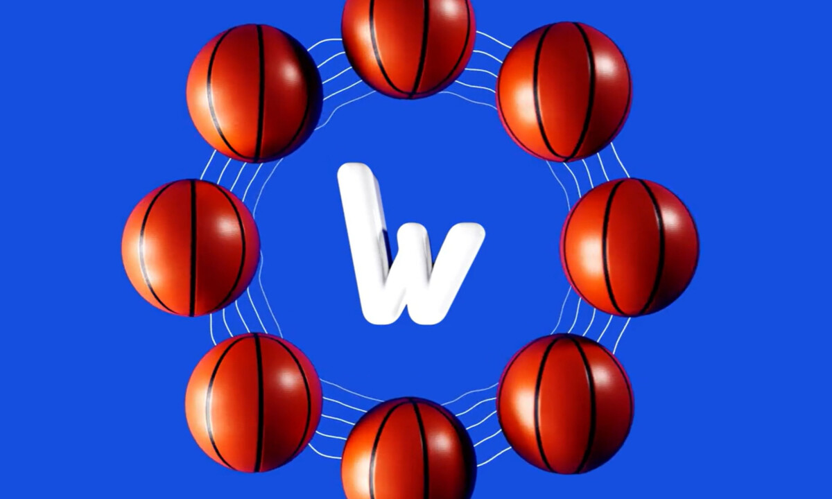
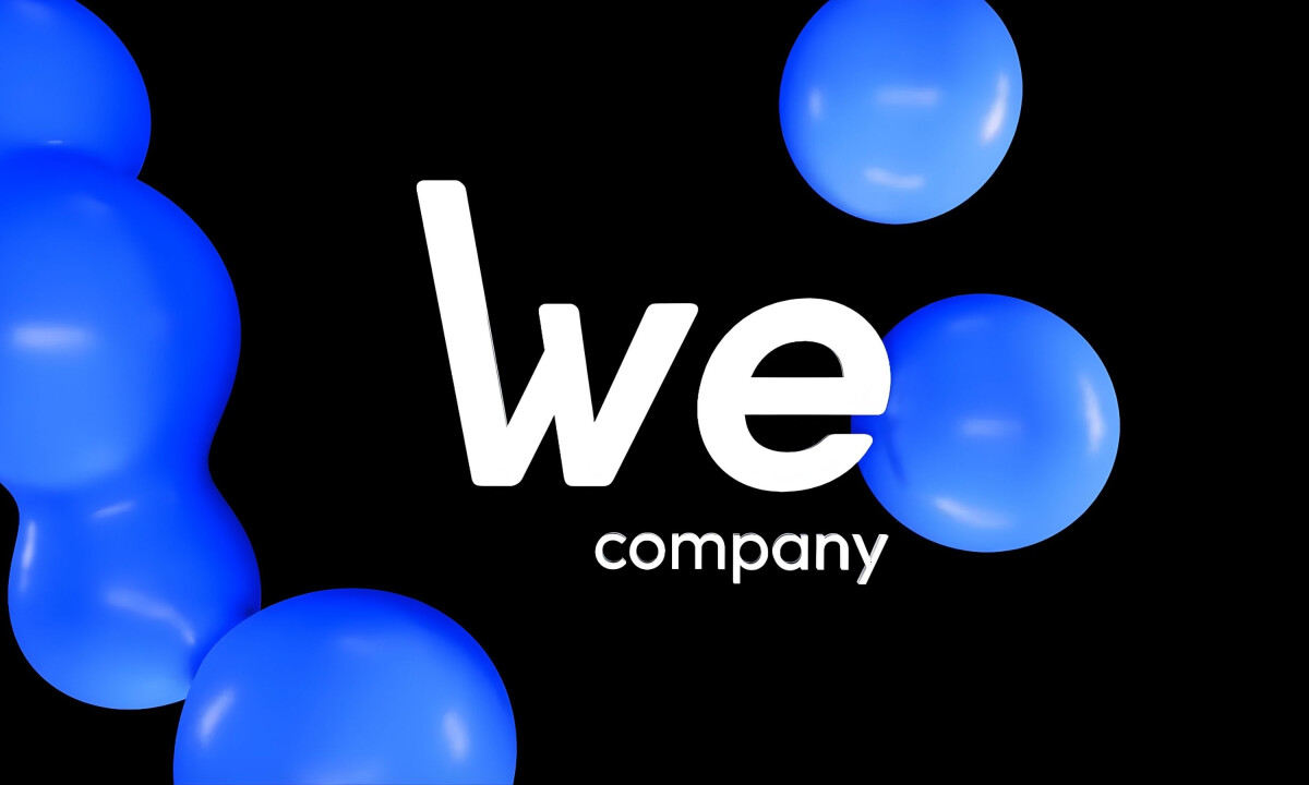
Professional services logo design often succeeds through restraint. We Company’s refreshed identity removes visual noise, replacing it with a bold, minimal wordmark that communicates clarity, confidence, and modern relevance.

Ready to elevate your designs?