- Article by
- Jermaine Dela Cruz


#050505 #EFEFEF #E41A28 #B61826
- Agency: Eich Studio & Co
- Client: Wolves Den
- Category: Logo Design — Sports and Leisure
- Location: São Paulo, Brazil
- Project Brief: Create a logo that reflects Wolves Den’s identity as a Brazilian Jiu-Jitsu academy focused on growth, teamwork, and competitive excellence.
A sports logo earns its keep when one mark carries the whole story. Eich Studio built the identity for Brazilian Jiu-Jitsu academy Wolf Den, that sells itself as a pack, so the symbol has to read as leadership and discipline at a glance.
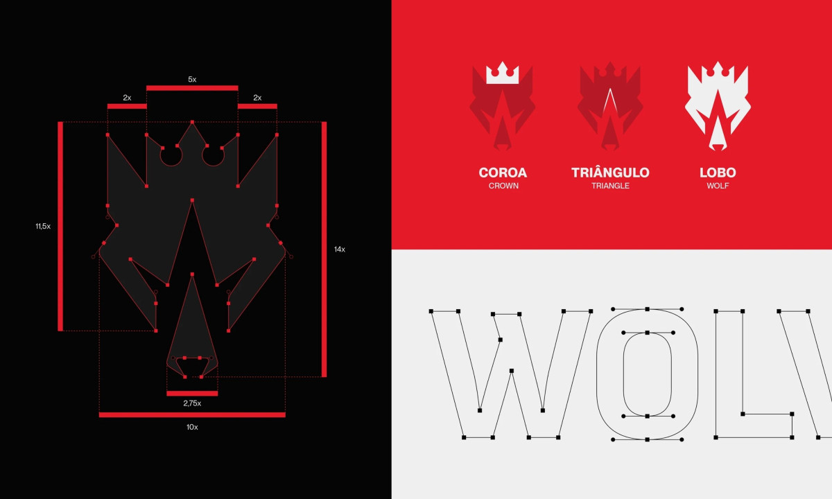
The construction is tighter than it first looks. A crowned wolf head sits up top, while the negative space below resolves into a clean triangle, the standard Jiu-Jitsu submission shape and a nod to the sport's philosophy. The breakdown shows how the crown, triangle, and wolf lock into one figure on a strict proportional grid.
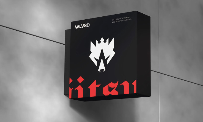
Color keeps the tone disciplined. Black, off-white, and red split the system between authority and aggression, holding up whether the mark is reversed white on red or carved out of a black storefront sign.
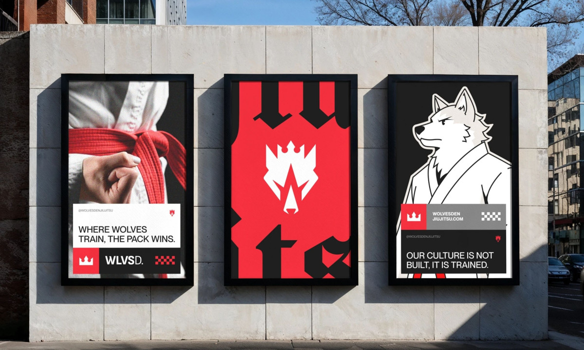
The identity stretches well past the logo. A kimono-clad wolf mascot, a custom blackletter wordmark, and poster lines like "where wolves train, the pack wins" give the brand a full visual language for the mats and the street. For a gym chasing national recognition, that range is the difference between a logo and a brand.

Q-Selection
Wolves Den

Rickenbacker Marina Park
Apax Architecture