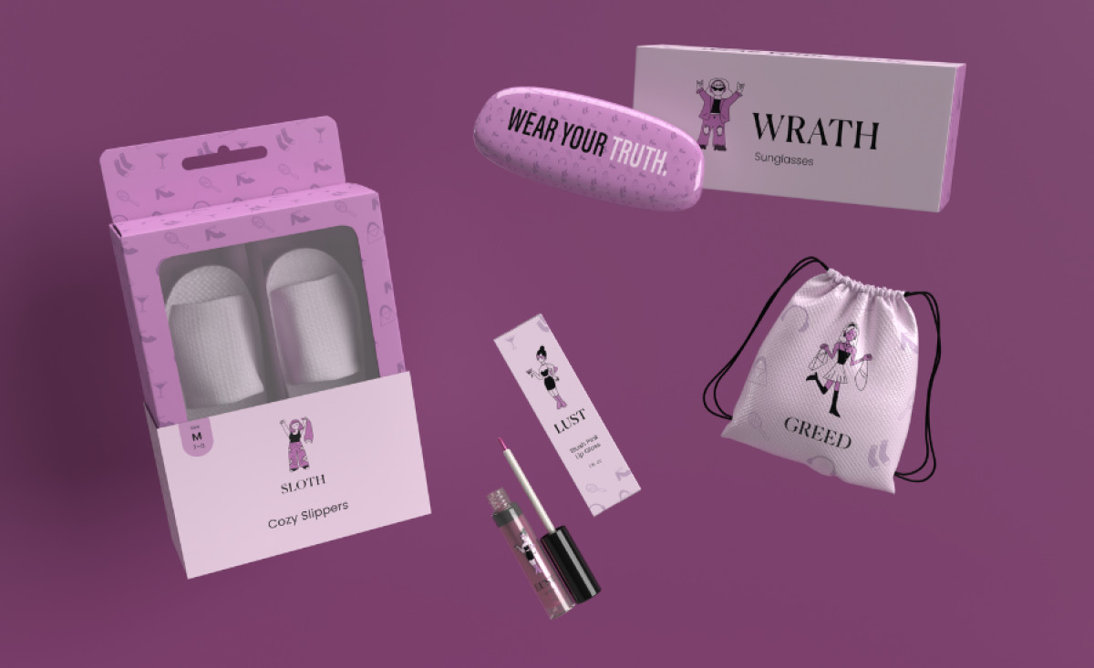
Standout Features:
- Two-tone purple theme
- Transparent cutouts
- Fun character representations
The contemporary packaging design for the 7 Deadly Sins cosmetics line by Cassie Pomierski is a rebellious yet playful reimagining of the concept of sin. It embraces a delightful contrast to the brand's name, utilizing different shades of purple to create an alluring and empowering aesthetic.
Strategic cutouts on the packaging offer a glimpse of the product, showcasing its quality while appealing to curious consumers. This playful feature enhances the visual quality and invites consumers to interact with the packaging, creating a sense of anticipation and discovery.
The character visuals further amplify the packaging's visual impact. Each “sin” is represented by a unique illustration, which captures attention and reflects the brand's message of self-expression and defiance of societal norms.