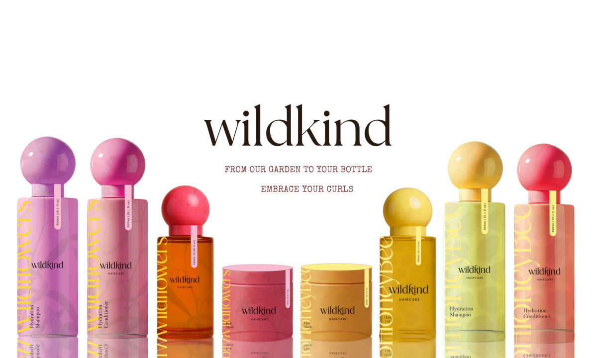
Studio Deia made Wildkind as a conceptual haircare brand, turning the nurturing feel of a garden into a tactile packaging experience that celebrates natural texture and elevates daily rituals. This design approach strengthens brand identity, builds emotional connection, and aligns with the global hair and scalp care market’s projected growth to $151.07 billion by 2030, fueled by rising demand for natural, nourishing products.
Key Insights for Brands:
- Use thematic aesthetics to cultivate a distinct brand identity
- Design with tactile elements to increase perceived value
- Leverage color themes to effectively organize product lines and guide customer choices
Wildkind’s Nature-Inspired Aesthetics and Sustainability Cues Define Brand Identity
The Wildkind Haircare packaging instantly draws consumers into its core philosophy, transcending generic visual cues to establish a truly distinctive presence.
Rather than lean on sleek plastics and glossy coatings, Wildkind’s bottles and labels reflect the textures of nature — matte finishes, soft earth tones, and hand-illustrated elements that evoke wildflowers, soil, and sun.
This isn't just about depicting natural ingredients; it's about evoking a profound sense of calm and unadulterated authenticity through color palettes that feel genuinely rooted in the natural world.
This thoughtful aesthetic journey also strategically positions Wildkind as a beacon in a crowded market, directly appealing to consumers actively seeking genuine, holistic, and transparent beauty solutions.
This distinct visual identity holds significant commercial weight, especially considering a report revealing that 73% of global consumers are willing to pay more for sustainable brands. Wildkind's packaging thus doesn't just look good; it communicates a valuable ethos.
Studio Deia Enlists the Help of Tactile Elements to Enhance Sensory Experience
Wildkind's packaging goes beyond just looking good; it's designed to be felt. The thoughtful inclusion of tactile elements, from the specific choice of materials to subtle textures, perhaps even a delicate embossing or debossing, invites a physical interaction that deeply connects with the brand's "tending a garden" philosophy.
This isn't a mere visual experience; it transforms the simple act of picking up a product into a genuine ritual. This sensory depth cultivates a richer engagement and reinforces the luxurious, nature-infused experience Wildkind sets out to deliver.
This strategic emphasis on touch aligns with a growing trend in luxury packaging, where multisensory experiences are crucial for brand differentiation and fostering lasting consumer loyalty.
Unveil fashion and beauty packaging that captivates and delights the senses.
Studio Deia Uses Visual Storytelling to Increase Engagement
-desktop.jpg)
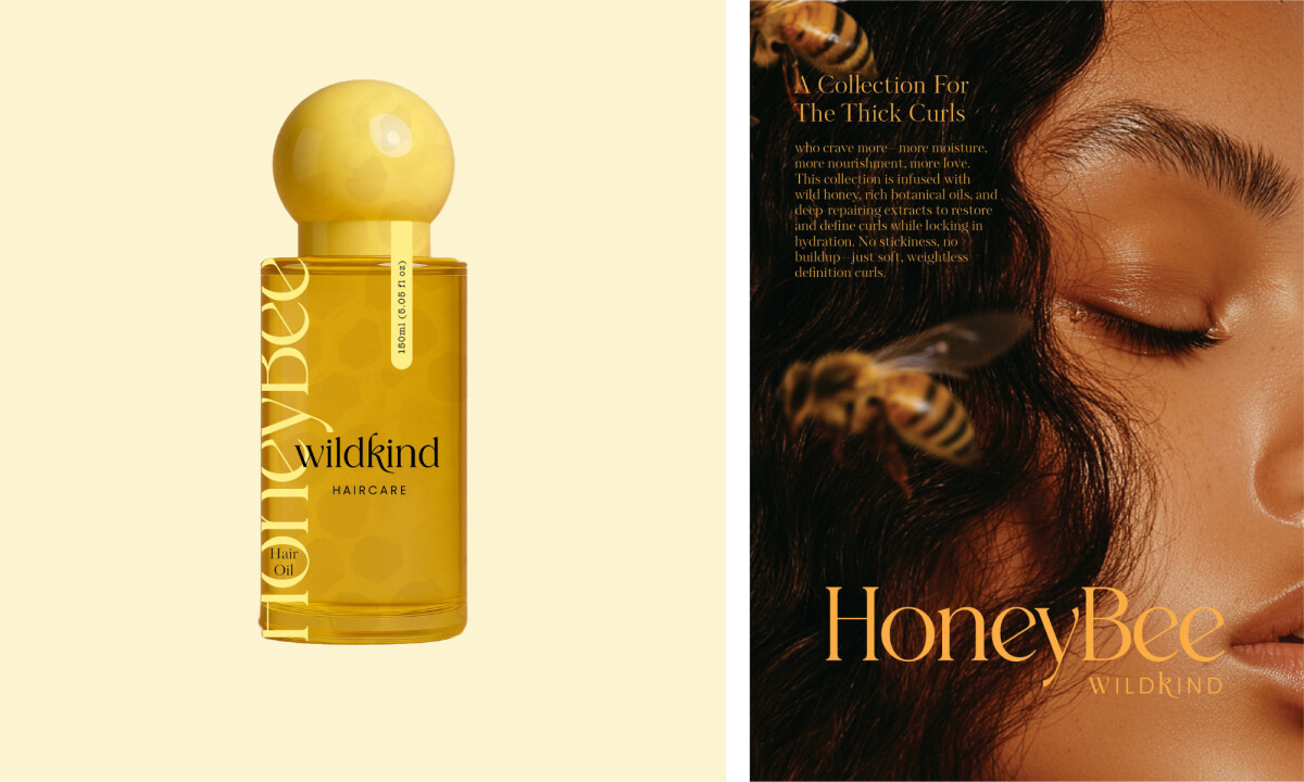
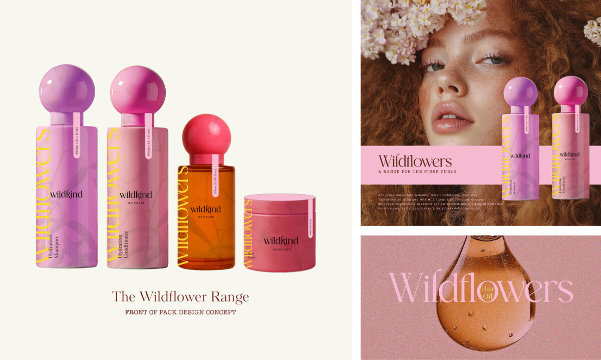
The design of Wildkind Haircare packaging masterfully tells a story of natural growth, care, and transformation. Each element, from the subtle illustrations of wildflowers and honeybee botanicals to the overall composition, contributes to a cohesive narrative about embracing natural curls and rituals inspired by in-house cultivated ingredients.
This narrative approach allows consumers to connect with the brand on an emotional level, understanding its values and origin, a testament to the power of thoughtful design by professional packaging design agencies.
Brands that successfully weave stories into their packaging often see increased engagement and memorability, a strategy championed by companies like Lush, which uses its packaging to communicate ethical sourcing and handcrafted quality.
Wildkind’sHarmonious Color Palette and Typography Bring Cohesion to a Varied Product Line
The carefully curated palette features hues extends its use outside of the aesthetics. With Wilkdkind, specific color groupings are dedicated to different customer avatars.
For instance, a particular set of shades covers the "wildflower" collection, designed for customers with fine hair, while another distinct group of colors defines the "honeybee" collection, aimed at those with thick curls.
This clever application of color helps customers easily identify products suited for their unique hair types within the broader Wildkind family. Such strategic color usage is backed by research. A study on packaging color indicates that specific color palettes can significantly prime consumer expectations about a product's attributes, influencing perceptions of naturalness, effectiveness, and ultimately, purchase intent, especially in the home and personal care categories.
Complementing this, the chosen typography balances a handcrafted feel with modern clarity, ensuring readability and maintaining the overall premium, authentic brand image.
This thoughtful integration of color and type not only enhances product discoverability but also strengthens brand recognition, as supported by the study on The Impact of Typography in Graphic Design.
Studio Deia's packaging for Wildkind expertly combines natural aesthetics with a rich sensory experience, setting a new benchmark for the industry. This design powerfully demonstrates how intentional, sensory-driven packaging elevates brand perception and deepens consumer connection, solidifying its place among this month’s best packaging designs.