- Designer: 7-Eleven Internal Team
- Category: Packaging Design — Beverage
- Project Brief: Design a ready-to-drink soda package that celebrates the 60th anniversary of the Slurpee while extending its playful identity into a portable beverage format.
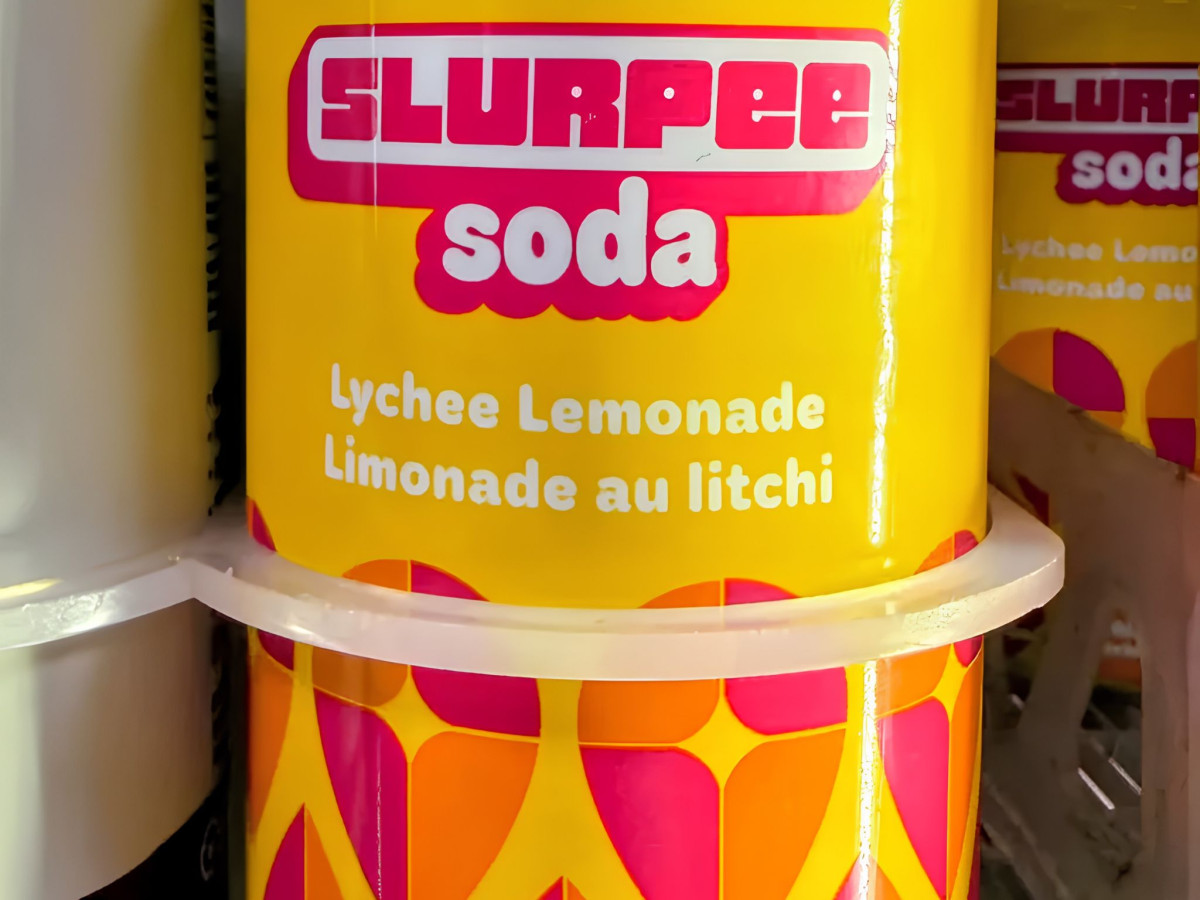
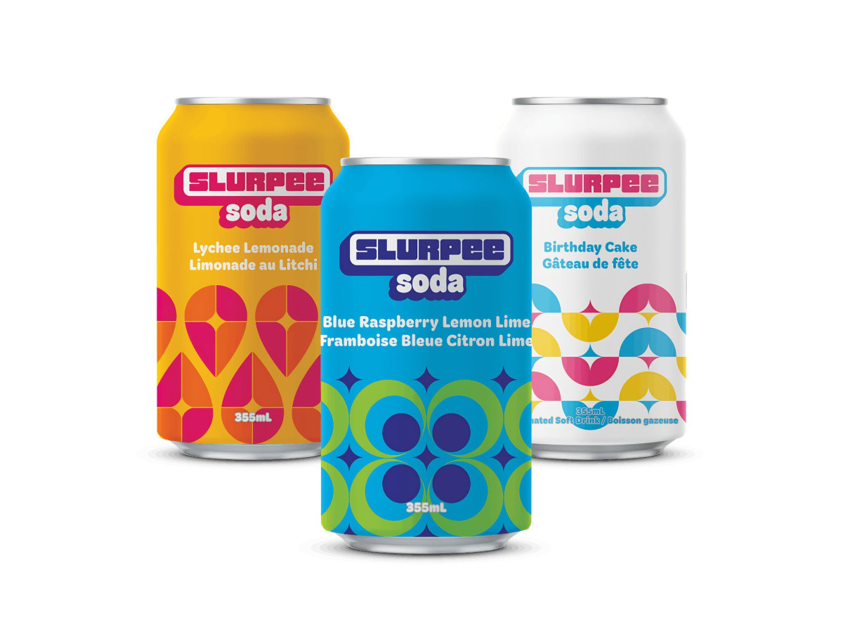
Beverage packaging works when one look at the can tells you everything about the brand. 7-Eleven's canned Slurpee Soda gets that right, bottling the Slurpee's loud, sugary fun into a ready-to-drink can for its 60th birthday.
The patterns carry it. Each can is covered in chunky retro shapes, teardrops, circles, and starbursts, in bright flavor-matched color, so the whole lineup feels playful and happily stuck in childhood.
Color does the sorting. Sunny yellow means Lychee Lemonade, blue-green means Blue Raspberry Lemon Lime, and a confetti-white means Birthday Cake, each its own thing but clearly part of the same crew.
The logo ties it together. That fat, rounded Slurpee badge, recolored to suit every can, sits right up top so the 60-year-old name jumps out fast. For an old favorite going canned, this much noise on the package is exactly right.