AEVUM Packaging Design by Greatergood Brands®
Greatergood Brands® created AEVUM’s packaging identity around the concept of the Fountain of Youth. The project rejects trend-driven supplement aesthetics in favor of monochrome visuals, heritage symbolism, and a timeless design language that communicates longevity, credibility, and premium wellness positioning.
Glossy black supplement bottle with architectural white lettering on dark grey
Elegant black insulated bottle anchor premium counter display spaces flawlessly
Close-up of an intricate circular monogram logo printed on paper
Monochrome illustrations evoke enduring classic traditions on product labels
Glossy supplement capsules and sleek pouches
Structural unboxing elements transform standard wellness interactions into memorable rituals
Cohesive corporate stationery suites carry heritage-inspired branding elements gracefully
Branded slate grey envelopes and cards laid flat together neatly
This website uses a colour palette of 4 colours
  • #383E4D
  • #777B84
  • #4F5667
  • #C4730C
Technologies & Tools
Description
Team Behind the Design
  • Agency: Greatergood Brands®
  • Client: AEVUM
  • Category: Packaging Design — Health & Wellness
  • Location: London, United Kingdom
  • Project Brief: Create a health and wellness packaging identity that positions AEVUM as a timeless premium longevity supplement brand outside conventional wellness trends.

A health and wellness packaging design outlasts its category when it refuses to speak the category's language. Greatergood Brands® builds AEVUM's identity around that refusal, bypassing clinical whites and playful pastels in favor of something that reads less like a supplement and more like an object someone would keep.

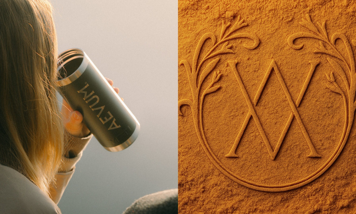
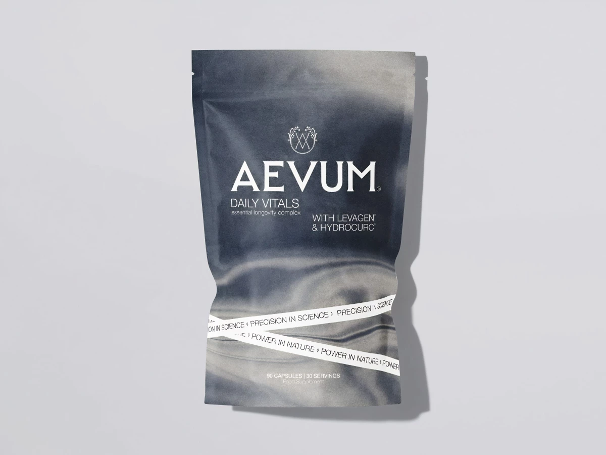
Matte-finished pouches give the packaging a tactile quality that suggests permanence rather than purchase cycle. Deep slate grays, crisp creams and monochrome etchings define the primary pouches. A sleek custom cylindrical container serves dedicated customers who want the full ritual on the counter.

At the center of the system sits an intricate monochrome illustration of the Fountain of Youth, printed directly on the face of each pouch as a historical emblem rather than a decorative flourish. A custom AV monogram enclosed in a botanical frame balances that reference, holding scientific precision and natural power in the same mark.

A carved architectural wordmark gives AEVUM the presence of something discovered rather than designed. Greatergood Brands delivers a packaging system built to sit on a countertop for years without ever looking like it's overstayed its welcome.

Vote for the best design in this year's Design Awards and help decide which projects deserve top recognition. Every vote contributes to celebrating creativity and craftsmanship across categories like web, branding, product, and digital design.
AEVUM Packaging Design by Greatergood Brands®

AEVUM

Varus 775 Packaging Design by OlssønBarbieri

Varus 775

Makhyam Crunch Packaging Design by Orange Tribe

Makhyam Crunch

Designed byOrange Tribe
Sooki Packaging Design by The Collected Works

Sooki

Sundae Body Mist Packaging Design by Jo Cutri Studio

Sundae Body Mist

Designed byJo Cutri Studio
SPYRE Packaging Design by Hello Comrade

SPYRE

Designed byHello Comrade
View All BestPackaging Designs

Ready to elevate your designs?