- Article by
- Jermaine Dela Cruz

#ACAFB4 #956148 #74403C #030303
- Agency: Also Known As
- Client: AM/FM Brew Works
- Category: Packaging Design (Beverage Packaging)
- Location: Chicago, Illinois, United States
- Project Brief: Design packaging that enhances shelf appeal and communicates a culturally driven brand through bold visuals and a cohesive system.
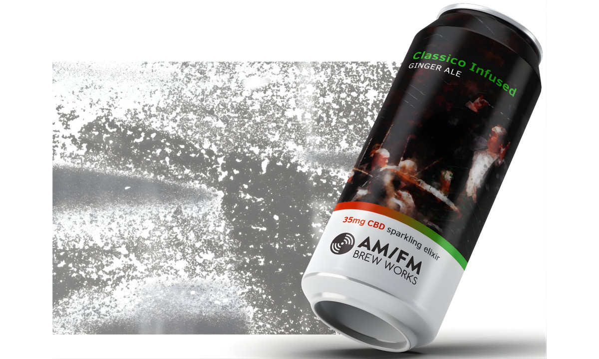
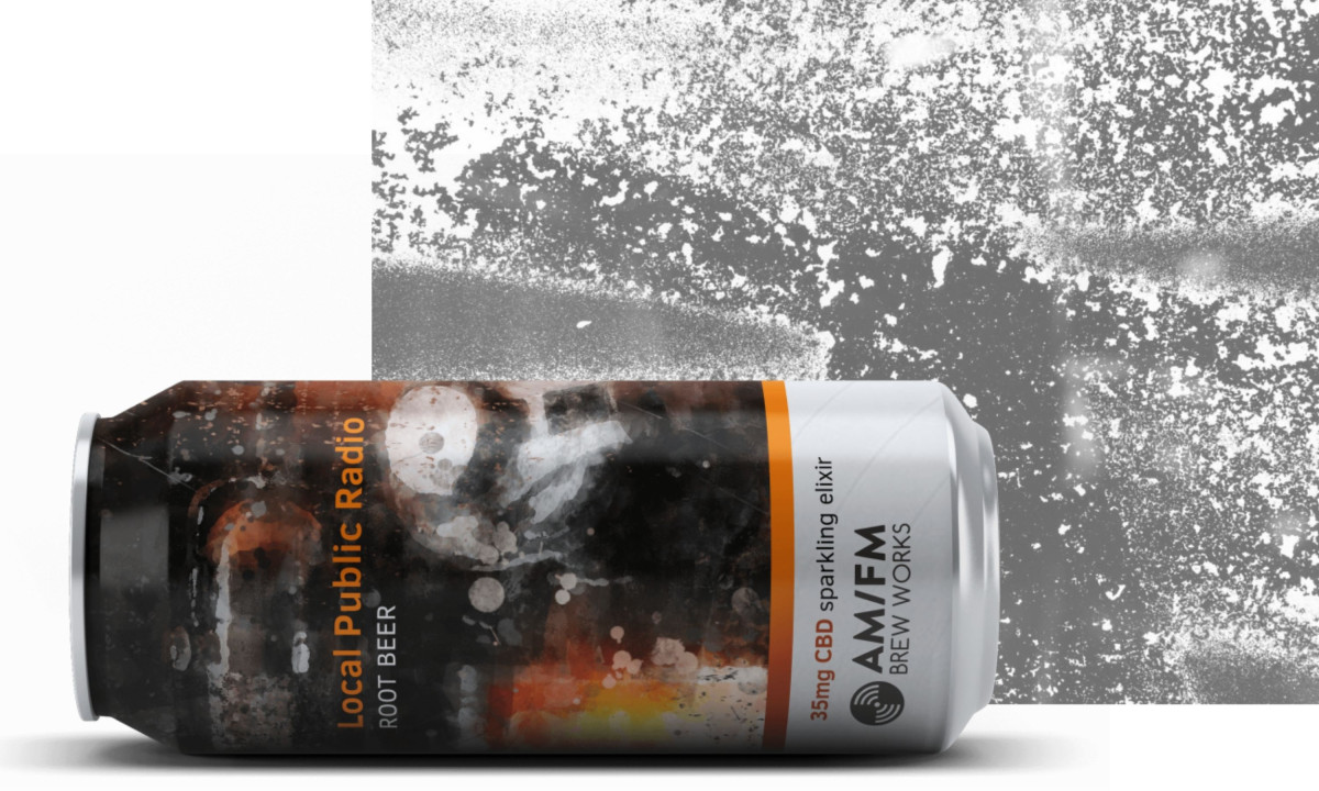
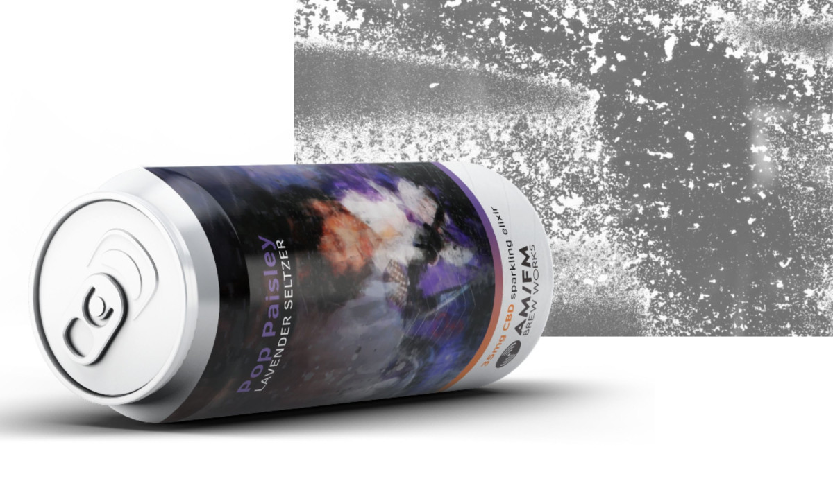
Beverage packaging should give someone a feel for the product's world before they even take a sip. AM/FM Brew Works pulls this off by mixing the grit of a brewery with the warmth of an old record store.
High-contrast colors and sharp lines mimic the look of classic vinyl covers. Heavy lettering and radio-wave patterns make the cans easy to spot on a shelf, even in a crowded market.
The labels feel solid in your hand, making the transition from the shop to the couch feel like a real event. It turns a regular drink into something that feels like part of a music collection rather than just a retail purchase.
The brand sits right where cannabis culture meets craft beer. Using details like radio dials and vintage logos allows the design to avoid the cold, clinical look of most dispensaries in favor of something more inviting.
A steady look across all the packaging builds a sense of reliability. This clear approach helped the brand find its footing in the new THC beverage market and showed that a strong idea can change how people shop.
Moctezuma
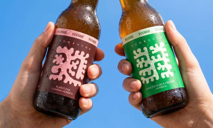
Fooshi
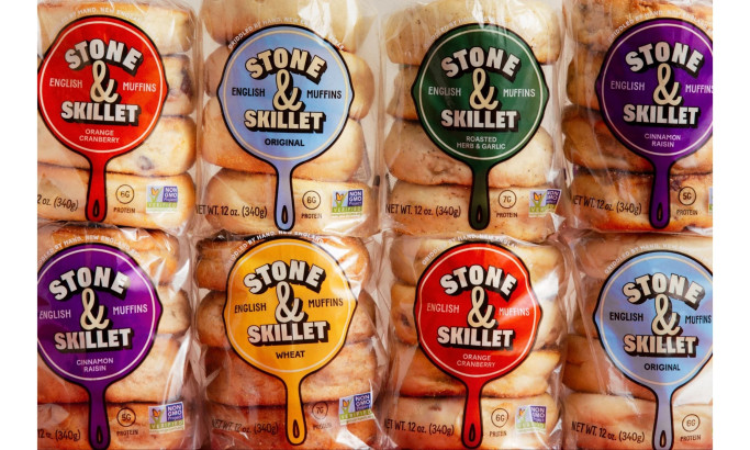
Stone & Skillet
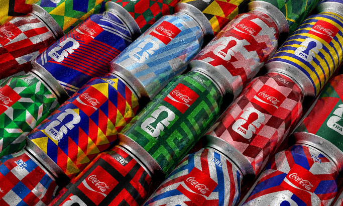
Coca-Cola FIFA World Cup 26 Collectible Country Cans
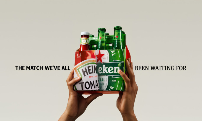
HEINZ x Heineken® Limited Edition Six-Pack
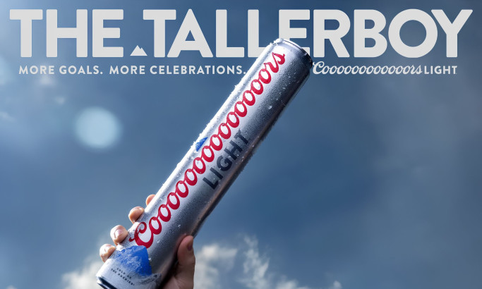
Coors Light Tallerboy
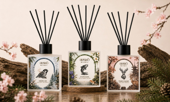
Hushō

Mật Mã Gift Set
